

The Daily Digest, 16Nov2020
Georgia COVID-19 Updates

The World

Globally, the SARS-CoV-2 virus that causes COVID-19 disease has sickened > 54.6 million people (+3.9 million since last week) and killed at least 1,320,100 (+59,300 in the past week) as of this morning.
The US is ranked in the top color category for hot spots, where the dark red represents counties with >14 average daily case rate per 100,000 for the past week. Noticeable changes in this week’s global map is that things have intensified in Canada and Russia. Canada was doing really well for a long time. But October 11th was Canadian Thanksgiving. So just understand that even a country that is doing everything right can have a major escalation of disease when people gather. In the US, we are not doing everything right and our amount of disease is greater than Canada was experiencing prior to their Thanksgiving holiday. The entire European continent is shaded dark red with the exception of Norway, Finland and Belarus. We are ranked 23rd in the world for average daily case rate per 100,000 people over the past 7 days (last week, 31st) with a rate of 45.3 compared to 33.5 last week. The top five countries for average daily case rate per 100,000 in the past week are Montenegro, Luxembourg, Andorra, San Marino, and Georgia (the country in Eurasia).
For deaths, our average daily death rate per 100,000 over the past week is 0.3, the same as last week, and we are ranked #41 in the world for this (last week we were ranked #39). The top five countries for average daily death rate per 100,000 in the most recent week are Czech Republic, Belgium, Slovenia, Bosnia and Herzegovina, and Montenegro.
The United States
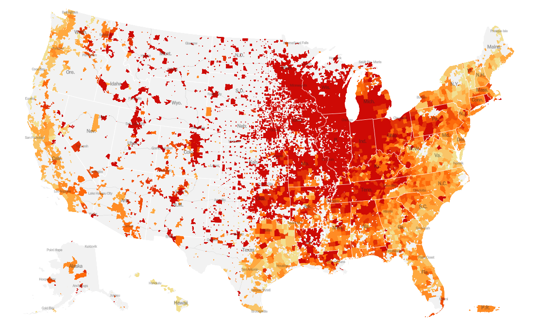
This week we see escalation of disease rates for the Colorado front range, the entire west coast and in the midwestern states of Ohio, Michigan, Indiana and Kentucky. In the south, we see increases for Louisiana, Mississippi and Alabama.
As of this morning, there have been over 11.1 million cases (+1 million in the past week) and 246,083 deaths in the US (+7,837 in past week). Keep in mind that both of these numbers are probably an under-count of the situation in our country. Note, the New York Times coronavirus tracker *IS* now including the antigen test-identified positives that Georgia DPH reports each Monday in the Daily Situation Report.
The top five states in the nation for average daily case rate in the past 7 days are North Dakota, South Dakota, Iowa, Wyoming and Wisconsin. The top five states in the nation for average daily death rate in the past 7 days are North Dakota, South Dakota, Montana, Wisconsin and Wyoming.
I’m changing up the format for this week’s comparison of rates and rankings. The table below tells you where we are this week and how that compares to the previous week (in parentheses). The data for everything but the percent of inpatients with COVID-19 comes from the New York Times coronavirus tracker and is current as of this morning. The hospital data comes from the HHS Protect Public Data Hub and was last updated on 11Nov2020.

As far as pandemic data go, the best data are recent, local and adjusted for population. Because CDC has largely limited some of their data offerings to state level, I’ve tended to rely on other resources. But I still check their data weekly. I noticed something interesting this week in the map below. They note that Georgia is in the second tier of disease in the most recent week. However, this is an artifact of data reporting. They, too, are now including Georgia’s antigen test cases in Georgia’s totals, loading all of them en masse on November 12th. So we aren’t actually in the second tier of disease, but I bring this up to say that if CDC is including antigen test-identified cases in Georgia’s total, then why isn’t Georgia Department of Public Health?

Here’s a look at how COVID-19 is contributing to hospital admissions. The map below shows how many inpatient beds in each state are occupied by COVID-19 patients.

Next, let’s look at how seasonal influenza is impacting different states across the US. This week Iowa jumped from Moderate to Very High. Things also ticked upward for North Dakota, Idaho, New Mexico and Oklahoma. Things are steady among the other states in the US this week. You can consult FluView any time you’d like to see this map and other data visualizations.

Georgia remains in the most minimal of the minimal section. Keep in mind that influenza is not a mandatory notifiable disease for public health departments like COVID-19 is. But there is a robust surveillance network for tracking trends. So we aren’t likely to see case counts and death counts like we do for COVID-19 because we are seeing estimates for influenza rather than actual numbers. Both diseases feature a wide spectrum of disease severity that can make it hard to identify all cases. You can read the weekly report from Georgia Department of Public Health here.
Another graph offered by the FluView resource is this updated look at deaths due to three things that look at lot alike - pneumonia, influenza and COVID-19. In the past, all we’ve seen is the black and red lines that show the epidemic threshold and percent of deaths due to pneumonia, influenza or COVID-19. Even that piece alone shows us the three surges we’ve seen so far with COVID-19, with the greatest amount of death so far associated with the first surge that impacted the northeast (especially New York City). The second surge was ours in the south. The third is ongoing and for now it looks smaller, but this is an artifact of the reality that death reporting can be delayed by as much as 8 weeks. We should expect this number to rise, due to better data reporting and also just because with our surge in cases nationwide we should expect a surge in deaths to follow. You’ll note that I use the word “surge” and not “wave”. If we were experiencing waves, then the trough of that wave would dip back down to the epidemic threshold. But we haven’t ever had a time that we had COVID-19 under control.

The new features of this graph are the deaths coded as influenza and those coded as COVID-19. These codes come from the death certificates themselves. You’ll notice that COVID-19 is causing far more PIC deaths than influenza has historically.
Lastly, I’m not sure when CDC started offering these data on cases and deaths in correctional facilities, but I wanted to share this. If you click on the map below, it will take you to the site where you can interact with the data.

Georgia
Normally I would provide the Harvard Global Health Institute tool for assessing disease trends at a county level in Georgia. But they are only using PCR-based cases to compare counties because they rely on the same data source as the White House Coronavirus Task Force - USA Facts which is a repository of the data that each state wishes to share. Georgia only shares their PCR-based cases to this repository. So, using the same calculation method and color coding, here’s what the Harvard map would look like if antigen cases are included (as CDC, New York Times do). Click on the map to be routed to a live image where you can click or hover over your county of interest.

There are 56 counties in the red category, 85 in the orange category and 18 counties are in the yellow zone. There are no counties in the green category.
For today, here are the net increases for each key metric for Georgia. Note this tweet from Georgia DPH, indicating that there is an IT problem that is impacting Electronic Laboratory Reporting (ELR). This will impact testing data as well as case data.

Testing: 13,422 new PCR tests (a low day for us, not unusual for a Monday), 7.1% were positive. 97% of today’s cases were identified through electronic laboratory reporting (ELR). The state does not provide data regarding the number of antigen tests performed. Due to the IT problem, we might expect tomorrow to be artificially high, as we may see one and a half day’s worth of data instead of a single day’s data.
Cases: 1247 cases were newly reported today (981 by PCR, 266 by antigen test). Mondays are often low reporting days due to weekend effect, but for the past three weeks the Monday number has been >900. So we are seeing an escalation over time even on our low days. Add to that the tweet from Georgia DPH, and today might have been a rather large day. Again, we should brace for tomorrow to be a bigger day than we’ve seen recently as laboratories catch up on samples that arrived over the weekend and as laboratories report data through ELR that was down today. The new statewide total is 426,236 (387,930 by PCR, 38,306 by antigen test). Of today’s cases, 39% came from nonrural counties outside of the Atlanta metro. Atlanta suburb counties were the second highest contributor, with 20% of cases.
Hospitalizations: 24 new COVID hospital admissions and 4 new ICU admissions. These are low numbers for Georgia, but today’s admissions are 9 more than last Monday and the ICU admissions have doubled today compared to last Monday. the same as we saw last Monday). There are currently 1697 COVID patients hospitalized and this number is 163 additional patients compared to last Monday. Adult ventilators are being used at 28% of our state’s capacity as of today, and this is consistent with where we’ve been recently and where levels were prior to the summer surge.
There are two hospital regions using >90% of its ICU bed capacity - regions E (90%) and region N (91.5%).
Deaths: 9 newly reported confirmed deaths, a low day for us. It should be noted that nursing homes typically do not report over the weekends, and Mondays tend to be low count days for this reason. Eight of the deaths reported today came from outside of the Atlanta metro with rural counties leading with 5 newly reported deaths. The new statewide total is 8471. The case fatality rate remains at 2.18% if only PCR-identified cases are considered. Using antigen test-identified cases also, the case fatality rate is actually 2.10%).
The Georgia Department of Public Health County Indicators report is released on Mondays. This report provides a lot of county level data, including testing, confirmed and probable cases (i.e. those identified through the rapid antigen test) and the counties of concern as far as DPH is concerned.
Here’s a comparison of where the emerging counties are (this is code for “counties of concern”) last week compared to this week, on the right.
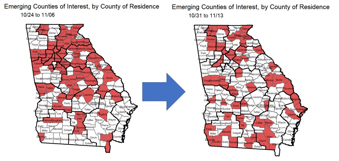
According to the new map, the counties are less clustered together and more dispersed throughout the state. We do we clusters of emerging counties along the Tennessee, South Carolina and Florida borders. There’s also a belt of counties that extend from Troup county to Peach county.
The White House Coronavirus Task Force reports are produced and released on Sundays but I usually don’t get a copy until Monday/Tuesday. So I’ll be back with that analysis on Wednesday.
References
https://www.nytimes.com/interactive/2020/us/coronavirus-us-cases.html
https://www.nytimes.com/interactive/2020/world/coronavirus-maps.html
https://protect-public.hhs.gov/pages/hospital-capacity
https://www.cdc.gov/flu/weekly/index.htm
https://dph.georgia.gov/covid-19-daily-status-report
https://covid-gagio.hub.arcgis.com/
https://dph.georgia.gov/epidemiology/influenza/flu-activity-georgia
https://dph.georgia.gov/county-indicator-reports
Georgia COVID-19 Updates is a free newsletter that depends on reader support. If you wish to subscribe please click the link below. There are free and paid options available.
My Ph.D. is in Medical Microbiology and Immunology. I've worked at places like Creighton University, the Centers for Disease Control & Prevention and Mercer University School of Medicine. All thoughts are my professional opinion and should not be considered medical advice.