Vaccine Update
Nationally, 78.8% of the available doses have been administered, either as a first or second dose. Twenty seven percent of the US adult population has received at least one dose and 14.5% have been fully vaccinated. Among those 65+, 63.4% have received at least one dose and 35% are fully vaccinated. Across all 50 states, territories and other recipients, there are 28,787,561 doses on hand (8676 per 100,000 residents).
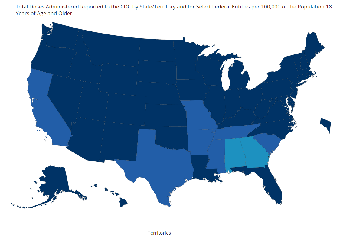
Georgia’s usage rate is below the national rate, at 69.2% (#49 in the US). There have been 3,981,815 doses delivered to the state of Georgia and 2,754,347 have been administered. It means that Georgia has 1,227,468 doses of the vaccine on hand, unused (or 11,561 per 100,000). This surplus is 33% higher than the national average. If we look at other states that have more than 1 million doses on hand one thing really stands out, the percent of their supply that’s been used. Georgia is the only state below 70% of its supply used. So while these other states have a lot of inventory like Georgia, they seem to be moving it out the door better than Georgia.
Vaccine eligibility expanded today in Georgia so perhaps the state was stockpiling doses to prepare for a big surge in demand today. But there is no need to hold stockpiles of the vaccines for second doses. The supply problem has been remedied with vaccines shipped increasing weekly and states getting a 3 week heads up on what is coming so they can plan. In the past, Governor Kemp has stated that there just isn’t enough vaccine to meet demand. But that doesn’t appear to be the case when the state has >1 million doses on hand. Georgia has plenty of vaccine, but it isn’t administering its vaccine supply to its people efficiently.
So far, 15.7% of the adult Georgia population has received 1+ dose of the vaccine (ranked #50) and 12.7% of the adult Georgia population is fully vaccinated (ranked #47). The low end estimate for herd immunity is 70% of the total population immune. So we have a ways to go. Compare that to the top state in the nation, Alaska, with 23.5% of its population fully vaccinated. Governor Kemp is very proud of the state’s efforts to vaccinate the population that is 65+. According to CDC data, 41.4% of that age group is fully vaccinated in Georgia (national average is 35%). Georgia is ranked #10 for this metric.
I think we need to be asking where these doses are, why they’re being held in reserve, and what the plan is for correcting this problem. The challenges that Georgia is facing are challenges in all 50 states. What is unique to Georgia that explains its poor performance?
The World
According to the New York Times Coronavirus Tracker, the SARS-CoV-2 virus that causes COVID-19 disease has sickened >119.9 million people (+3 million since last week) and killed at least 2,653,900 (+60,400 in the past week) worldwide as of this morning.
The US is ranked #54 in the world for average daily case rate per 100,000 people over the past 7 days (last week #48) with a rate of 17 (last week, 18). The top five countries for average daily case rate per 100,000 in the past week are Estonia, Czech Republic, Montenegro, Isle of Man, and San Marino.
For deaths, the US average daily death rate per 100,000 over the past week is 0.42 (previous week was 0.52), and we are ranked #28 in the world for this (last week we were ranked #24). The top five countries for average daily death rate per 100,000 in the most recent week are Czech Republic, Slovakia, Hungary, Montenegro, and Bulgaria.
The United States
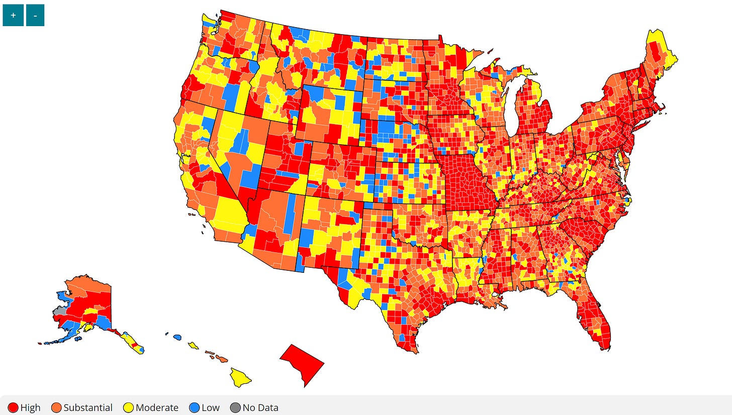
The map above comes from the CDC COVID-19 Tracker on the Community tab, county view. CDC recently gave us new guidelines on what it considers to be high, substantial, moderate and low levels of community transmission to inform school reopening decisions. But those thresholds can inform us how our communities are doing even outside of the school decision making. The map below looks at the combined community transmission indicators that looks at both case rate and test positivity. Red and orange are considered the danger zone, yellow is safer and blue is safest. So even though things are a LOT better than they were, I want you to see and realize that we remain at a very high rate of community transmission. Things are better in the western half of the country. For Georgia, things are better in the southern half of the state.
As of this morning, the New York Times coronavirus tracker indicates there have been over 29.4 million cases (+400,000 in the past week) and 524,652 deaths in the US (+9,824 in past week). Keep in mind that both of these numbers may be an under-count of the situation in our country. Note, the map above makes Missouri look really bad. But it’s really due to the addition of all of Missouri’s antigen positive cases to date all at once last week. Georgia had a similar effect in November when DPH added antigen cases to its public-facing data.
According to data from the 14Mar2021 HHS Community Profile Report (the source document for the White House Coronavirus Task Force reports), the top five states in the nation for new case rate per 100,000 residents are Missouri (remember, antigen case dump), New Jersey, New York, Rhode Island, and Delaware. The top five states in the nation for new death rate per 100,000 in the past 7 days are West Virginia, Arkansas, Virginia, Delaware and Texas.
The table below tells you where we are this week and how that compares to the previous week (in parentheses). The data for everything comes from the HHS Community Profile Report from 14Mar2021.
Note, the US is seeing a 10% increase in case rate according to these data, but I think this is another artifact of the Missouri antigen case dump. All of the metrics in this week’s table dropped for Georgia. Most of that drop is good - case rate, death rate, hospitalized patients for COVID-19. But a decrease in testing is not a good thing.
Georgia remains in the top 10 for percent of hospitalized patients who are being treated for COVID-19. But the state is out of the top 10 for just about everything else.
Georgia
We can zoom in on a current view of Georgia using the CDC community transmission criteria. This week, there are 4 counties in the blue category and 39 counties in the yellow category. That means that 73% of Georgia’s counties are in the substantial or high transmission categories.
Let’s discuss today’s numbers for Georgia.
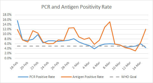
Testing: a mid-range for PCR testing, with 18,713 new PCR results reported, 4.4% of which were positive. There were 1634 new antigen tests reported today and 12.1% were positive. We only started to get antigen test output over time a couple of weeks ago to allow us to track percent positivity. But the graph below shows how PCR and antigen data have compared during that time. It seems that there is more day to day variation in antigen test percent positivity.
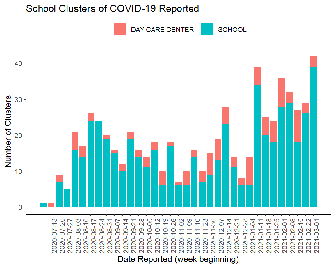
Cases: cases are often lower on Mondays due to weekend effect. Today there was a net increase of 977 newly reported cases (860 by PCR, 117 by antigen test). The graph below comes from the School Aged Surveillance Data report that comes out on Fridays. It shows us how many school and daycare associated outbreaks are reported each week. Schools can be K-12 or college settings in this definition. It’s a little strange to see outbreaks still this high in these settings, considering that the case rate for the state has been trending down since late January. It’s possible that this week’s new record is an outlier and we might see continued decreases next week. But we’ll have to see what happens with Spring Break.
Hospitalizations: Usually we see small numbers for the weekend that show up on Sunday and Monday. There were 22 new hospital admissions for COVID-19 today (last week, 50) and 3 admissions to the ICU.
According to the HHS Community Profile Report, the Georgia counties with the highest percentage of COVID-19 patients are Wilkes, Paulding, Henry, Bacon and Greene counties.
Deaths: there were 47 newly reported confirmed deaths compared to yesterday’s total and 0 probable deaths. Death reporting on Mondays is typically low due to weekend effect, but 47 is comparable to what we saw toward the end of last week too. For today’s deaths, 32% came from the Atlanta counties of Fulton and DeKalb and 30% came from nonrural counties outside of the Atlanta metro. The state 7-day death rate per 100,000 residents is 67% above the pre-winter surge baseline.
References
https://covid.cdc.gov/covid-data-tracker/#vaccinations
https://beta.healthdata.gov/download/gqxm-d9w9/application%2Fpdf
https://dph.georgia.gov/covid-19-daily-status-report
https://covid-gagio.hub.arcgis.com/
https://www.nytimes.com/interactive/2021/us/college-covid-tracker.html
https://www.cdc.gov/coronavirus/2019-ncov/community/schools-childcare/operation-strategy.html
https://covid.cdc.gov/covid-data-tracker/#county-view
https://dph.georgia.gov/school-aged-covid-19-surveillance-data
Georgia COVID-19 Updates is a free newsletter that depends on reader support. If you wish to subscribe please click the link below. There are free and paid options available.
My Ph.D. is in Medical Microbiology and Immunology. I've worked at places like Creighton University, the Centers for Disease Control & Prevention and Mercer University School of Medicine. All thoughts are my professional opinion and should not be considered medical advice.


