

The Daily Digest, 15Jan2021
Georgia COVID-19 Updates

Vaccine Update
Today CDC has updated their COVID Vaccine Tracker to include a bar chart identifying doses administered by vaccine manufacturer and we can also visualize how many people have received two doses of the vaccine. So far, 1.3 million Americans have received two doses of the vaccine and this is likely impacted by delayed reporting. So the number might be larger. The map below shows how states compare when considering how many people have received 1+ doses of the vaccine so far. There seems to be some data entry errors for Hawaii, since the table on the tracker shows doses administered per 100,000 but then doesn’t distinguish people with 1 or 2 doses of the vaccine. For now, the best states in the nation for this metric are West Virginia, South Dakota, Alaska, North Dakota and Connecticut. The worst states in the nation for this metric are Hawaii (again, this may be an error), Alabama, South Carolina, Georgia and Idaho.

I’ve seen requests for volunteers for both the Houston County Health Department (central Georgia) and the director of the Fulton Board of Health to assist with medical and non-medical needs during vaccine rollout. It sounds as though they are working to figure out how to best tap into the ServeGA registry and medical reserve corps. So if you have already registered and are awaiting a call back, it sounds like you might be called soon.
The New England Journal of Medicine, one of the top medical journals, released this FAQ document for the COVID-19 vaccine. It is mainly written for healthcare workers, but there’s a lot for laypeople here too. If there are terms that you don’t understand, please let me know so that I can help.
The Washington Post came out with a story today that indicates that our existing frustration with the vaccine rollout might persist because it seems there isn’t a stockpile of vaccine doses as originally thought. So future vaccine allocations will likely be based on how fast the manufacturers can make them rather than Operation Warp Speed releasing additional doses. So we can, and should, expect the state to do more to get the vaccines administered that they have on hand. But there is a significant part of future vaccination efforts that will be very much out of the state’s control. Understand that the expectations of when you might get a vaccine might need to be altered. Of course, this is further complicated by the fact that the Pfizer-BioNTech and Moderna vaccines are a two-dose series.
One more thing, if you are planning to get your COVID-19 vaccine, you can enroll in an app on your smartphone called V-Safe. This is something organized by the Centers for Disease Control to gather information regarding side effects you may (or may not) experience following your vaccinations. You should get information when you show up for your vaccination, but I wanted to provide the link here just in case.
Georgia Department of Public Health vaccine resources:
Main page now includes links to vaccine sites at Ingles, Kroger and Publix grocery stores.
Testing
According to the 14Jan2021 HHS Community Profile Report, Georgia has a testing rate of 1253 per 100,000 residents. That ranks Georgia at #46 in the nation for PCR test output. In addition, only 68% of the state’s PCR tests are being “resulted” (reported to patient and state) within 3 days over the past week. Georgia is #47 in the nation for this metric. Delays in turning tests around and reporting them might mean poorer compliance with quarantine and isolation for those who are pending laboratory results. Of note, California and Florida do not provide data for this testing metric.

Within the state, the best counties for tests per 100,000 over the past 7 days are Miller, Fulton, Clarke, Hall, and Butts. The counties at the bottom of the rankings for tests per 100,000 are Webster, Candler, Wheeler, Telfair, and Evans. As far as getting tests turned around quickly, the top 5 counties in the state are Webster, Tift, Ben Hill, Miller and McDuffie. The bottom 5 counties are Clinch, Jenkins, White, Quitman, and Liberty. There are 54 counties where less than 75% of tests are reported within 3 days and that includes some of our most populous counties such as Fulton, DeKalb, Gwinnett, Chatham, Cobb, Bibb, etc.
In today’s update, Georgia DPH reported 43,014 new PCR test results, a robust day. Of those tests, 16.8% were positive. Ninety eight percent of today’s newly reported PCR cases were identified through the Electronic Laboratory Reporting system. So that means that the 16.8% is a pretty accurate estimate of test positivity today. The state does not provide data on total antigen tests performed nor how many are positive. But antigen testing did identify 25% of today’s net increase in cases.
Cases
There was a net increase of 9806 newly reported cases today, 7348 by PCR and 2458 by antigen test. Our case total combining PCR and antigen cases is now 801,130 since the pandemic began. For today’s cases, 34% came from nonrural counties outside of the Atlanta metro. Twenty eight percent came from Atlanta suburb counties and 21% came from rural counties. The case rate is lower today than it was earlier this week. But it’s too soon to tell if this decrease is real or just part of the ongoing pattern we’ve seen in recent weeks.

The map below is formatted in much the same way as the 14-day case rate per 100,000 map on the Georgia DPH site with the same breakpoints and maximum for the color range. But whereas the DPH map only uses PCR cases to calculate case rate, I have included the antigen cases too. The map below gives us a more comprehensive look at disease burden. You can click on the map to see a live view of the map where you can click/hover over counties of interest to see their number. You can also consult this chart that ranks the counties by 14-day case rate per 100,000. The chart will also be a helpful reference to identify your county’s classification (i.e. rural, suburb, etc) and its hospital region.

Hospitalizations
The HHS Community Profile Reports allow us to dig into more local information than the state of Georgia provides, especially when it comes to hospital capacity and COVID-19 demand. And they’re updated daily except for federal holidays. A selection from the 14Jan2021 report is shown below, from the Census Bureau Statistical Area (CBSA) tab and sorted according to the percentage of staffed adult ICU beds that are occupied. We can see that there are 7 CBSAs that are maxed out on ICU beds including Cordele, Statesboro, Warner Robins, Cornelia, Thomaston, Dublin and Albany. We can also see how many of those ICU beds are occupied by COVID-19 patients, how many of their ventilators are in use and how many of those ventilators are being used by COVID-19 patients.

Here’s why I think these data are compelling. The way the state has been depicting the hospital data aggregated according to GEMA hospital regions gives people the ability to assume this is someone else’s problem - because we didn’t know how the hospital in the most immediate local area was doing. And I’m certain that’s not the state’s intention, given my experience working with the people who developed the hospital dashboards for us. But we have learned through this pandemic that for many people public health doesn’t matter until it matters personally to them. With the HHS Community Profile data being so much more local, this hospital demand and COVID-19 burden is no longer “someone else’s problem.” These are your healthcare workers, your neighbors, and others from *your* community. This is, in fact, your problem.
One way to look at COVID-19 burden on hospitals is to look at how many COVID-19 patients are currently hospitalized. However, it is important to remember what this number represents - the net sum of patients considering all who were admitted and discharged that day. We see that the number is decreasing in the past few days and that looks hopeful. However, it’s possible that hospitals are discharging more patients than they’re admitting right now, trying to brace for worse yet to come. Perhaps not, of course, but I would just say we need more time to see if this is real. I certainly hope it is!

Today there were 315 new hospital admissions for COVID-19 today and 50 new admissions to the ICU. The chart below shows us how each hospital region is faring in terms of ICU bed usage and the percentage of all patients who are there for COVID-19. There are four regions using all or more of their ICU beds, including regions E, G, I and M. Eleven of the 14 regions are using >90% of their ICU beds and 91.5% of the beds available in the state are in use. According to yesterday’s HHS Community Profile Report, COVID-19 patients are using 49% of the state’s ICU beds. In four hospital regions, COVID-19 patients make up >40% of their overall patient census.

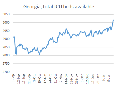
I do want to remind you of one thing and that is that the percentage of beds occupied is of course a function of how many patients they have but also how many beds and staff to support the beds a hospital region has. In the past day, region C has added 12 ICU beds and D (Atlanta) has added 26 beds. Region K has added five beds. It’s unclear how much of this is because they’ve brought in contract staff to support additional beds or because they’ve converted non-ICU beds to meet the growing need. In the graph below, you can see how the number of ICU beds available has grown daily over time since Labor Day. Since a low on 10Oct, Georgia hospitals have added 210 ICU beds (+7.5%). Sixty one of those beds were added in the past 4 days alone.
Just remember that if hospitals are converting beds for ICU use, the bed and the staff that support it are diverted from their original purpose. In other words, healthcare beyond COVID-19 treatment is being impacted by our ever-growing COVID-19 burden.
Deaths
Today we set a new record for the most confirmed COVID-19 deaths reported in a single day, 157. The previous record was set three days ago on 12Jan, at 145. Of today’s deaths, 34% came from nonrural counties outside of the Atlanta metro, 29% came from rural counties, 20% came from Atlanta suburb counties and 13% came from the Atlanta counties of Fulton and DeKalb. We’ve now had four straight days of death counts >130. So even though it’s only Friday, we have already set a new weekly record for deaths. The previous record was 503, set during the week ending 16Aug. My week cutoff is Sunday and we are already at 596 confirmed deaths for the week so far.
The graph below shows us how the 7-day death rate per 100,000 residents has varied over time for the different county types in Georgia. First, let’s look at the state death rate (black line) - it is now 27% higher than the summer peak and has risen 324% since 04Jan. It really is a breathtaking amount of death in a short period of time.
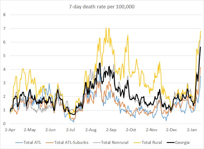
Death rate is climbing for all county types, but counties outside of the Atlanta metro (rural and nonrural) are faring much worse than the Atlanta metro itself.
Unfortunately, this surge in deaths was both predictable and preventable. Remember that cases fuel both hospitalizations and deaths. If we want deaths to stop, we have to stop cases. That requires immediate, drastic action that has a delayed return on investment. That’s because the bulk of the people who are going to die in the next three weeks have already been exposed to the virus during or prior to this week. But just because that investment of our shared sacrifice (i.e. stay home) won’t bear fruit for at least three weeks doesn’t mean that we shouldn’t make that investment anyway - especially when it’s lives we’re talking about. I know my readers are probably the sort to be working to limit disease transmission anyway, so I want to thank you for the sacrifices you are making and it is my fervent hope that we can get more people to join this effort to save lives.
References
https://www.nejm.org/covid-vaccine
https://beta.healthdata.gov/National/COVID-19-Community-Profile-Report/gqxm-d9w9
https://dph.georgia.gov/covid-19-daily-status-report
https://covid-gagio.hub.arcgis.com/
Georgia COVID-19 Updates is a free newsletter that depends on reader support. If you wish to subscribe please click the link below. There are free and paid options available.
My Ph.D. is in Medical Microbiology and Immunology. I've worked at places like Creighton University, the Centers for Disease Control & Prevention and Mercer University School of Medicine. All thoughts are my professional opinion and should not be considered medical advice.