

The Daily Digest, 14Apr2021
Georgia COVID-19 Updates

Vaccine Update
Johnson and Johnson vaccine pause
By now you’ve likely heard that the FDA and CDC have requested a pause on Johnson and Johnson vaccine administration out of an abundance of caution. There have been at least 6 people (all women) between the ages of 18 - 48 who have developed a rare and serious blood clotting disorder following vaccination. So far it is 6 cases out of 6.8 million doses administered (as of 12Apr). One thing I’ve learned today from the ACIP meeting (see more info below) is that 52% of the Johnson and Johnson doses given overall were given since March 30th. The women who have been impacted so far experienced their event 6-13 days after vaccination. Vaccine eligibility has expanded to younger populations since early April. It’s reasonable that we need more time to see the size of the problem. However, just because it is rare does not mean that it doesn’t matter, especially to the women involved here and their families. This is a serious medical condition and merits a closer look. So I support the decision by FDA and CDC to pause. It shows a transparency in the process that we should expect from our government and regulatory bodies. It shows that our safety monitoring system works.
However, I know there’s a tendency to panic with news like this and we need to balance healthy awareness of the situation with the scope of the problem. Clotting problems can happen for a variety of reasons and, again, the one here is unique. Not only are they developing a serious blood clot, the people impacted also have thrombocytopenia, or low blood platelet count. But we can compare the relative risk of blood clotting disorders from a variety of potential causes. For example, so far the risk of developing serious clotting problems with COVID-19 disease (going with high end estimate for all comparisons) is 20 per 100,000. Compare that to 6 per 6.8 million doses of J&J at the time of the pause, and you can see that the risk of clotting with COVID-19 disease (0.02%) is worse than for the vaccine (0.00009%) by 3 orders of magnitude. You may be surprised to know that pregnancy and oral contraceptive pills carry an elevated risk of blood clotting problems too. These are risks we take on fairly regularly and don’t really panic too much about. Again, I think what has been identified in the 6 women so far is important and I want CDC and FDA to look into it more closely. But I also want us to use data to get a sense for how common (or uncommon) this problem is so far.

The Advisory Committee on Immunization Practices (ACIP) is meeting today to go over the data on these 6 women’s cases, try to determine whether the clotting problems are linked to the vaccine or coincidence, and provide guidance for healthcare providers on how to manage this condition if and when it arises. We don’t have a lot of information yet, which is why I’m waiting for the ACIP meeting and the data provided in order to do a more expansive explanation of what is going on. As such, there may be a “special edition” of the Daily Digest that comes out this evening or tomorrow.
But there are two reasons to have this pause at this point:
Identify if there really is a problem with the vaccine or if this is just unfortunate coincidence. If a link to the vaccine is established, reassess the risks and benefits for the general population.
Make physicians and other healthcare providers aware of the complication, especially because this is not a typical blood clot and requires a different treatment plan. Hopefully, we will see guidance from ACIP on this today.
If you have been vaccinated with the Johnson and Johnson vaccine more than 3 weeks ago, you are in the clear. If it was within the past 3 weeks, again the condition is very rare, but it’s important not to shrug off the following symptoms: severe headache, abdominal pain, leg pain or shortness of breath. So far, the condition has only been identified in women. But if you experience these symptoms, regardless of sex, check in with your medical provider. These symptoms are not the ones we typically expect following the vaccination as a normal part of an immune response.
The good news is that we have alternatives, the Pfizer and Moderna vaccines, that accomplish the same goal of protecting you against COVID-19. Those vaccines are actually the vast majority of the US vaccine supply and they don’t appear to have the blood clotting concerns that have been identified with Johnson and Johnson and the AstraZeneca vaccines (authorized in the European Union). Hopefully everything gets properly investigated with the Johnson and Johnson vaccine and we have clear guidance on how to proceed either today with the ACIP meeting or in the coming weeks.
HHS State Report and Rankings
First, let’s begin with a look at the latest White House / HHS state reports that were finalized last Friday but released to the public yesterday. The table below identifies the best and worst states for different metrics in the US and the relative change compared to last week.

Vaccinations
The two graphs below look at how well Georgia is doing at vaccinating its population (this is by state of residence, not administration) compared to the national trend for first doses full course administered to all adults. These data come from the HHS State Report, I just graph them week to week. For first doses administered, the state is matching the pace of the US, even if it has vaccinated less of its population. The graph on the right shows the percent of adults who are fully vaccinated.

The state report also contains new data visualizations on vaccinations by age and race. I don’t have space to discuss those findings in this newsletter, but hope to do so in upcoming newsletters. In the meantime, you can review them for yourself on pages 9-10 of each state’s report.
Testing
For each of these sections, you’re going to see a graphic similar to what’s provided below. The map comes directly from the HHS state report and gives us a look at where we are now. The graphs are related to that same metric, but show us how Georgia and the US have trended weekly over time (where we’ve been). The graphic below all relates to testing. Georgia is ranked #26 in the nation for test positivity (with #52 being worst) and in the light green zone (hooray!). However, I want to point out some changes week to week with the county-level maps. For the map, you want to be in the green categories as much as possible. On the left is the report from the previous week. The map on the right is from this week’s report. We can see that counties in the red zone for test positivity are shifting and a handful are located in the northwest corner of the state. This is an area of concern because of rising COVID-19 patient census counts there. Test positivity rising like this means that the local area’s current testing output is not sufficient to adequately measure the local case rate. When test positivity exceeds 5%, it’s more likely that cases are being missed due to insufficiency of testing.

Test positivity is shown over time in the graph on the lower left. The gray dashed line shows the WHO goal line (5%). The US rate has risen to exceed the Georgia rate, at 5.4%. The graph on the right shows how tests performed per 100,000 people have trended over time. Testing remains high for the US, but has decreased for the state of Georgia since late January. At this time, Georgia is in the red zone for tests performed per 100,000. The Georgia testing rate is 61% less than the national average and the gap is widening over time.
Cases
For the map, it’s best to be in the yellow or green categories - or better yet, the gray counties where there are too few cases to categorize here. Many of the red zone counties are clustered in the northwest corner of the state and the Atlanta metro. Georgia is ranked #17 for case rate (with #1 being best and #52 being worst) and in the orange zone.

If we look at where we’ve been (on the right), we can see that Georgia’s case rate has hit two plateau in its descent from the winter surge and is currently decreasing at a much more shallow rate than in January. Georgia’s weekly case rate has almost reached pre-winter surge levels. Nationally, case rate has been pretty flat for the past month or so, rising slightly in the past two weeks.
Hospitalizations
The map below shows how regions compare for COVID-19 hospital admission rate. The areas in red in the northwest corner of the state correspond mostly to hospital regions A, N, D, and C. If we look at the trends over time (upper right) then we can see that hospital admission rates for COVID-19 have sort of leveled off over the past three weeks for Georgia and the same is true for the US. Georgia has a nearly identical hospitalization rate as the national average. This week, Georgia is ranked #46 in the US (with 52 being the worst) for COVID-19 hospital admission rate, in the orange zone. In the bottom right of the graphic below, we can see how the COVID-19 demand on ICU beds has changed over time. This metric has decreased for both the state and the US and the state percentage is nearly identical to the US average. But the US percentage is beginning to increase, a worrying sign.

Deaths
The map on the left shows how Georgia counties are doing with respect to new death rate per 100,000. In this week’s report, it appears that some of the darkest red counties are clustered in the eastern half of the state. The graph on the right shows how the death rate has changed over time for the US and for the state of Georgia. The Georgia death rate is 71% above the national average.

The latest data for Georgia
TESTING: today there were 18,047 new PCR test results reported (net increase) and 6.2% were positive. There were 11,882 new antigen test results reported and 6% were positive. The PCR test positivity rate has ticked up slightly in recent days. According to DPH, the 7-day average of test positivity is now at 5.3%.
CASES: today there was a net increase of 1081 newly reported PCR cases and 654 newly reported antigen cases for a combined total of 1735. The state 7-day case rate per 100,000 has increased 20% in the past week. Much of this is due to what is happening in the Atlanta metro where Atlanta counties have seen a rise of 29% and 10% for Atlanta suburbs.

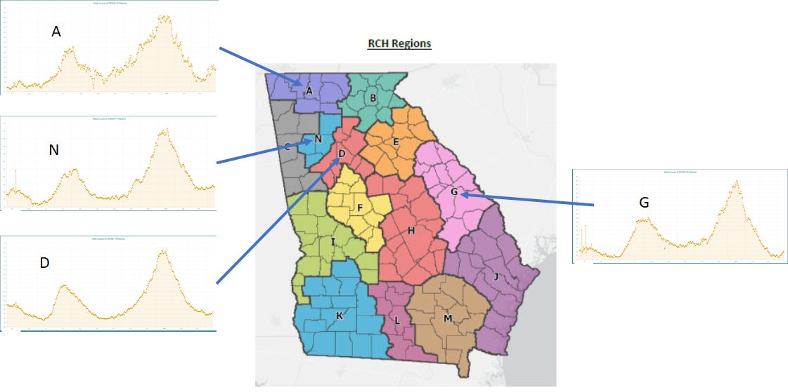
HOSPITALIZATIONS: today there were 137 newly reported hospital admissions for COVID-19 and 21 ICU admissions, according to the state. These are not unusual numbers on the day-to-day. However, I’m concerned about some trends that are emerging across multiple hospital regions. I realize the graphs for the regions are small, and you can review them here to zoom in and explore. Increases are being observed for regions A, N, D, and G with the increases being largest for A and G. For region N, the increase is more gradual. While the increase appears smaller on the graph for Region D, it is an artifact of the scale of the y-axis. Since 01Apr, COVID-19 patient census has increased 38% for region G, 28% for region A, 20% for region D, and 7% of region N. These increases are concerning, especially considering that only 16.4% of the Georgia population is fully vaccinated and so many people are going back to life as usual.
DEATHS: There was a net increase of 39 newly reported confirmed deaths and 13 probable deaths. The current 7-day death rate for the state is 14% above the pre-winter surge baseline.
I’m continuing to listen to the ACIP discussion on the Johnson and Johnson vaccine and await their vote and decision regarding extending the pause on the vaccine or other policy recommendations. I will follow up with more information.
References
https://dph.georgia.gov/covid-19-daily-status-report
https://covid-gagio.hub.arcgis.com/
https://beta.healthdata.gov/browse?tags=covid-19-spr
https://covid.cdc.gov/covid-data-tracker/#vaccinations
https://beta.healthdata.gov/Health/COVID-19-Community-Profile-Report/gqxm-d9w9
https://www.cdc.gov/vaccines/acip/index.html
https://www.fda.gov/news-events/press-announcements/joint-cdc-and-fda-statement-johnson-johnson-covid-19-vaccine
Georgia COVID-19 Updates is a free newsletter that depends on reader support. If you wish to subscribe please click the link below. There are free and paid options available.
My Ph.D. is in Medical Microbiology and Immunology. I've worked at places like Creighton University, the Centers for Disease Control & Prevention and Mercer University School of Medicine. All thoughts are my professional opinion and should not be considered medical advice.
Dr. Schmidtke, Why do you think the Atlanta metro counties are seeing some of the highest increase in cases, hospitalization, and positivity rate but doing well on vaccinations. Just trying to understand what might be causing this increase in these counties.
Thank you, Amber! We appreciate you so much!