

The Daily Digest, 13Jul2020
Georgia COVID-19 Updates

Just a couple clarifications after the announcement I made yesterday regarding my departure from Mercer University and Georgia:
My family is moving in support of my husband’s career, not mine. So I am currently a free agent. I’ll be sure to let you know if/when I find a professional place to land. I’m so touched by your words of support!
I’m still going to be doing the updates. But I need to scale back so that I can devote more time to pursuing career opportunities in the new location. For now, I’m planning on distributing the Daily Digest on Monday, Wednesday and Friday. The Week in Review will continue to happen on Sundays.
On Mondays I try to put what’s happening in Georgia into more of a national context. So this report will look different. I also want to spend extra time talking about testing.
Testing
You’ve probably heard the argument that the reason we are seeing more cases is because we’re doing more testing. I’m here to dispel that myth today.
Below you can see how daily testing output has varied over time in peach and its 7-day moving average in the orange, dashed line. In gray we see the accumulation of cases over time. Look at the data and see what it tells you.
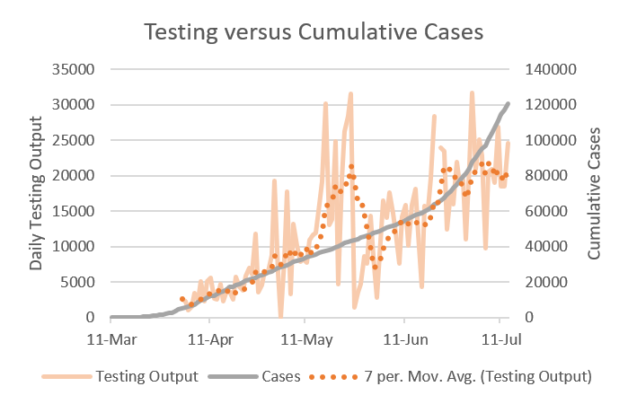
What it tells me is that cases were on a slow but steady increase through 11Jun and then turned sharply up. And rather than seeing an increase in testing that then tracked and followed the increase in cases, we see testing increase but hold steady for 3 weeks. So our surge in cases cannot be because we are testing more - we aren’t actually testing more.
Today, the state’s positive test rate for the PCR diagnostic test was 15.5%. According to the World Health Organization we need to be at 5% or less in order to contain the virus. So we aren’t there yet - not even close. Let’s take a closer look at how Georgia compares to other states. Below I’ve collated information from COVID Exit Strategy, a website that compiles a lot of information into once place, especially regarding testing. For the sake of clarity, I’ve pulled the top 9 jurisdictions (8 states and the District of Columbia) and the poorest performing states with respect to testing. They are ranked according to their % positive rate using a 7-day average. Georgia is ranked 46 of 51 (they’re including DC but none of the other territories). The next column shows their 14-day change in cases and the current state of their ICU capacity. Green = normal, yellow = elevated, orange = constrained. What do you notice about the states/territory above the line compared to those below the line?

Here’s some things I notice:
The company we’re in. The states below the line are some of the worst hit in the country in the past month. What they all have in common is high PCR positive test rate.
The states above the line tend to have better 14-day change in cases, with some exceptions. If we had a 14-day change in cases of 2-3% like in New Jersey and New York, we could have reasonable discussions about opening schools in Georgia right now.
There’s a lot more “green” in the ICU column for states with low PCR positive rates. That’s because these states are doing enough testing to identify, isolate and manage positive cases, and limit their spread to others. As a result of this hard but vital work, they are not overwhelming their healthcare infrastructure.
How would we get to something like this? It might not be possible right now without a pretty broad shelter in place order. See, what the northeast did after their big spike in cases was a long shelter in place while they ramped up both testing AND contact tracing. We didn’t do that work here in the south. Instead, we’ve reopened without a lot of community buy-in to the process of limiting disease transmission. We now have widespread community transmission combined with not enough testing and not enough contact tracers. Testing and contact tracing were problems before we reopened. We are still underwater for both, and that’s before we reopen schools, which will be a contact tracing nightmare.
Cases
Today was another big day for cases in Georgia, although not a record-breaker. There were 3643 new cases (+3.1% compared to yesterday) and the new statewide total is 120,569. About 1300 of the new cases came from nonrural counties that aren’t part of the Atlanta metro. Below you can see how today’s new cases compare to our history. Note that these cases are graphed based on date of report, not symptom onset. The red line is a 7-day moving average to help us see the trend.

This next map comes from one of my favorite resources lately, and that is COVID Exit Strategy. I like this resource because it compiles a lot of information into once place and their maps and color-coding are really intuitive in terms of grading risk.
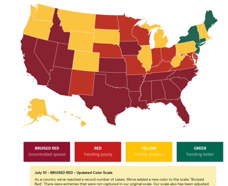
Something important to talk about when it comes to presenting data in an evolving pandemic - as things intensify, the color scales and axes on our graphs have to adapt to larger and larger numbers. This is true on the Georgia Department of Public Health website and here too. But what I think this website does well is transparently explaining why the color changes had to be made. This map used to be red-yellow-green with red being trending poorly. That’s still the case, but they’ve added a “bruised” red (interesting name?) that demonstrates particularly intense, uncontrolled spread of the disease. Of course, it’s no surprise at this point that Georgia is among the uncontrolled spread states.
Hospitalizations
Current hospitalizations continue to rise in the state and today adult ventilator usage is at 38%, the highest it has ever been.
The following charts come from the Centers for Disease Control and Prevention. First is looking at the rates of hospitalization when controlling for age by race and ethnicity.

Compared to non-Hispanic white White populations (far right), Hispanic or Latinx populations are hospitalized at a rate that is 4.6 times higher. Non-Hispanic Black populations are hospitalized at a rate that is 4.7 times higher than Non-Hispanic White populations. And Non-Hispanic American Indians and Alaskan Natives are hospitalized at a rate that is 5.8 times higher. Much has been made of the idea that these populations might experience greater rates of underlying conditions but an important point that even I have previously failed to mention is that these populations are less likely to have access to careers that can be safely done from home. So the virus has had greater opportunity to spread to and within these populations, contributing to their greater case rate and hospitalization rate.

This next chart also comes from CDC and it looks at race & ethnicity as a function of age with everything being compared to non-Hispanic White populations (notice their rate ratio is set to 1.0). So pay attention most to the second column for each race and ethnicity. With schools reopening soon, let’s look at children, where the rate of hospitalization is greatest among Hispanic or Latinx children (8.7 compared to 1.0). Disparities exist across all ages, most significantly for Non-Hispanic American Indian and Alaska Native, Non-Hispanic Black, and Hispanic or Latinx populations.
Deaths
There were 25 new deaths reported today, a low-medium day for us. About half of the deaths (n = 13) came from outside of the Atlanta metro. There were 4 deaths among non-Georgia residents. This category can be people who traveled across state lines for medical care (but they are usually included in the death total for their home state), migrant workers and those residing in a federal prison, immigrant detention center, VA nursing facility, military installation. Unfortunately we do not get further details about this category from the Georgia Department of Public Health. The new statewide total is 3026.
Media
https://www.gpbnews.org/post/macon-coronavirus-infections-doubled-last-2-weeks?fbclid=IwAR1UH6uJzOHG2oZRGGEM5ewKJK_wbhjuyEzf6-BJJon2aqRwAD4vVILuosQ
References
https://dph.georgia.gov/covid-19-daily-status-report
https://gema.georgia.gov/document/document/sitrep-713/download
https://www.covidexitstrategy.org/
https://www.cdc.gov/coronavirus/2019-ncov/covid-data/covidview/index.html
Yes, as other commented, Facebook is removing your posts as violating its community standards. They are considering it "spam". I have "disagreed with this decision", but I am confident no human being has or will laid eyes on the removal process. It's all done via magical algorithms.
Don’t know why or if you’re aware but when you click on the daily report (from where it shows up on my timeline in FB) it says the link goes against community standards. If I try to find it on your page directly, it’s not there at all. 😒 hoping FB just made a mistake. Thanks for all you do.