

The Daily Digest, 13Jan2021
Georgia COVID-19 Updates

Today we have the latest White House Coronavirus Task Force (WHCTF) report to go through, and I’m not sure whether these reports will continue or if the responsibility will return to the CDC after the presidential transition next week. For now, here’s the summary table. We’ll go through many of the highlights in the following sections. You can read the report in full here.

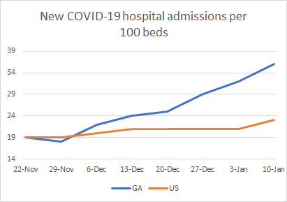
As far as rankings go, Georgia is ranked #16 for new case rate per 100,000, #8 for test positivity, #4 for new COVID-19 admissions per 100 beds, and #43 for new deaths per 100,000.
Vaccine Update
On a more personal note, my dad lives in Orange County, California. Last night he texted me to share his excitement that his county was going to be holding mass vaccination events for those over 65 at Disneyland this weekend. He and my stepmom are planning to go. I really admire the way that their county is taking advantage of local resources and infrastructure, leaning on leaders who know how to run complex logistics. To further incentivize people to get their vaccinations, Disneyland is waiving the $35 parking fee for the day.
Today I received a copy of the White House Coronavirus Task Force report and among the new things it now includes is a look at how Georgia is doing on the vaccine effort. They report that as of 08Jan, Georgia had distributed vaccine doses at a rate of 6474 per 100,000 residents which really wasn’t that far below the national average of 6667. However whereas Georgia has administered the vaccine to 1.5% of the adult population, the national percentage is 2.5%. Either way, we are still early in this vaccine effort and have a long way to go.
Looking at today’s data, the only states in the light blue color tier are Alabama (#50), Georgia (#49) and South Carolina (#48). I understand that someone has to be last when there’s a race to get this vaccine out. I also understand there are complex logistics to all of this. But I don’t understand why the South, as a group, is having a harder time managing these logistics than the rest of the country.

Georgia vaccine resources:
DPH Vaccine Locator: https://dph.georgia.gov/locations/covid-vaccination-site
DPH COVID-19 Vaccine Hotline: (888) 357-0169
Vaccine appointment signup for healthcare workers: https://dph.georgia.gov/provider-vaccine-registration-ph-district-list
Testing
According to the WHCTF report, Georgia’s test positivity rate is now 43% higher than the national average, at 20.4%. That means that one in five people are testing positive for COVID-19. The goal is to be at or below 5% for a sustained period of time to ensure you’re testing widely enough to identify most cases. With our test positivity high and staying high, it means that we are missing a significant number of cases.

What’s interesting is that our case rate increased this week (see cases section below) but that happened while test output plummeted. Georgia’s test output is 72% less than the national test output. You can’t find disease when you aren’t looking for it.

Today in Georgia there were 26112 new PCR tests reported through Electronic Laboratory Reporting. Of those, 17.7% were positive. Of all the new PCR cases reported today, only 82% were reported through ELR. That’s lower that usual. So it’s possible that the 17.7% positive is not a good estimate of the state’s positive rate today. Meanwhile, the antigen test identified 34% of today’s newly reported cases. But DPH does not provide any details on antigen testing, nor do they include antigen case data in any of their graphs or maps. It gives a misleading impression that disease severity isn’t so bad in Georgia.
Cases
As indicated above, the new case rate per 100,000 continues to increase in Georgia, but the national case rate is just below us. So clearly, while things are bad in Georgia, they are bad in many other places too.

Today in Georgia there was a net increase of 8596 new cases with 5662 identified by PCR test and 2934 identified by antigen test. Thirty eight percent of today’s newly reported cases came from nonrural counties outside of the Atlanta metro. Twenty seven percent came from the Atlanta suburbs and 23% came from rural counties. Below, you can see how the 7-day case rate per 100,000 residents has trended over time. The state average is represented by the black line and it is now 158% higher than the summer peak. Ignore the weird spike in the data around early October - that’s an artifact when DPH notified us of 26,000 antigen cases all in one day. The case rate is currently worst in the Atlanta suburbs and best in the Atlanta counties of Fulton and DeKalb.

The top ten counties for 14 day case rate per 100,000 in order are Madison (3359), Upson (2124), Treutlen (1898), Whitfield (1878), Johnson (1846), Dodge (1844), Turner (1841), Jackson (1828), Taliaferro (1757) and Pike (1709).
Hospitalizations
Georgia’s new COVID-19 hospital admission rate per 100 beds continues to climb and it is now 56.5% higher than the national average.
Using data from the HHS Community Profile report (current as of 10Jan), we can see how ICU bed usage by COVID-19 patients is trending over time. Things have been steady or slightly decreasing for the US. But over the past four weeks, we’ve seen Georgia’s percent usage climb from 33% to 47%.

We can also see how many of the ventilators are in use by a COVID-19 patient. Again, things have been steady for the US, but have risen from 10% to 16% in the past month for Georgia.

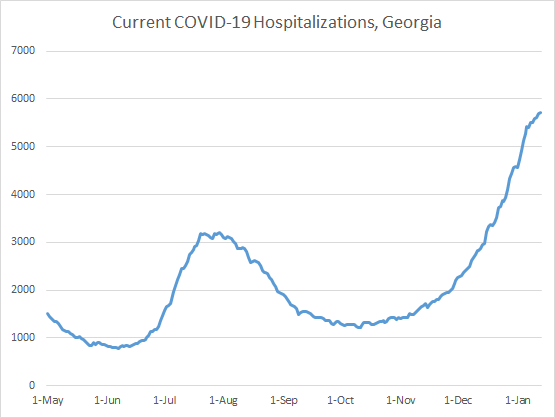
Today there were 356 new COVID-19 admissions to the hospital for the state of Georgia and 38 new admissions to the ICU. The number of patients currently hospitalized is 5721, an increase over yesterday, but the increases seem to be smaller than they were a week ago. Given that cases fuel hospitalizations and cases haven’t slowed down, we might see a short reprieve followed by a continued climb upward. It’s too soon to know, but that’s my prediction.
Next, let’s look at how COVID-19 demand is impacting hospitals across the state. The hospital regions are shown in the map on the left and the table on the right tells you how many of each region’s ICU beds are in use (by any patient) and how many of all their hospitalized patients are there for COVID-19 treatment.
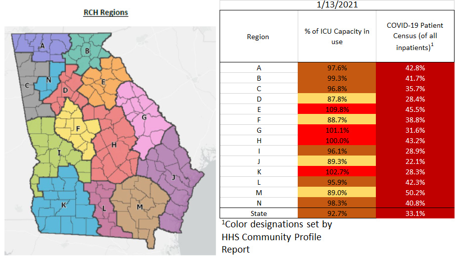
There are four regions using all or more of their ICU beds (E, G, H, and K). Across the state, 92.7% of ICU beds are in use. The HHS Community Profile Report for 12Jan2021 tells us that 48% of Georgia’s ICU beds are occupied by a COVID-19 patient. So now, COVID-19 is demanding more than half of the state’s ICU beds.
For COVID-19 Patient Census (the percent of all patients who are there for COVID-19), most regions saw a small decrease today - definitely good news. But there were a handful of regions that saw a continued increase. Most notably, in region M more than half of all patients in the hospital are there for COVID-19.
Deaths
Yesterday was a record setting day for newly reported deaths, 145. Today there we did not set a record but it was still a really big day for newly reported confirmed deaths, at 136. Forty two percent of these deaths came from nonrural counties outside of the Atlanta metro, with 7 deaths in Paulding county alone. The next highest contributor to newly confirmed deaths was rural counties (24%) and Atlanta suburb counties (22%). The graph below shows the 7-day death rate per 100,000 over time for the different county types. The state death rate per 100,000 has now surpassed the summer peak, and is actually 1.6% above it now. As we saw for previous death surges, it is disproportionately worse in rural counties than anywhere else. However, nonrural counties outside the Atlanta metro are not far behind the rural counties this time. Not only do cases fuel hospitalizations, they also fuel deaths. After all, you can’t die from COVID-19 if you never catch it in the first place. Given that cases have been surging since early December, it’s possible that this surge in deaths will continue to climb also. The worry, of course, is that with hospitals overwhelmed and possibly rationing care, there may be additional deaths due to not enough resources to care for the ill, even if their chief complaint isn’t COVID-19.

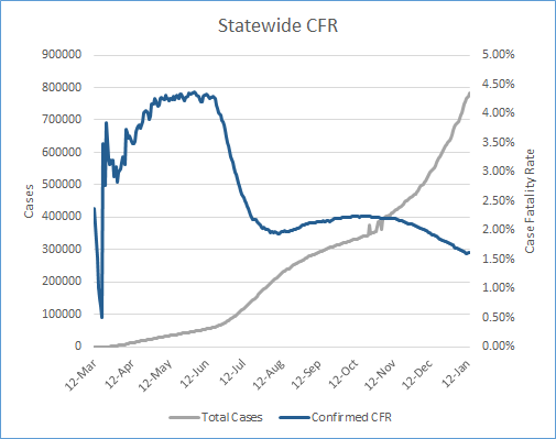
I don’t show this next graph very often, but it’s something I update every day. It shows cumulative cases in the gray line (corresponds with left y-axis) and the statewide case fatality rate in blue (corresponds with right y-axis). Case fatality rate (CFR) means of all the people who have been diagnosed, how many have died. I usually don’t show cumulative case totals because I think day to day incidence is better to see if things are going up or down. But there’s some value in a graph like this too. You can see when cases surged starting in early July and mid-November. You can also see the dilution effect that these surges in cases have on the CFR. The summer surge caused the CFR to drop like a stone, from just under 4.5% to 2%. But because deaths follow cases, eventually the deaths surge too, and there is a correction that brings the CFR back up. During the summer surge the CFR thankfully did not return back to >4%, but bounced back modestly to 2.25%. With the latest surge, the dropoff for the CFR has been more gradual, but nevertheless consistent every day up until yesterday. It’s just another signal that there’s momentum now for deaths. Because it takes a lot of death to move the percentage when the cases are this large. And that is really, really sad.
Unfortunately, there does not appear to be any political will to implement any mitigation strategy that would bring down disease transmission. And that seems like such a disservice to the healthcare workers who have been struggling with this pandemic for months and are now having to make tough decisions on who gets scarce resources. Yet, the cases keep climbing, feeding further hospital demand and death. The people who heed public health guidance and are moved by data and the suffering of others have been doing the right thing for months. The rest have not and likely will not. So unfortunately, the only things we can do now is watch the lines on these graphs grow and demand faster action for the vaccine rollout. It’s hard to be patient when people are dying.
I will just sign off by saying that I wish I had better things to share today. Perhaps there is hope in the graph that shows how many COVID-19 patients are currently hospitalized. I really look forward to being able to celebrate our descent down from this surge.
References
https://dph.georgia.gov/covid-19-daily-status-report
https://covid-gagio.hub.arcgis.com/
https://dph.georgia.gov/covid-vaccine
https://drive.google.com/file/d/11Jt0Kqqv-JMvO6rtbSu9J_gEV-zy5Nm8/view?usp=sharing
Georgia COVID-19 Updates is a free newsletter that depends on reader support. If you wish to subscribe please click the link below. There are free and paid options available.
My Ph.D. is in Medical Microbiology and Immunology. I've worked at places like Creighton University, the Centers for Disease Control & Prevention and Mercer University School of Medicine. All thoughts are my professional opinion and should not be considered medical advice.
Dr. Schmidtke, I noticed that you sometimes put out mini-like updates on Facebook in between your substack posts. Is there a way to get those through our substack subscription too? I recently deactivated my FB, but I do miss reading your in-between posts. (Not anything to do with FB's recent banning decisions. I simply can't take the divisiveness on it anymore.)
I appreciate all the work you do. Your information is the one place I can turn to so I can make informed decisions on how to adjust my family's behavior. I'm incredibly frustrated that our DPH continues to exclude antigen tests from our numbers and cloud the reality of the spread. Thank you so much for helping us sort out important information. It *does* make a difference.
Heather