
Vaccine Update
Here's a link for healthcare workers to register for an appointment to get their vaccine if they are not part of a larger hospital system that is providing them (https://dph.georgia.gov/provider-vaccine-registration-ph-district-list).
This week, vaccination eligibility has expanded to first responders and people >65 years of age although the rollout is not without problems. DPH has provided this vaccine locator so that you can find the enrolled vaccine providers in your area and make appointments, if vaccine is available.
We can see how the US (and Georgia) is doing with respect to the vaccine administration effort using the CDC’s COVID-19 Data Tracker. As of Friday, Nationally, 30.2% of the available doses have been used to initiate a person’s 2-dose vaccine series. With respect to the long term care facility allocation, only 17.1% of the doses have been administered.
The CDC Tracker provides a map of the US for how many people have received at least one dose of the vaccine, adjusted for population. Using this method of looking at vaccine data, Georgia’s vaccination rate has increased 58% in the past week. It is great to see that upward momentum. However, Georgia is still ranked last among the 50 states, with a vaccination rate that is 1,122 per 100,000 residents. To be fair, someone has to be last, that’s how numbers work. But it’s a shame to see that the states with the poorest vaccination rates are all in the South. States with more rural populations than ours have been able to vaccinate more of their population. In fact, the top three states for doses administered per 100,000 residents are West Virginia (4867), South Dakota (4170), and North Dakota (3931). In other words, West Virginia has vaccinated more than three times as much of their population as Georgia has.

According to the Georgia DPH website, they have received 555,800 doses of the vaccine. As of the last update yesterday evening, 183,870 of those doses have been administered, or 33.1% of the state’s supply. But reporting delays mean that it’s possible that more of those doses have been administered.
The Coastal Health Department has reported that their appointment system for phase 1a is booked into March. It’s unclear if this is due to lack of vaccine doses or people to administer them. It’s disappointing news, to be sure. In the meantime, our non-pharmaceutical interventions such as wearing masks, remaining socially distant, etc, will be the best way to protect our communities.
I know there are legitimate concerns about safety with the new COVID-19 vaccines. If you have questions about how the vaccines work or vaccine efficacy, please check out this newsletter I wrote. The clinical studies showed that the most common side effects were similar to what you see with the flu vaccine, things like pain at the injection site, fever, fatigue, headache, etc. Many of these things are signs of inflammation - your immune system is responding to something new - exactly what we want your immune system to do with a vaccine. But as the vaccine studies looked at tens of thousands of people. As the vaccine is used more widely in the population, any adverse events are reported through the Vaccine Adverse Event Reporting System. The data are available to the public. A couple reminders, these events are reported and pending investigation to determine whether the adverse event was due to the vaccine or an unrelated cause.
I sorted the search criteria to limit it to events considered serious and associated with an emergency room visit. So far there have been 64 people that fit these criteria and the top symptoms experienced are listed below. There are 579 symptoms listed. Just keep in mind that people can experience more than one symptom at once. Some of the “symptoms” are laboratory results, including normal findings. Also, some of the symptoms are redundant depending on how the report was submitted. For example, tachycardia means elevated heart rate. But if the person submitting the report said “heart rate increased,” then that’s a separate symptom listed even though they’re the same thing. So these things explain why there’s a disagreement between 64 and 579. A lot of these medical terms will be unfamiliar. Dyspnoea = shortness of breath, Tachycardia = rapid heart rate, Paraesthesia = altered sensation (i.e. pins and needles).

As of Friday, there have been 64 people with serious events associated with an ER visit out of 6.6+ million people who have started the vaccine series (or 0.000009%). And not all of those will ultimately be determined to be associated with the vaccine. But even if all of these were definitively linked to the vaccine, the vaccine still seems to be very, very safe for the larger population so far. That’s reassuring news, and I’ll be sure to keep an eye on this to let you know if there are big deviations. Important caveat: both data collection streams might be susceptible to delayed reporting.
The World
According to the New York Times Coronavirus Tracker, the SARS-CoV-2 virus that causes COVID-19 disease has sickened >90.3 million people (+5.3 million since last week) and killed at least 1,935,700 (+93,300 in the past week) worldwide as of this morning.
The US is ranked in the highest color category for hot spots. We are ranked #10 in the world for average daily case rate per 100,000 people over the past 7 days (same as last week) with a rate of 77 compared to 64.2 last week. So our case rate is getting worse. The top five countries for average daily case rate per 100,000 in the past week are Gibraltar, Ireland, Czech Republic, Slovenia and the United Kingdom.
For deaths, the US average daily death rate per 100,000 over the past week is 0.98 (previous week was 0.8), and we are ranked #16 in the world for this (last week we were ranked #20). The top five countries for average daily death rate per 100,000 in the most recent week are Liechtenstein, Gibraltar, Lithuania, San Marino and Slovakia.
The United States

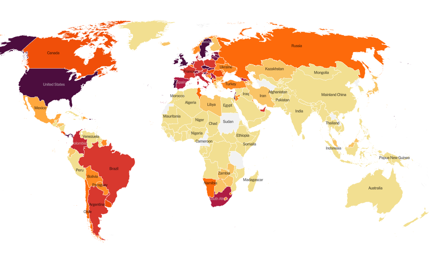
The map above comes from the New York Times Coronavirus Tracker. As of this morning, there have been over 22.4 million cases (+1.8 million in the past week) and 374,428 deaths in the US (+22,746 in past week). Keep in mind that both of these numbers are probably an under-count of the situation in our country.
This week we see more intensity across the southern half of the US but also from Kansas and Oklahoma to New York. For the second week in a row, intense disease seems to jump over the state of Missouri, but I think that’s probably an artifact of reporting delays or deficiencies in testing. Viruses don’t stop at state borders, after all. The southeast US is also seeing more disease this week than previously. According to data from the 10Jan21 HHS Community Profile Report (the source document for the White House Coronavirus Task Force reports), the top five states in the nation for new case rate per 100,000 residents are Arizona, Rhode Island, South Carolina, California, and Utah. There are four southern states in the top 10 - in addition to South Carolina at #3, there’s Tennessee (#8), Alabama (#9) and Georgia (#10). The top five states in the nation for average daily death rate in the past 7 days are Arizona, Rhode Island, Pennsylvania, West Virginia, and Tennessee. Mississippi is ranked #6 and Georgia is ranked #37 for 7-day death rate per 100,000.
Next, let’s look at some of the latest data from the US Department of Health and Human Services (COVID-19 Community Profile Report) for counties and cities. It is formatted in much the same way as the White House Coronavirus Task Force reports but with one key difference - this resource DOES include Georgia’s antigen cases in their total whereas the WHCTF does not. So this resource is the best head to head comparison we have for how Georgia is faring relative to other states.
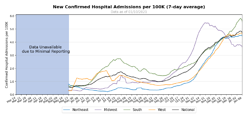
First, I want to look at hospital admission rates adjusted for population by each region of the US. California is in the news a lot right now for the strain in their hospitals. But actually, the South is the region with the highest COVID-19 admission rate in the country (green line above).
The table below tells you where we are this week and how that compares to the previous week (in parentheses). The data for everything comes from the HHS Community Profile Report from 10Jan2021. Keep in mind that some states did a lot of catching up with delayed reporting due to the holidays last week, so the rankings might not be accurate assessments of how states compare this week.

Georgia has seen some dramatic increases in their rankings for case rate per 100,000 (+33%) and the percentage of hospital inpatients with COVID-19. Georgia currently does not have any counties in the list of the top 20 counties for disease rate in the nation.
Next, let’s look at how seasonal influenza is impacting different states across the US. You can consult FluView any time you’d like to see this map and other data visualizations. You can read the weekly report from Georgia Department of Public Health here. The maps below show last year’s map for the week ending 04Jan2020 of the year (left side) and this year’s map for the same week (ending 02Jan2021).
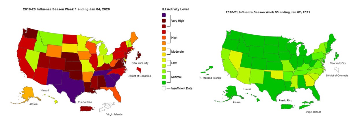
We are seeing more states in the “low” disease category, which is good news. Because the last thing the US needs right now is a spike in influenza infections on top of the surge in COVID-19 infections. Compare where we are now compared to where we were a year ago in the map on the left. The things we’re doing to limit the transmission of COVID-19 are also interrupting the transmission of influenza. Of course, COVID-19 is more transmissible than influenza so we aren’t seeing the same impact for COVID-19. But it’s a pretty great way to see what is possible through collective effort. Imagine a map that looked like this for COVID-19 if we could get more people to wear a mask. It is a good thing to see influenza levels as low as they are. Remember, it’s not too late to get your flu shot. Please do so, if you haven’t already.
Georgia
Normally, in this part of the newsletter I would give you an updated risk map for Georgia, calculated and formatted in the same way as the Brown University School of Public Health but including Georgia’s antigen cases (which DPH does not for any of their graphs or maps). Evidently the person responsible for this tool moved from Harvard to Brown. However, the map isn’t particularly interesting this week since the entire state is in the red category except two counties, Long and Schley counties, which are in the orange category. According to the tool’s color coding, that means that 157 of Georgia’s 159 counties have disease rates that are beyond the point that contact tracing can isolate and manage cases. There is a LOT of disease out there.
Last week I argued that some sort of government intervention was necessary, since cases continue to rise without any sign of slowing, despite news reports that go more grim by the day. The Governor has chosen to stick with the guidance he’s been giving this whole time, appealing to Georgians to “do the right thing.” If asking people to do the right thing were a viable strategy, it would have worked by now, unfortunately. It hasn’t, and it seems there is no political will to do anything more.
Let’s discuss today’s numbers for Georgia.
Testing: a robust day for PCR testing, especially considering it is a Monday. There were 35,770 new results reported, 18.3% of which were positive. Antigen testing identified 15% of today’s cases.
Cases: cases are often lower on Mondays due to weekend effect. But this Monday’s case total is an additional 2291 people compared to this time last week. So if this is our “slow day,” I worry what that means for the rest of the week. Today there was a net increase of 7454 newly reported cases (6339 by PCR, 1115 by antigen test). Cases were equally distributed across Atlanta suburb and nonrural counties outside of the Atlanta metro, each contributing 31% of today’s cases. Nineteen percent came from rural counties and 15% came from the Atlanta counties of Fulton and DeKalb. The top five counties for 14 day case rate are Madison (3269), Upson (2318), Johnson (2001), Turner (1991) and Treutlen (1942). These are all rural counties.
Hospitalizations: there are 5,615 patients currently hospitalized for COVID-19. This metric appears to be slowing down. But if this is real, and not an artifact of prolonged weekend effect, it’s likely that it will be a short-lived respite, given that we know many gathered for Christmas and New Years, despite public health warnings. Since our cases growth hasn’t really slowed, we might expect a resurgence for this metric in the weeks to come. Let’s hope not, of course.

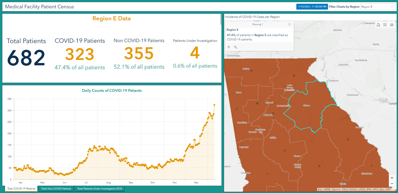
COVID-19 patients represent 33.8% of all patients currently hospitalized in Georgia and this varies by hospital region.
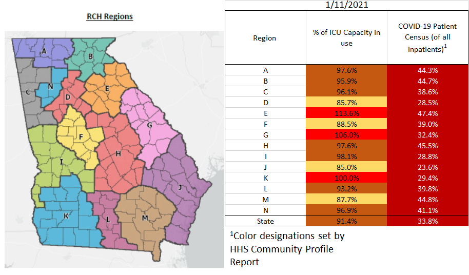
More than 91% of the ICU beds in the state are full. According to HHS, 47% of Georgia’s ICU beds are occupied by COVID-19 patients. The demand this disease is placing on our healthcare system is intense. Three regions are coping with an overage, regions E, G and K. Ten regions (of 14) are using >90% of their ICU beds. All hospital regions have now surpassed their summer peak for ICU bed usage.
I am especially concerned about region E (Athens-Clarke and surrounding counties). They’ve been coping with an overage of ICU bed usage for six days straight now and nearly half of all of their hospitalized patients are being treated for COVID-19. They’ve clearly been trying to overcome this challenge by adding more ICU beds (+11 beds since the start of the year) but even those reinforcements have been exhausted. They remain in an overage, using 114% of their available ICU beds.
There were 107 new hospital admissions for COVID-19 today and 2 admissions to the ICU. We typically see lower numbers on Mondays.
Deaths: there were 17 newly reported confirmed deaths compared to yesterday’s total. Death reporting on Mondays is typically low due to weekend effect.


References
https://covid.cdc.gov/covid-data-tracker/#vaccinations
https://beta.healthdata.gov/download/gqxm-d9w9/application%2Fpdf
https://dph.georgia.gov/covid-19-daily-status-report
https://covid-gagio.hub.arcgis.com/
Georgia COVID-19 Updates is a free newsletter that depends on reader support. If you wish to subscribe please click the link below. There are free and paid options available.
My Ph.D. is in Medical Microbiology and Immunology. I've worked at places like Creighton University, the Centers for Disease Control & Prevention and Mercer University School of Medicine. All thoughts are my professional opinion and should not be considered medical advice.