Vaccine Update
The CDC has recently updated their COVID-19 Vaccine Tracker to include demographic data on vaccine recipients. The data collection are best for age (91%) and sex (89%) but substantially worse for race (52%). We should note that they can only report data for the states that are providing them. I attended a meeting yesterday where DPH Commissioner Dr. Kathleen Toomey indicated that we could expect an expansion of the Georgia vaccine dashboard as early as yesterday to include demographic data. It hasn’t come to fruition yet, but hopefully we’ll see some new data this week. If so, then the state’s data can be included in the national data. For now, the national data likely do not include Georgia’s data.
Considering people who have received 2 doses (completing the vaccine series), women make up 64.2% compared to 35.8% being men. There are two possible contributing factors for this disparity and both have to do with the populations we are vaccinating - a lot of healthcare workers are women and life expectancy in this country is such that women tend to live longer than men. So when we vaccinate healthcare workers and people >65, there are fewer men in those populations than women to begin with.
If we consider age groups, we can see that the bulk of people who have 2 doses of the vaccine are mostly between ages 30 - 64, but if we look at people who have received 1+ doses, we see that the percentage grows with age. These differences are probably explained by the sequence of vaccine eligibility. The vaccines were first made available to healthcare workers and long term care facility residents. So I’m not surprised to see that those with 2 doses are younger - healthcare workers justifiably had a head start. We should anticipate that these graphs will change considerably now that the population >65 is eligible in many states and is taking up the vaccine at high rates. As that happens, we can hope to see that deaths and hospitalizations will decrease, because the people >65 are at greatest risk for those complications and outcomes.
As stated above, the data coverage for race and ethnicity data is not as robust as for age and sex. But the graphs below show us what we *do* know. We can see that White, Non-Hispanic populations have received ~62% of the vaccine doses so far.
I get a lot of questions about what to do about vaccine hesitancy - the people who aren’t sure whether they want the COVID-19 vaccine. And much like the pandemic effort from its outset, we have not seen enough coordinated messaging from state or federal government (even since the new administration took over) talking about how the vaccines work, why it’s important to be vaccinated, etc. When leaders and public health officials don’t take this effort seriously and head on, then conspiracy theory fills the void. More often than not, I think a lot of the problem here is that people don’t have an opportunity to ask their questions and have them answered. And it’s important for those of us in public health or medicine to listen to these concerns and recognize that people understandably have a lot of fear and anxiety about a lot of things in this pandemic. We need to acknowledge and hear out those concerns and then use data wherever we can to provide reassurance, connecting basic humanity to science.
If you have questions or concerns about the vaccine, I want you to email me. I am just one person but I’m more than willing to be that person who will listen and validate your anxiety. I promise that my goal is not to bully you into getting a vaccine. My goal is to listen and make sure you have the best data we have to address your concerns. It is my hope that having better understanding of how the vaccines work or the clinical trial data will empower you to feel confident in your decision - either way. So please send in your questions and I’ll collate them and try to address them in future newsletters. Many of you may have the same questions so answering them publicly will be efficient for me and help others who were maybe afraid to ask the same questions.
The White House state reports now include this map and graph showing how each state is doing with respect to the vaccination effort. It is my hope that once the single dose Johnson and Johnson vaccine is given Emergency Use Authorization then we will see these visualizations change to percent of population who have completed vaccination since that’s matters more than 1+ doses.
The CDC issued new guidance for those who have completed vaccination (either the 2 dose series or the single dose Johnson and Johnson vaccine once it is approved). We are still recommended to continue to wear masks, remain socially distant, etc. But if you are exposed following vaccination and if you meet certain criteria, you no longer need to quarantine. However, if you do not meet all three of the criteria below, then you *do* need to quarantine as you would if you were unvaccinated.
We have this week’s White House report for the state of Georgia and the summary table is provided below. There’s a lot of red in the table for most metrics. However, these are lighter shades of red than we’ve seen previously and things are improving (see all the green in the second column). We aren’t in a safe position, but things are getting better. Georgia’s national rankings as of this 07Feb2021 report are as follows:
#10 for new cases per 100,000 (red zone)
#9 for test positivity (light red zone)
#6 for new hospital admissions per 100 beds (red zone)
#11 for new deaths per 100,000 (red zone)
Testing
Georgia is ranked #39 in the nation for tests performed per 100,000 residents. The Georgia test rate has historically always been below the national test rate (see graph below). At present, the state tests at a rate that is 36% less than the national rate.
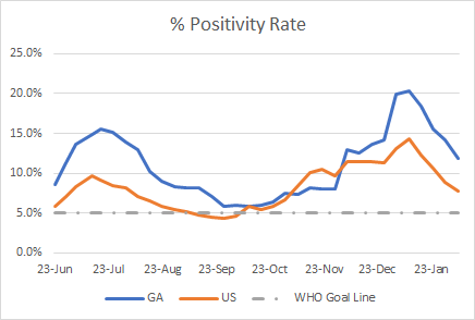
Both the state and national test positivity rates are declining. The Georgia trend follows the national trend, but we remain twice as high as the national rate. That means that we are missing more cases - something that is not surprising given that we test at a lower rate.
Today Georgia reported 22,794 new PCR test results, 9.9% of which were positive. The last time we saw this metric below 10% was 05Dec. Remember, we need to consider trends rather than single day data points. However, this 9.9% is a continuation of an overall trend that test positivity is decreasing. Hopefully we remain below 10% for the weeks to come and ideally we’ll reach 5%. While being under 10% is certainly a welcome sign of good progress, we are still twice as high as the goal line. So we are likely still missing quite a few cases. So our existing case rate is likely still an underestimate of the cases that are out there.
Cases
For new case rate, Georgia has almost met the national rate. We are just 20% higher this week.
If we consult the map, Georgia is one of 29 states that remain in the red zone. Things seem to be getting better for our neighbors Alabama and Tennessee. However, things remain intense from Florida to North Carolina in the South. In fact, South Carolina is ranked #1 and North Carolina is ranked #4.
Today Georgia reported a net increase of 3490 newly reported cases - 2445 by PCR testing and 1045 by antigen testing. This is a higher proportion of antigen cases (30%) than we typically see.
The 7-day case rate per 100,000 for the state is now virtually the same as the height of the summer surge. But we are still 238% higher than Georgia’s pre-winter surge case rate. Things are better than awful, but not quite safe. Please continue to be diligent about limiting disease transmission.
Hospitalizations
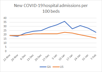
The state’s hospital admission rate per 100 beds is decreasing, thank goodness. The national rate is also decreasing, but Georgia’s admission rate is 44% higher than the national rate.
It’s very possible that many of the state’s hospitalizations and deaths during the winter surge have stemmed from infections and outbreaks taking place in skilled nursing facilities (SNFs).
Today, Georgia reported 281 new COVID-19 admissions and 33 new ICU admissions for COVID-19. The state reports 3322 COVID-19 patients currently hospitalized. But the US Department of Health and Human Services reports that number is 3721, including 54 children.
We see good news and items of concern in today’s numbers from the state dashboards for patient census and hospital capacity. We’re seeing some rebound on ICU bed usage. Statewide, the usage rate has increased from 83% on Monday to 86% today. We also have two more regions in the red zone than we did on Monday. This could just be day to day variation and we’ll want to keep an eye on this. Moving on to the patient census (second column) we have our first region that is back in the yellow zone (region L). It’s not pictured here, but region H has returned to its pre-winter surge patient census percentage. Pay attention, however, that even that pre-winter surge level for Region H is still considered to be in the red zone. Again, better than awful is not the same thing as safe.
Deaths
The entire South is part of a multistate distribution of high COVID-19 death rates per 100,000. Things are especially bad for neighbors Alabama and Tennessee. I would love to say that the lack of color in the northern plains states and mountain west are a positive sign of what’s to come for us as cases have crested for us, weeks after the other regions. But you can see that deaths remain high for many of the midwestern states, even though their cases crested more than a month ago. In fact, for Kansas, their case rate crested the week of Thanksgiving. Yet, their new death rate still puts them in the top 10, more than two months later. Hopefully that’s not the case for Georgia. But we should be prepared for history to repeat itself - it takes longer and more effort to descend from a surge than it takes to climb it.
Today Georgia reported a net increase of 118 newly reported confirmed deaths and 2 probable deaths. Of today’s newly reported confirmed deaths, 37.3% came from rural counties and 34.7% came from nonrural counties outside of the Atlanta metro.
References
https://covid.cdc.gov/covid-data-tracker/#vaccination-demographic
https://beta.healthdata.gov/Community/COVID-19-State-Profile-Report-Georgia/xhcs-tqqe
https://www.cdc.gov/vaccines/covid-19/info-by-product/clinical-considerations.html#phrecs
https://dph.georgia.gov/covid-19-daily-status-report
https://covid-gagio.hub.arcgis.com/
Georgia COVID-19 Updates is a free newsletter that depends on reader support. If you wish to subscribe please click the link below. There are free and paid options available.
My Ph.D. is in Medical Microbiology and Immunology. I've worked at places like Creighton University, the Centers for Disease Control & Prevention and Mercer University School of Medicine. All thoughts are my professional opinion and should not be considered medical advice.


