The Daily Digest, 09Jul2020
Georgia COVID-19 Updates

Testing
The Department of Public Health has simplified their testing chart at the top of the daily update. Hopefully this helps with some of the confusion.
Today there were 19,013 new PCR (diagnostic) tests reported through Electronic Laboratory Reports. Here’s how testing output has varied over time. The red dotted line is a 7-day moving average to help us see the trend.

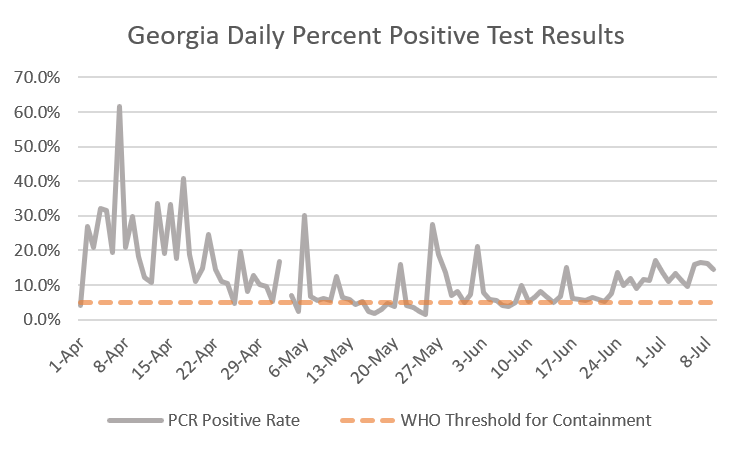
Of today’s new PCR tests there were 2727 positives, producing a percent positive rate of 14.3%. Below you can see how this rate has varied over time and where we are in relation to where we need to be in order to approach containment of the virus. What this means for now is that we aren’t testing enough people. We are probably missing people who are infected and they are continuing to move about the community, unaware, contributing to disease spread.
Cases
There were 2837 new cases reported today. Note that number differs from the number of PCR positive reported above (2727) through Electronic Laboratory Reporting (ELR). This means that 110 of today’s new cases were communicated to DPH outside of the ELR submission method - through things like phone calls, faxes, email, etc. The new state wide total is 106,727.

Of the new cases, 795 came from nonrural counties outside of the Atlanta metro (94 came from Muscogee, 82 came from Bibb). The next largest contribution came from the Non-Georgia Resident category, at 682 (a 9.3% increase over yesterday).
Below is the graph of cases over time, by date of symptom onset, from the Department of Public Health. I’ve marked two things for your convenience. The first arrow is our previous peak, which doesn’t really look like a peak at all anymore. The second arrow is when Georgia reopened. The things we are seeing are being observed in many of the states that were the first to reopen including South Carolina, Alabama, Oklahoma, Tennessee, and Mississippi. Still, there may be a lesson to be learned in this - it took about 6 weeks for cases to surge after reopening. I’m not sure whether that will apply after a subsequent shelter in place (should our governor decide to do so), but it might be worth it to remember this for future planning.

In total, there have been 84,579 cases and 2048 deaths since the reopening.
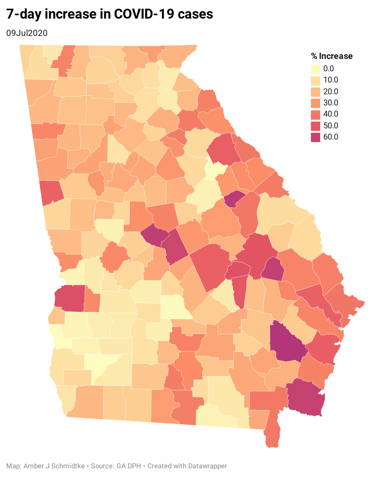
Below, you can see the rate of 7-day increase across all of Georgia’s counties.
Next is my list of counties of concern. Today it features 25 counties, or 15.7% of the state’s counties. To make this list, counties need to have a >25% 7-day increase and a >5% 24 hour increase. However, I have a grace period for counties that were on the list yesterday but didn’t meet the 24-hour increase threshold today (shaded in tan), just in case they had a low testing output day.

Next is a resource that I like a lot because it simplifies the data into risk categories for each county based on community spread - the thing every school district in Georgia is having to consider when it comes to their instructional model. For the risk levels, green means low risk and on the path to containment. Yellow means community spread is present and robust testing and contact tracing is needed. Orange means a shelter in place order is recommended and Red means a shelter in place order is required to manage community spread. You can explore this map here and click on Georgia on the left hand side.

In the meantime, there are only 26 counties (of 159) that are green or yellow according to this resource. There are 46 counties where a shelter in place order is needed to control the spread. There are 87 counties where a shelter in place is recommended. There is a limitation with this resource and that is that they are using data that are 2 days old. It would be better to have “live” data or at least from today’s update from DPH. But I appreciate how clear this is. There’s another resource being produced by Malmstrom Air Force Base that simplifies it by state. According to that resource we are in a High Risk category in Georgia, as is much of the South.
.jpg?ver=2020-07-07-165220-930)
Hospitalizations
Current hospitalizations continue to surge and hospitals are sounding the alarm. I spoke to a friend who is a physician treating hospitalized COVID-19 patients recently and they related that many of the patients are young, solidly millenials. In addition, it seems that as far as exposures go, these young adults were doing all the right things - avoiding unnecessary errands, wearing masks, etc. But what many of them have in common is recent (non-household) family contact. They had “one slip” where they didn’t wear a mask, or got together for a hug or a group photo, or rode in a car with someone from outside their household. Now they’re in a hospital. So please remain vigilant.
Today, there are 2322 currently hospitalized for COVID-19, 107 more than yesterday. As has been the case everyday for the past 9 days, this is the highest ever recorded since GEMA began providing the data.

Below you can see the second page of the daily situation report from GEMA. Only 17% of the critical care beds across the state are available for use. With hospitalizations surging, this is troubling. But the situation grows more dire when you look at bed availability in hospital regions. I’ve circled the regions where less than 20 beds are available. Keep in mind many of these regions serve large geographic areas. There are 8 hospital regions affected by this strain, including regions I’ve never seen impacted before - most notably the region that serves Savannah and the coast (Region J) which has 2 beds at present. Remember that this region surged in cases in the last two weeks. These hospitalizations might be the after effect of that surge since hospitalizations tend to lag behind cases.

Below, I’ve colored over the regions where critical care bed availability is running low to help us see how big this problem is. I wish we had data at a lower level, but hospital region is all that is provided to the public.

The entire southeast portion of the state is impacted. Imagine being sick and needing care but you live in that area right at the intersection of regions H, J and M. Where do you go? How many hours will it take you to drive there? This is a circumstance where we really see the painful effects of our rural health care deserts that existed even before the pandemic, where many counties don’t have a hospital at all.
Deaths
There were 8 new deaths reported today, a low day for us. None of these deaths came from the Atlanta metro. The new statewide total is 2930. The updated statewide case fatality rate is 2.75%. For reference the case fatality rate for influenza is 0.1%.
An update - this morning I got an email from a Georgia news organization who followed up with Georgia DPH after my report on 14-year old boy whose death we learned of yesterday. They relayed this statement to me from DPH:
“The individual tested positive for COVID-19, however, a review of the medical records revealed the death was unrelated to COVID-19. The positive test will remain in our count because the test was done in Georgia, but the death will come off of our totals in today’s update. The individual was a resident of Tennessee – and again, because the death was unrelated to COVID, it will not appear in Tennessee’s deaths, either.”
So perhaps this boy died in a car accident while he happened to be COVID-19-positive, as an example. His death is tragic no matter what. But that explains why his death was removed from the list today.
Lastly, I wanted to share a deeper look at the fatalities recorded as of 07Jul2020 by age range and county type. All of these data come from the DPH, I just sorted and graphed them. Please note these are total counts, not percentages. Some interesting things to notice: people from rural counties are more likely to die than those from other county types among those aged 40 - 69. In many age groups, Atlanta (Fulton & DeKalb counties) has the least amount of death despite having a really big population. And Atlanta metro (city + suburbs) tend to fare better than the rest of the state. Let this be a reminder that this isn’t just an Atlanta problem. In fact, Atlanta is doing pretty well. This is affecting every kind of community in our state.

That’s it for today. Be safe and be well!
References
https://dph.georgia.gov/covid-19-daily-status-report
https://gema.georgia.gov/document/document/sitrep-79/download
https://www.nytimes.com/interactive/2020/07/09/us/coronavirus-cases-reopening-trends.html
https://globalepidemics.org/key-metrics-for-covid-suppression/
https://www.malmstrom.af.mil/Portals/43/DigRotate/COVID/US%20Risk%20Map%20(20200707).jpg?ver=2020-07-07-165220-930
https://www.13wmaz.com/article/news/health/coronavirus/we-need-the-communitys-help-macon-hospitals-plead-for-public-mask-use-as-cases-surge/93-46ba29be-031d-4114-9938-a3118f5da2fb
https://www.cdc.gov/flu/about/burden/index.html#:~:text=While%20the%20impact%20of%20flu,61%2C000%20deaths%20annually%20since%202010.
Would love to see the stat for new hospitalizations per day over time. Also your stated fatality rate is inaccurate and misleading of course because many people have it and will never know they have it. The WHO estimates a fatality rate of .6%
what does "Non-Georgia Resident category" mean