The World
Globally, the SARS-CoV-2 virus that causes COVID-19 disease has sickened 27.1 million people and killed 888,901 as of this morning. Of those, 6.29 million cases and 188,815 deaths are in the United States, or 23.2% of cases and 21.2% of the world’s deaths, respectively. That’s despite the US making up just 4.25% of the world’s population.
The US is a hot spot , as is much of the Western hemisphere. Our weekly case rate per 100,000 is 87 and we are ranked 21st in the world with this rate.

For deaths, our weekly death rate per 100,000 is 2 and we are ranked #15 in the world for this. It’s important to remember that many developing countries do not have robust public health systems and may be under counting both their cases and deaths. But even a robust public health system here in the US has not spared us from some of the worst numbers in the global response to this pandemic. I remember learning about the 1918 influenza pandemic in graduate school and teaching it to my nursing students. I always marveled, as did my students, that the global death estimates for that pandemic were 30-50 million people. Why was there such a wide range? You’d think you’d notice 20 million people missing, so why didn’t we have a better estimate? Now, living through COVID-19, I can appreciate the difficulty that public health officials had in tracking cases and fatalities, especially considering the lack of technology and communications that we have now.
The United States
This week’s White House Coronavirus Task Force report has not yet been leaked to the public. But based on previous updates, it should have been produced yesterday, on September 6th. It’s possible they took the weekend off for the holiday.

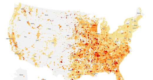
As hot spots go, the South is cooling off for now and disease hot spots are cropping up throughout the Midwest. We should anticipate disease to increase in the fall and winter months as people tend to gather indoors more often when the weather turns cold. We see this trend with influenza and I wouldn’t be surprised if COVID-19 follows it.
Hey! A welcome bit of good news. With our weekly case rate of 131 per 100,000 people, we are no longer in the top 10 states and territories in the US for disease transmission. Instead, we are #13 and this is consistent with the Harvard Global Health Institute tool as well. The state where I currently reside, on the other hand (Kansas), is now ranked #9. Sigh…thought I was trading a hot spot for a warm or cool spot. But it’s not to be.

And here are the top 20 cities with the greatest rate of disease over the past week. Note that most of these are college towns. Statesboro is ranked #4 and Athens is ranked #9.

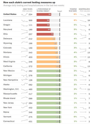
Nationally, we are averaging 224 tests per 100,000 in the past two weeks, which is 64% of the testing target. The national percent positive test rate is 6%. The states at or below 5% all have one thing in common - they are doing at least 50% of the testing target. So let this be our goal, since achieving 100% of the target is unlikely to happen for Georgia.

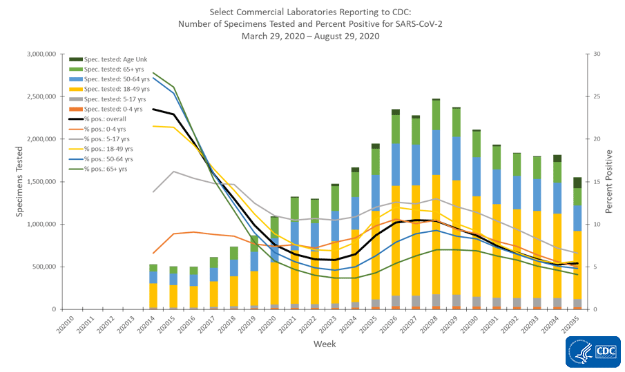
Below we can see how percent positivity compares across age group from commercial laboratory testing - the majority of testing done in the US for COVID-19. The bars represent the weekly total number of tests performed and corresponds to the left y-axis. The color coding is for different age groups tested within that weekly total. The lines show the percent positive for those tests each week and correspond to the right y-axis. They have the same color coding as for total tests performed. The average for this subset of laboratories is just above 5% (black line).

The majority of tests are for those 18-49 years of age and that makes sense since that’s where the majority of our cases are coming from. The percent positive for each age group is below the overall average EXCEPT those 5-17 years of age, which pulls the average up. The proportion of tests performed for school aged kids is small and the higher percent positive rate means we are likely not testing enough and so there is likely more disease among this population than we currently realize.
And here is how COVID-19 hospitalizations compare across the country:

Georgia still ranks #1 and by a good margin, at 14.4%. The next highest state is Mississippi at 9.9%. These data are current as of today, 07Sep2020. So we should be glad to know that hospitalizations are declining in Georgia, but we still remain well above the next highest state as has been the trend for at least the past month.
For deaths, we remain in the top 10. In fact, we’re #2 for weekly death rate per 100,000 and about twice the national average. About half of the states and territories in the top 10 are southern states. Since the summer surge was experienced most acutely in the South and the surge in deaths was delayed compared to the surge in cases, it is perhaps not surprising (though no less sad) that the South is so heavily represented in this list.

The State
Georgia is averaging 207 tests per 100,000 in the past two weeks, which is 46% of the testing target. The statewide percent positive test rate for the past two weeks is 10%. However, today we see weekend effect in every measure of the COVID-19 pandemic in Georgia, including testing, cases, hospitalizations and deaths. Simply put, as laboratories take the weekend off or work at reduced capacity, we are less able to see clearly what is happening in our communities. Today, Georgia turned in just 9,273 new test results, and we haven’t seen a number this low since June 3rd. It is about half of our usual output and a far cry from our record of 45,506 (set July 24). When you aren’t looking for disease, it’s harder to find. So the state only reported a net increase of 608 cases today, a number that is likely an under-representation of our situation due to the deficiency in testing. I would brace for big days this week as the laboratories catch up with the weekend backlog.
According to the Harvard Global Health Institute, 28 of Georgia’s 159 counties are in the green or yellow zones, indicating that they are on the path to containment for the virus or have community spread that might be manageable through rigorous testing and contact tracing. The remaining 131 counties (or 82.4% of the state’s counties) have disease rates that are beyond our capacity to track and control short of a shelter in place order. Our most intense counties are in the eastern half of the state.


Thirty-five percent of today’s cases came from nonrural counties outside of the Atlanta metro. Another 30.6% came from rural counties. Among today’s newly identified cases were 79 reported among healthcare workers, which is more than the total for Atlanta today (61). We don’t get data on the county of residence for healthcare workers and a good many of them may live in the Atlanta counties of Fulton and DeKalb. But it’s interesting and troubling that so many healthcare workers are getting sick.
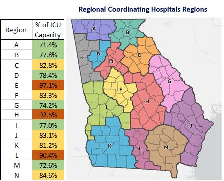
I’m beginning to think that the Georgia Geospatial Information Office hub for hospital capacity and patient census is being updated in real time. Because I recorded numbers this morning for ICU bed capacity with the 9/6/2020 11:00 pm time stamp for latest update and then double checked my numbers at 3:15 pm eastern standard time and the numbers were different, despite having the same time stamp. I’m not sure if others are noticing this too, but I think it’s very unlikely I had that many data entry errors for that many hospital regions. If that is true, it will be very hard to compare reports from different news organizations or individuals like me who provide daily updates. As for me, I will be checking the dashboards right after the 2:50 pm Department of Public Health update. As of today at 3:15 pm, ICU bed usage looks like this for the state.

The areas of greatest strain are hospital regions E, H, and L, in terms of ICU bed usage. There were 15 new hospital admissions and 3 new ICU admissions today. Both of those numbers are small and in keeping with weekend effect. Adult ventilator usage remains about 35%.

There was a net increase of 7 deaths newly reported today. Five came from rural counties and one each from nonrural and Atlanta suburb county groups. The new statewide total is 6044. As of the September 4th State Long Term Care Facility report, there have been 2322 resident deaths, or 38% of the total COVID-19 deaths the state has reported thus far. It’s important to remember that the LTCF report only tracks data for homes that host 25 or more residents.
That’s it for today. Take care!
References
https://www.nytimes.com/interactive/2020/world/coronavirus-maps.html
https://www.worldometers.info/world-population/us-population/#:~:text=the%20United%20States%202020%20population,(and%20dependencies)%20by%20population.
https://globalepidemics.org/key-metrics-for-covid-suppression/
https://www.nytimes.com/interactive/2020/us/coronavirus-testing.html
https://dch.georgia.gov/document/document/covid-19reportposted09042020pdf/download
https://dph.georgia.gov/covid-19-daily-status-report
https://protect-public.hhs.gov/pages/hospital-capacity


