The Daily Digest, 07Oct2020
Georgia COVID-19 Updates

Good afternoon! Let’s take a look at the latest numbers for Georgia and the most recent White House Coronavirus Task Force (hereafter abbreviated WHCTF) report. The grid that leads off the report is provided below. We’ll walk through how each metric has changed over time for the state and the US in the sections that follow.

Testing
The WHCTF report shows that Georgia remains below the national test rate per population and the gap between us is widening. In fact, in the recommendations section of the WHCTF report, they write “Must increase testing statewide.” Remember, the WHCTF is only counting RT-PCR tests performed in this graph and the grid provided above.

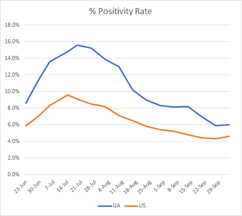
Our percent positive rate for the RT-PCR test has continued to decline, although the rate has leveled off recently. We have substantially narrowed the gap between our state and the nation for this metric. It’s noteworthy that the national percent positive rate has started to increase. We can’t make conclusions based on a single data point, but I think there is some worry whether this might align with the beginning of a fall surge in other parts of the country.
Another recommendation from the WHCTF is that “All antigen positive results must be reported with both the number of positive results and total tests conducted; these must be reported as COVID cases.” So the WHCTF is telling the state to start including the rapid antigen test-identified cases in the overall case total. At present, the only data we get on rapid antigen test cases are in the county indicators report, which is produced weekly. More on that in the cases section today.
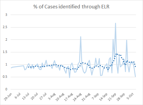
For today, the state reported some wonky test data. There were 13,395 new tests reported (a low day for us). In total there were 773 newly identified cases reported through Electronic Laboratory Reporting (ELR) which is just over half of our net increase in cases for the day. So it’s a low reporting day for us, meaning that we have just a limited view of the total tests that were performed to yield today’s case total. Of the limited tests that were reported through ELR, 5.8% were positive. With it being a low reporting day (51.8%), the 5.8% positive rate may not accurately depict our current situation. The state tends to have one day a week of this weird low reporting anomaly (see the graph below), but it does affect our overall percent positive rate.
Cases
As far as the WHCTF is concerned, they are tracking that we have dipped below the national case rate per 100,000. Some states are including rapid antigen test results in their overall case total, but Georgia currently is not. For now, it looks like Georgia is doing really well. I hope that remains the case when cases identified by the rapid antigen test are included in our state total. We’ll just have to see.

The graph below shows the number of total counties on the WHCTF’s list of counties of concern (blue line) and those in the red, orange or yellow categories. Combined, the number of counties on their list has decreased since mid-August. We increased slightly last week.

A very positive development is that Georgia has now dipped below the national average for skilled nursing facilities with at least one COVID-19 case. This could also be impacted by the advent of the rapid antigen test, especially since the Governor indicated these would be deployed to nursing homes.

Remember that the Georgia Department of Public Health recently updated their case definition. Probable cases meet at least one of the following criteria: has a positive antigen test on a respiratory specimen; OR has not had a confirmatory COVID-19 test but has symptoms compatible with COVID-19 AND a known exposure to a COVID-19 case; OR the individual has died and the death certificate lists COVID-19 disease or SARS-CoV-2 as an underlying cause of death or a significant condition contributing to death.
Using data in the most recent county indicators report from DPH, I was able to calculate how big of a deal the addition of probable cases is for each county. The map below shows us the proportion (%) that probable cases make up compared to the total combined case total (confirmed + probable). The darker the color, the higher the proportion. The image below is linked to a live image where you can click/hover over a county of interest to get the actual number.

I was surprised to see how significant the probable cases were to the case totals in rural counties. I mean, the darkest counties on this map are rural. If we look at the table below that compares how much of an increase the probable cases have made in the combined case total for each county type, it ranges from 5.4% in the Atlanta counties to 9% in rural counties. The percent increase is even bigger for the unknown category (18.1%). Across the state, the percent increase is 6.7%.

The disproportionate effect on rural counties made me wonder whether these probables were mostly identified through rapid antigen testing or if they were another criterium for inclusion, like a family member tested positive but no one else in the family was tested, even though they all had symptoms. However, in a press release that the Department of Public Health sent to the media yesterday, they wrote: “As of Oct. 5, there are 323,714 confirmed cases of COVID-19 and approximately 21,348 probable cases of COVID-19, most identified through antigen testing.” I don’t know whether “most” means 51% or 99% or somewhere in between. But the rural counties contribute 32% of the probable cases to date. Hopefully, we will get more clarity when the total rapid antigen tests performed by county are released. My apologies, I don’t have a link for you for the press release, hopefully the DPH will upload the report to their press release area soon. I received it via email.
For today, the DPH reported a net increase of 1492 cases today, bringing the statewide total to 326,142. Of these newly reported cases, only 15.5% were backdated prior to the 14-day window of uncertainty. So most of these 1492 are recent cases. Nonrural counties contributed 35% of today’s cases followed by Atlanta suburbs (29.7%) and rural counties (29%). I have provided an updated look at the case rate per 100,000 by county type below. Atlanta counties are increasing over the past week or so. But all county types are tightening around the statewide average.

Another interesting thing to come from the press release from DPH is an update on outbreak clusters. Here’s the latest table they’ve provided.
We can see that long term care facilities remain the #1 source of outbreaks overall. But Schools remain the #1 source in the most recent week.
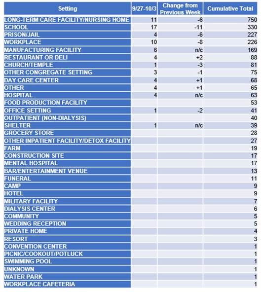
In fact, now that we have these data from DPH, we can look at the top four outbreak sources in the month of September and how they compare.

Schools are far and away the most common source of outbreaks last month. Thankfully, that number has decreased over time. But there’s a reason why schools were among the first things that public health officials recommended that we close at the start of the pandemic. We don’t have details on how many cases, hospitalizations and deaths are associated with each outbreak of disease. As the Department of Public Health has informed the Atlanta Journal Constitution, “the public has no legal right to information about outbreaks that the state is investigating.” Unfortunately, it leaves parents, faculty and staff potentially in the dark as they attempt to make evidence-based decisions unless schools willingly offer up that information.
Hospitalizations
The WHCTF report is showing a slight increase in hospitalizations compared to last week. Our rate of hospitals reporting into the system is improving.

Today in Georgia, there were 154 new hospital admissions for COVID-19 and 34 new ICU admissions. The current number of hospitalized patients is 1280, a decrease of 7 from yesterday, but equal to where we were on Sunday. Twenty nine percent of adult ventilators are in use, which is consistent with where we were prior to the summer surge. There are two counties using >90% of their available ICUs, regions L (97.3%) and N (91.4%).
Deaths
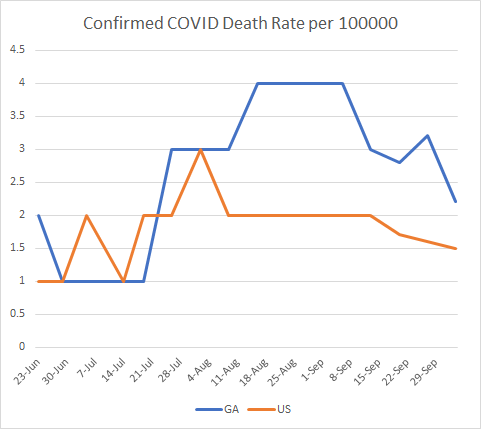
According to the WHCTF, our death rate is going down alongside the national rate. We still remain above the national average but are narrowing the gap.
Today there was a net increase of 30 newly reported deaths. The updated statewide total is 7259. Of today’s deaths, half of them came from rural counties. Nine more came from nonrural counties outside of the Atlanta metro. You can see how the weekly death rate per 100,000 has varied over time for each county type. At this time, rural counties have a death rate that is twice as high as the statewide rate and 165% higher than the national rate.

That’s it for today. Be safe and be well!
References
https://www.documentcloud.org/documents/7222884-Georgia-10-4-20.html
https://datawrapper.dwcdn.net/lej6W/2/
https://dph.georgia.gov/press-releases/2020-10-02/207000-abbott-binaxnow-rapid-covid-19-tests-arrive-georgia
https://dph.georgia.gov/covid-19-daily-status-report
https://countyindicatororeport.s3.amazonaws.com/county_indicator_report_201005.html
https://www.ajc.com/education/georgia-withholds-school-covid-19-counts-from-public/MSVEFPYMIJAMDO4TRMVPR2SWUE/
Georgia COVID-19 Updates is a free newsletter that depends on reader support. If you wish to subscribe please click the link below. There are free and paid options available.
My Ph.D. is in Medical Microbiology and Immunology. I've worked at places like Creighton University, the Centers for Disease Control & Prevention and Mercer University School of Medicine. All thoughts are my professional opinion and should not be considered medical advice.