The Daily Digest, 06Jul2020
Georgia COVID-19 Updates

Good evening! Here are the latest updates for Georgia and a look at how they compare to national trends.
Testing
It was a slow day for testing with only 9768 new PCR (diagnostic) test results. This is likely due to slow-downs over the holiday weekend. Below, you can see how today’s testing output compares to recent days. As a reminder, only the PCR test results are used to determine positive cases. The red line shows the 7-day moving average to allow us to see the trend through the noise.

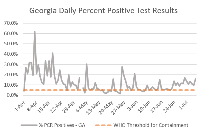
Of the 9768 PCR tests, 1548 were positive, giving a positive rate of 15.8%. Below you can see how our positivity rate has changed over time. According to the World Health Organization, we need to be at 5% or below to contain the virus. So we’re a long way from accomplishing that goal.
Cases
There were 1548 new cases reported today, bringing the new statewide total to 97,064. Five hundred eighty seven of these cases (about a third) came from nonrural counties that aren’t part of the Atlanta counties or its suburbs. Below you can see how new case reports have varied over time. Note: this will look different than the graph provided by Georgia Department of Public Health because they graph based on date of symptom onset. The red line is a 7-day moving average to help us see the trend. Our case trend has been surging upward, but today was a light day compared to where we’ve been recently - likely due to reduced testing output over the holiday weekend.

This next map shows the increase in cases over the past 7 days for all counties across Georgia. The darker the color, the more intense the increase. You can see that things are particularly intense in counties near the Georgia coast. Things are also heating up along the South Carolina border and in Central Georgia. Notably, things are quiet in southwest Georgia - a good thing since they were so hard hit in the early days of the pandemic. However, I worry this may be the calm before the storm, since Phoebe Putney health system in Dougherty county is beginning to sound the alarm once again regarding their hospitalizations.

There are 34 counties on the list of counties of concern today (or 21.4% of Georgia counties). To make this list, counties need to have a 7-day increase of >25% and a 24-hr increase of >5%. However, I have a “grace period” for counties that dip below 5% for 24 hour increase so that a bad testing day doesn’t take a county off the list prematurely. You’ll notice a LOT of these counties are impacted by this and this may be an artifact of decreased testing output across the state as described above. If they have a second <5% day then they drop off. The counties are ranked by their 7-day increase with Glynn county leading the way.

There is just one Atlanta metro county on the list today, Henry county. But actually, many of the Atlanta metro counties are one big testing day away from making the list. So things are definitely heating up in the Atlanta metro with respect to 7-day increase.
Fulton: +33.6% 7-day increase
DeKalb: +28.9%
Clayton: +25.8%
Cobb: +26.5%
Douglas: +29.4%
Fayette: +29.4%
Gwinnett: +26.2%
Rockdale: +30.3%
To consider national trends, I really like this map and grading system produced by a group at Harvard University. Counties are graded based on risk level where red indicates that shelter in place orders are necessary. Green indicates that the county is on its way to containment if they can sustain testing and contact tracing. You’ll notice that many of the areas in the news lately (Arizona, Texas, Florida) have significant red areas. Georgia does too. You can explore this map here.


Nationally, we are at 2,911,888 cases in the US, or 25.3% of the world’s cases. Meanwhile, we make up just 4% of the world’s population. So we are outperforming in a contest that no one should want to win. There have been 130,101 deaths in the US (24.3% of the world’s deaths).
Hospitalizations
The number of Georgians currently hospitalized for COVID-19 continues to increase. Today there are 1962 currently hospitalized, an increase of 157 compared to yesterday.

And things aren’t just increasing in terms of hospitalizations but also for adults requiring ventilators. Today 34% of the adult ventilators are in use (n = 950) and this is the highest I have recorded since Georgia Emergency Management Agency began providing these data. The trend is provided in the red line as a 7-day moving average. The trend is moving upward after weeks of hovering around 30%. Critical care beds in Georgia are 78% occupied - however GEMA does not provide details on how many of those are COVID-19 patients compared to those suffering from other serious conditions.
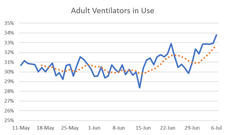
The orange line shows the 7-day moving average, allowing us to see the trend.
Deaths
There were 18 new deaths reported, a low-medium day for us. The new statewide total is 2878. Half of today’s deaths came from nonrural counties not affiliated with Atlanta counties or its suburbs.
If you look at the pandemic in Georgia so far, it can really be broken down into two distinct periods in terms of our efforts to control or contain it. The first phase was when we learned about the virus, how to treat those infected, and our greatest collective effort at diminishing its effects through the shelter in place order. The second phase is what we’ve done since reopening after three weeks of shelter in place on 24Apr. In the time since the reopening, you can see how many cases and deaths have taken place and where they came from, in terms of county type.
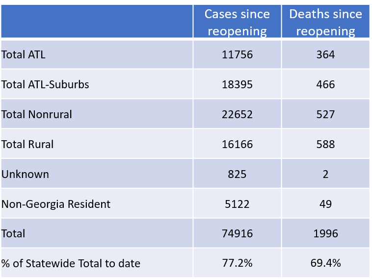
The vast majority of the pandemic has taken place since the reopening - as we’ve tried to get back to approaching normal life - with 77.2% of the cases to date and 69.4% of the deaths to date taking place between 24Apr and now. I think that’s important because there might be a tendency to assume that the disease isn’t that significant since the shelter in place order was lifted. These numbers show us that isn’t really true.
Gallup released new polling data concerning public sentiments surrounding mask wear and worries over social distancing. They found that 86% of US adults reported wearing a mask in public over the past week compared to 11% who said they weren’t even considering wearing a mask in public. So keep the faith, all of you mask wearers. Despite what we might observe locally, this poll suggests there is a shared sense of unity in caring for others in our communities.
References
https://dph.georgia.gov/covid-19-daily-status-report
https://gema.georgia.gov/document/document/sitrep-76/download
https://globalepidemics.org/key-metrics-for-covid-suppression/
https://coronavirus.jhu.edu/map.html
https://www.phoebehealth.com/patients-and-visitors/coronavirus/coronavirus-update
https://news.gallup.com/poll/313463/mask-worry-lack-social-distancing.aspx
Thank you for reporting this! I lost faith in the department of health when they changed how they were illustrating the numbers to look like it was on the decline when in fact it wasn't.