The Daily Digest, 05Aug2020
Georgia COVID-19 Updates

Good afternoon! Just a reminder that I’m offering paid subscriptions now for those who wish to support these analyses financially. There is certainly no obligation to do so and the Daily Digest and Week in Review that provide information on the COVID-19 pandemic will remain free to the public. As a thank you to those who are able to contribute, I’ll be offering additional analyses on other issues in public health and science as bonus content. If you’d like to subscribe to the Georgia COVID-19 updates (free or otherwise), you can do so by clicking the link below.
Also, I’ll be speaking tomorrow evening at the March for Masks. Registration is free and it will be a good opportunity for solidarity and education if you’d like to participate.
Testing
Today was a higher than average day for us for testing, with 30,812 new results reported. Below you can see how testing has varied over time. The left y-axis corresponds to new tests reported (blue lines) and the y-axis indicates how many of those tests were positive (red lines). The dashed lines are trend lines to help us see through the noise of day to day variability.

Of the new test results today, 11% were positive. Remember, we want to be at or below 5%. I know there’s a lot of bad news out there for COVID-19, but I wanted to share an example of how it is, in fact, possible to bring our disease transmission down through better (and more strategic) testing. In New York, yesterday they reported 72,668 test results (in a single day, more than twice what we reported today). Of those, 636 were positive, or 0.88%. We haven’t had a single-day increase that small since 16Jun.
Cases
There are 3765 new cases as of today’s Department of Public Health report and we passed a grim milestone of surpassing 200,000 cases today. The statewide total is 201,713. To put that big number in perspective, the population size of Augusta is 196,303.
Below you can see how cases have intensified over the past two weeks, adjusted for population.

Next, let’s look at how the state is doing toward containment, according to Harvard’s Global Health Institute. Red counties indicate a shelter in place is necessary to bring the virus under control, Orange counties are recommended to order a shelter in place. Yellow counties have community spread that might be manageable if rigorous testing and contact tracing are performed. As of Monday (their data feeds are delayed two days), all but 7 of Georgia’s counties either should consider or require a shelter in place order because disease transmission levels are out of control. So we aren’t doing well.

In spite of that, it’s time to add another milepost to our case graph - the date of school reopening, with the first on July 29th. By now, you’re probably familiar with the 14-day window of uncertainty and what it means. Just in case, during that time the data are unreliable and likely to increase because of the delays that accompany an infectious disease such as incubation period, delays in seeking care, delays in test turnaround and delays in test reporting.
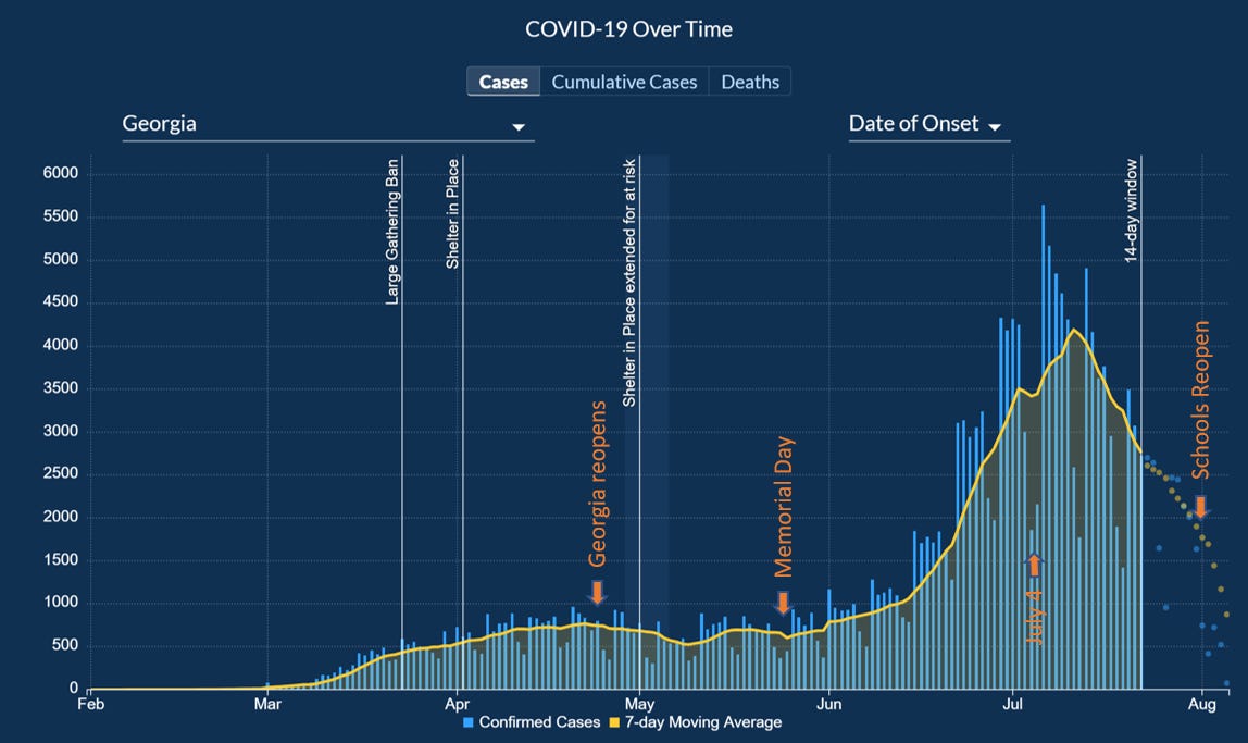
During the earlier peak in April, we got used to seeing a steep dropoff at that 14-day threshold and learned that it was an artifact of how the disease works, but didn’t represent a true increase. I am concerned that our 14-day window needs to be a 21-day window at this point. Because we haven’t done anything as a state to knock disease transmission down like a ban on large gatherings, closing businesses or a shelter in place order. There is no reason for the disease to decline like it is here. And that precipitous decline is similar to what we were used to seeing at the 14-day threshold in April. But we ARE hitting a wall with testing with some people waiting 2-3 weeks for their test results. Not only is that problematic for generating a good count of who is sick for graphs like this, but it also makes contact tracing nearly impossible. Most people don’t remember what they had for lunch two days ago. Imagine asking them to remember who their close contacts were 3-4 weeks ago? When test results are reported, the cases are backdated and we should probably anticipate some significant growth outside of the 14 day window. But for a graph like the one presented above, these delays in testing might mean that we have a misleading graph that gives the public the impression that the disease is on the decline when it is likely an artifact of our testing challenges.
And remember how I brought up New York in the testing section? I want you to see what is possible if we can get our testing and (more importantly) disease transmission to where it needs to be. According to the Harvard Global Health Institute, much of their state is on the road to containment. Their statewide daily case rate per 100,000 people is 3.5 compared to 33.6 for Georgia. In other words, we have roughly 10 times the amount of disease that New York has on a day to day basis over the past week.

All this to say that the cases, hospitalizations and deaths we are experiencing are (1) preventable and (2) something we can turn around. But we have to get transmission down to a manageable level for testing and contact tracing to be effective. The only way I see us accomplishing that at this point is through a statewide shelter in place order and then to follow the guidelines on phased reopening set forth by the White House Coronavirus Task Force.
Hospitalizations
There are 362 new hospitalizations reported today, the highest it has been in five days. You can see how new hospitalizations have varied over time. The dips you see periodically are weekends. The orange trendline shows us that new hospitalizations are much higher in the past few weeks than they have ever been during the pandemic but seem to be leveling off.

I just want to remind folks that if you are positive or think you might be for COVID-19 and are experiencing the following symptoms you need to seek medical care at a hospital. I know there have been concerning news reports over the past couple weeks about overcrowding at hospitals, but it’s not safe for you to try to ride these things out at home: trouble breathing, persistent pain in the chest, new confusion, inability to wake or stay awake, bluish lips or face.
Current hospitalizations are the net result of hospital admissions and discharges. You can see how that number has changed over time below.

Only 13% of the state’s ICU beds are available right now and the usage of this critical resource (and the healthcare staff that supports it) is being strained more in some areas than others. For example, hospital regions E, H and L have 1-2 beds each and they each cover multiple counties.

The governor has stood up two hospitals that can augment general inpatient beds at the Georgia World Congress Center in Atlanta and another facility in Milledgeville. But those won’t solve the capacity problems for critical care beds.
Deaths
There were 63 deaths newly reported today. Thirty two came from nonrural counties that aren’t part of the Atlanta metro. In fact, for much of the pandemic, the biggest contributor to our deaths has been rural counties. But nonrural counties have overtaken that position in the last week. Meanwhile, deaths for both populations continue to increase.

The new statewide total is 3984. We will likely surpass 4000 deaths tomorrow. As a reminder of how significant the death impact is from COVID-19, I’m reposting the picture of excess deaths (looking at all causes of death) for Georgia this year compared to the trend for the past five years. We are well above “normal.”

We need to do the work and follow the example of states like New York or other countries that have limited transmission to levels that they can properly track and monitor disease and also have the healthcare capacity to care for the sick.
References
https://dph.georgia.gov/covid-19-daily-status-report
https://gema.georgia.gov/document/document/sitrep-85/download
https://globalepidemics.org/key-metrics-for-covid-suppression/
https://covid19tracker.health.ny.gov/views/NYS-COVID19-Tracker/NYSDOHCOVID-19Tracker-DailyTracker?%3Aembed=yes&%3Atoolbar=no&%3Atabs=n
Is there any indication that asymptomatic infection is more or less likely for different age groups?
I'm just curious... Do we know what caused the excess deaths in early spring of 2018?