

The Daily Digest, 05Apr2021
Georgia COVID-19 Updates

Vaccine Update
This week, I’ve tried to simplify some of the verbiage that typically goes in this section, presenting the data in table form instead. The data are publicly available and current as of the CDC update at 12:27 pm on 04Apr2021. The table compares Georgia’s data to the US average. CDC indicates that 6,237,495 doses have been delivered in the state of Georgia and 4,153,506 have been administered in the state of Georgia. That leaves an inventory of 2,083,989 doses on hand.

Georgia is doing much better than it was in the past at getting shots into arms. Last week the state averaged about 83,500 doses administered per day if you consider DPH data. But there is still a big gap between doses and the people who need them. Some of the same barriers to healthcare access in general are at play here too: issues of transportation, proximity to a vaccine provider, internet access to schedule appointments, ability to take time off from work, etc. The map below shows the availability of vaccine appointments available through retail pharmacies. This is not the only way to get a vaccine, of course. You can also go through local health departments and GEMA mass vaccination sites. In the past, I’ve talked about the disparity between metro Atlanta where it seems that there are few if any appointments available and non-metro Atlanta where vaccine appointments appear to be plentiful. One conclusion you might draw from this map is that demand is not as great in south Georgia. And that may certainly be an issue. But even with this map, you can see vaccine supply deserts, at least through these retail pharmacy vaccine providers. For example, look at the space between Macon and Dothan (Alabama) in southwest Georgia. There are a dozen or so counties in that swath with no retail pharmacy vaccine provider. If you have to drive several counties away to get to a vaccine, you’re less likely to do so. The problem is magnified further for homebound seniors and those who lack transportation.

I think there is still a fair amount of hesitancy when it comes to the vaccine within the population as a whole. But there are people who want the vaccine and need help to do so. It is my hope that the efforts that are brought to bear to address these disparities in access to the vaccine will live beyond the pandemic to address disparities in access to healthcare in the future.
The World

According to the New York Times Coronavirus Tracker, the SARS-CoV-2 virus that causes COVID-19 disease has sickened >131.3 million people (+4.1 million since last week) and killed at least 2,853,000 (+69,200 in the past week) worldwide as of this morning. For both cases and deaths, the increases this week are greater than the increases during the previous week and this trend has continued for at least 2 weeks now. So it seems that things are growing more intense.
The US is ranked #54 in the world for average daily case rate per 100,000 people over the past 7 days (same as last week) with a rate of 19 (same as last week). The top five countries for average daily case rate per 100,000 in the past week are Curacao, Uruguay, Bermuda, Hungary, and San Marino.
For deaths, the US average daily death rate per 100,000 over the past week is 0.25 (previous week was 0.30), and we are ranked #49 in the world for this (last week we were ranked #44). So the US death rate decreased this week while it intensified for other parts of the world. The top five countries for average daily death rate per 100,000 in the most recent week are Hungary, Bosnia and Herzegovina, North Macedonia, Bulgaria and Czech Republic.
The United States

The map above comes from the CDC COVID-19 Tracker on the Community tab, county view. The map above looks at the combined community transmission indicators that looks at both case rate and test positivity. Red and orange are considered the danger zone, yellow is safer and blue is safest.
As of this morning, the New York Times coronavirus tracker indicates there have been over 30.7 million cases (+500,000 in the past week) and 554,579 deaths in the US (+5712 in past week).
The HHS Community Profiles were not updated over the weekend, likely due to Easter. According to data from the 02Apr2021 HHS Community Profile Report (the source document for the White House Coronavirus Task Force reports), the top five states in the nation for new case rate per 100,000 residents are Michigan, New Jersey, New York, Connecticut and Rhode Island. The top five states in the nation for new death rate per 100,000 in the past 7 days are Georgia, West Virginia, Kentucky, New York and Massachusetts.
The table below tells you where we are this week and how that compares to the previous week (in parentheses). The data for everything comes from the HHS Community Profile Report from 02Apr2021.

This week the rankings for Georgia are largely the same as the previous week. The exception is case rate. On a national level, case rate has increased 6.3% this week, a concerning trend, but it’s less than the previous week (10% increase). The percentage of patients hospitalized for COVID-19 is about the same as last week for both Georgia and the US. Georgia is #1 this week for percent of hospitalized patients who are being treated for COVID-19. Bacon county in the southeast corner of Georgia has the highest new case rate in the country right now. However, this appears to be the result of a data dump of cases reclassified from the “unknown” category to Bacon county dating back to last summer. So I expect that this county will drop off of the HHS rankings soon. Meanwhile, Chattahoochee county is ranked #3 in the country and that does appear to reflect recent disease trends, according to the Georgia DPH dashboard.
Georgia
We can zoom in on a current view of Georgia using the CDC community transmission criteria. Last week, there were 4 counties in the blue category and 40 counties in the yellow category, with 72% of Georgia’s counties in the substantial or high transmission categories. This week, there are 5 blue counties and 44 counties in the yellow category. That leaves 69% of the state’s counties in the substantial or high transmission categories. So on a county to county level, disease transmission got a bit better this week.

Let’s discuss today’s numbers for Georgia.
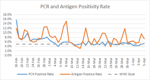
Testing: a low day for both PCR and antigen testing. For PCR testing, there were 10,801 new PCR results reported, 5.2% of which were positive. There were 2541 new antigen tests reported today and 7.3% were positive. The graph below shows how PCR and antigen test positivity have compared during that time. It seems that there is more day to day variation in antigen test percent positivity.

Cases: cases are often lower on Mondays due to weekend effect. But today’s numbers are 45% lower than last Monday. Today there was a net increase of 643 newly reported cases (501 by PCR, 142 by antigen test). The 7-day case rate remains 10% above the pre-winter surge baseline and this is the closest we’ve been to that baseline since the winter surge began.
The 02Apr School Aged Surveillance Data Report from DPH shows that things are continuing to calm down across many metrics for children and college aged adults. The only exception was this graph that shows the number of school-associated clusters of disease reported each week. For the week starting 22Mar2021, there were just under 30 reported clusters. Sorry, I have to eyeball this since they don’t give us the exact numbers. The number isn’t as important as the trend, which is increasing. It appears that the number of clusters has increased quite a bit in the past 5 weeks. As a reminder, these are clusters, but they don’t tell us how many cases were associated with each. These numbers are also likely delayed - it takes a while for symptoms to arise, then to seek testing, get those test results back and then for a contact trace investigation to identify a possible cluster. The trends are the important thing to keep an eye on.


Hospitalizations: Usually we see small numbers for the weekend that show up on Sunday and Monday. There were 9 new hospital admissions for COVID-19 today (last week, 35) and 0 admissions to the ICU.
According to the HHS Community Profile Report, the Georgia counties with the highest percentage of COVID-19 patients are Liberty, Paulding, Douglas, Forsyth, and Newton counties.
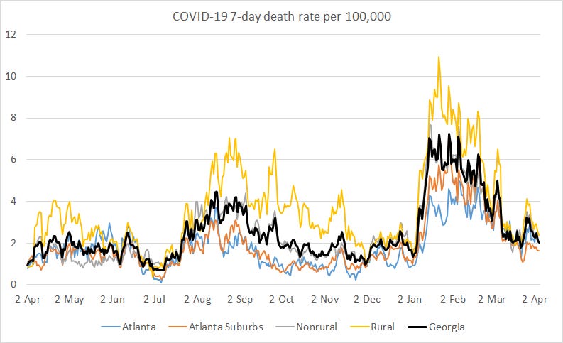
Deaths: there were 0 newly reported confirmed deaths compared to yesterday’s total and 0 probable deaths. Death reporting on Mondays is typically low due to weekend effect. All the same, it’s pretty great to have a day with zero deaths. The state 7-day death rate per 100,000 residents is 33% above the pre-winter surge baseline.

References
https://covid.cdc.gov/covid-data-tracker/#vaccinations
https://dph.georgia.gov/covid-19-daily-status-report
https://covid-gagio.hub.arcgis.com/
https://www.nytimes.com/interactive/2020/us/coronavirus-us-cases.html
https://covid.cdc.gov/covid-data-tracker/#county-view
https://dph.georgia.gov/school-aged-covid-19-surveillance-data
Georgia COVID-19 Updates is a free newsletter that depends on reader support. If you wish to subscribe please click the link below. There are free and paid options available.
My Ph.D. is in Medical Microbiology and Immunology. I've worked at places like Creighton University, the Centers for Disease Control & Prevention and Mercer University School of Medicine. All thoughts are my professional opinion and should not be considered medical advice.