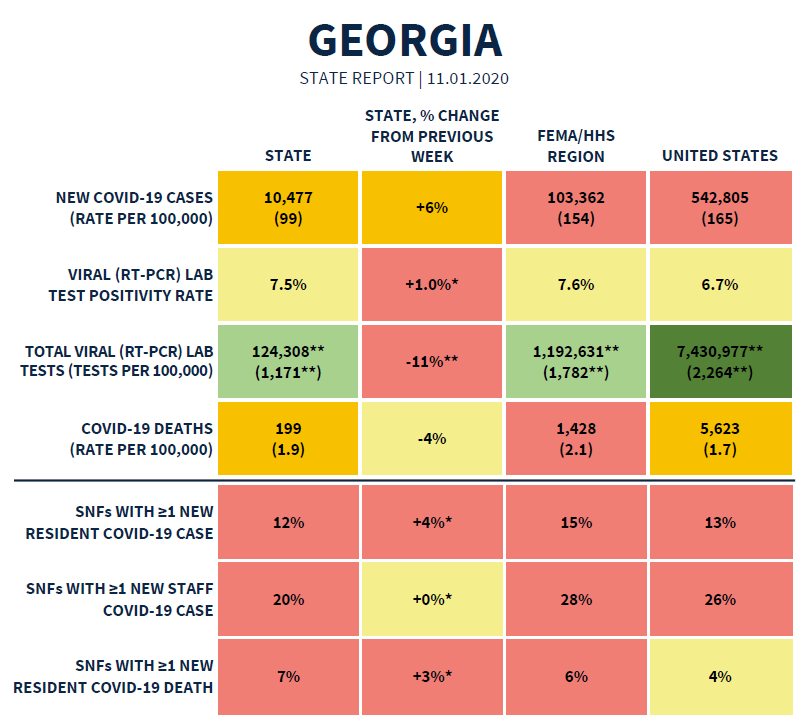
Good afternoon! Today we’ll discuss the White House Coronavirus Task Force (WHCTF) report, October testing data and the new data coming from Georgia Department of Public Health regarding antigen positive cases and probable deaths. First, here’s the summary table from the most recent WHCTF report. We’ll go through many of these metrics in the following sections. You can read the full report at the Center for Public Integrity.
Testing
Georgia has always performed testing per 100,000 at a rate that was below the national average. However, recently that disparity is growing. We’ve held relatively steady over the past month while the rest of the country has increased.
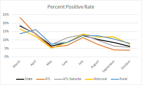
Georgia continues to be above the national average for percent positive rate, but that disparity has narrowed over time. The percent positive rate should be considered alongside the case rate (next section). The latter tells us how much disease is circulating. The percent positive rate tells us whether that case rate is more or less likely to be an under count. The higher the percent positive rate, the more likely the case rate is under-representing the situation on the ground. You want to be at or below 5%, ideally. Despite narrowing the gap between the state and national percent positive rate, both are increasing together.
In fact, one of the summary statements from the WHCTF is “Georgia’s testing rates have significantly declined, making it difficult to interpret the current state of its epidemic.” A few lines down they add, “Georgia has seen stability in new cases and an increase in test positivity suggesting undertesting.” It’s not completely clear what they’re talking about regarding test rates “significantly” declining. They note an 11% decrease in test rate compared to the previous week in the summary table. But last week they said Georgia had a test rate of 1110 per 100,000 and this week it’s 1171. So test rate increased this week unless they had some data corrections in the previous week that were not made available to the public. It might be more appropriate to say that test rate has held steady while percent positive rate has increased…
Today Georgia reported a net increase of 28,448 new PCR tests, a medium-high day for us. Of those tests, 5.8% were positive. Only 15.7% of the cases identified through testing were backdated prior to the 14 day window of uncertainty (within normal limits). So today’s newly reported cases are mostly current or recent.
Now that we have all of the tests reported for October, it’s time to look at how well Georgia is doing at testing its population across county types. The statewide average (black line) has increased slightly and the nonrural counties track along with the statewide average. Testing improved for Atlanta counties and Atlanta suburbs. The latter is a really good thing, since they were testing at the lowest rate per population in September and by a large margin.
For percent positive rate, the rate decreased in October relative to September for the state and for most county types. Atlanta counties had a percent positive rate below the 5% goal.
Next, let’s look at how the test rate per 100,000 in October compared to the case rate per 100,000 for each county type. Ideally, you want to have a large gap between test rate and case rate. The bigger the gap (I may use the word “delta” from time to time), the more widely you are testing and less likely to miss cases. The largest delta is observed for the Atlanta counties followed by nonrural counties outside of the Atlanta metro, Atlanta suburbs, and finally rural counties.
Cases
Here’s how Georgia has tracked for cases per 100,000 over time, compared to the US average. We have been below the national average since late September. But both the US rate and the Georgia rate are increasing.
This next graph tracks how many counties are on the WHCTF radar, or counties of concern. The WHCTF defines these counties based on recent case rates, and severity ranges from red (most intense) to yellow. There are color classes for counties that aren’t on the list (shades of green) to represent low case rates. The black line below is the total of all counties on the WHCTF list (red, orange and yellow).
For months now, we’ve been steadily decreasing the number of counties on the list. But that trend has reversed over the past three weeks. In all, 102 of Georgia’s 159 counties are on the WHCTF list of counties of concern.
Today Georgia reported a net increase of 2755 cases (+1863 PCR cases, +892 antigen cases), bringing the combined statewide total to 397,281. The graph below shows you how things are moving for different county types. Before anyone freaks out about the big blip in the line around 06Oct, keep in mind that this is when we first started learning about antigen cases. Sot this blip is an artifact like a data dump - it’s a lot of cumulative data entered all at once. Pay more attention to the trend overall. The antigen tests are not as reliable as the gold standard PCR tests and are best used with symptomatic individuals or places where you expect to find positives (for example, close contacts of a known case). PCR confirmatory tests are recommended as a follow up and my understanding is that DPH is de-duplicating cases that first test positive via antigen test and then are confirmed through PCR. In other words, they’re only counted as a case one time and placed in the correct tally (PCR versus antigen). However, according to my colleague at DPH, they initiate a contact trace investigation for each and every one of those antigen positive cases…so from a practical standpoint, they are being managed the same way as PCR positive cases. For that reason, I feel comfortable from a data standpoint to combine the totals in graphs like the ones shown below so that we have a better picture of how intense disease is for different areas and as the antigen test gains in popularity. It’s also consistent with how other organizations are reporting the data such as the New York Times coronavirus tracker. The COVID Tracking Project does combine PCR and antigen positive cases for other states, but hasn’t yet begun doing so for Georgia.
The state average (black line) obscures the lines for many of the county types. But they are all tracking right along with the state average. Nonrural counties currently have the highest case rate per 100,000. These counties are those outside of the Atlanta metro with >50,000 residents.
Lastly, let’s look at how the WHCTF sees the case situation nationally. Georgia is right on the edge of the red zone, with a case rate of 99 (the threshold for red is 101), not including cases identified through antigen testing. In the recommendations section, they note that increases in cases, hospitalizations and deaths are spreading southward as the weather turns colder. From this language, it implies that they see a surge in Georgia as not a question of “if” but “when.” And “when” may be sooner than later. We still have the power as individuals and communities to put the breaks on that though. We need to limit exposure risks wherever we can. I track the reports for Kansas and Missouri too and in Missouri the WHCTF is advising against any gathering with people from outside your household until case rate and positivity rate decrease. We don’t want that to be the guidance for Georgia if we can avoid it.
Hospitalizations
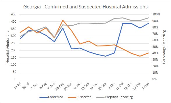
Here’s what the WHCTF is tracking for hospital admissions over time for Georgia. The gray line shows how many Georgia hospitals have reported into the system (right y-axis), staying at or near 90% for the last several weeks. The left y-axis pertains to confirmed and suspected COVID-19 hospital admissions.
Confirmed COVID-19 hospitalizations are for patients who have already tested positive for COVID-19 prior to admission. The suspected COVID-19 patient hospital admissions are those whose test results are pending at the time of admission, but hospitals are treating them as COVID-19 patients in the meantime. If we add these two together to get a better sense of the demand for treatment and personal protective equipment (PPE), the average daily number of admissions is 571 this week, an escalation over 517 last week.
The next graph is from the WHCTF report concerning the supply of personal protective equipment (PPE) at Georgia hospitals. The top image is from the previous week, the bottom image is from the most recent week.
About 90% of hospitals have only 0-3 days worth of PPE supplies on hand. That’s pretty concerning when the hospitalization rate in Georgia isn’t “that bad” yet. If we see a spike in hospitalizations like we saw during the summer surge, Georgia is not in a good position to cope with that and keep healthcare workers safe.
Today Georgia reported that there are 1435 patients currently hospitalized for COVID-19 (+11 since yesterday). There were 149 new hospital admissions and 34 new ICU admissions reported today.
Deaths
The death rate per 100,000 in Georgia has come down a long way since the summer surge. The gap between Georgia and the US has narrowed in a big way, partly because we’ve decreased and partly because the national rate is increasing.
Georgia started reporting “probable” deaths yesterday in the daily situation report. The definition for this is a bit more obscure than the antigen positive cases. It includes people who died who had tested positive using the antigen test, but also those whose death certificates indicate COVID-19 illness contributed to their death but they never were tested. So this is a murkier situation than the antigen positive cases. For that reason, I’m reluctant to combine confirmed and probable deaths together, although I am tracking both for the time being. Today Georgia reported a net increase of 43 confirmed COVID-19 deaths today, bringing the statewide total to 8072. Twenty of the deaths came from nonrural counties and fifteen came from nonrural counties outside of the Atlanta metro. Below, you can see how the death rate has moved over time for different county types. To be clear, this graph is based on confirmed COVID-19 deaths (PCR-identified) only.
The inclusion of antigen positive cases does mean that the case fatality rate has decreased somewhat, from 2.20% to 2.15%.
That’s it for today. We’ll walk through more of the antigen positive case data on a county by county level on Friday. Talk to you then!
References
https://publicintegrity.org/health/coronavirus-and-inequality/white-house-coronavirus-red-zone-reports-covid/
https://dph.georgia.gov/covid-19-daily-status-report
https://covid-gagio.hub.arcgis.com/
https://covidtracking.com/data
Georgia COVID-19 Updates is a free newsletter that depends on reader support. If you wish to subscribe please click the link below. There are free and paid options available.
My Ph.D. is in Medical Microbiology and Immunology. I've worked at places like Creighton University, the Centers for Disease Control & Prevention and Mercer University School of Medicine. All thoughts are my professional opinion and should not be considered medical advice.


