
Vaccine Update
Unfortunately, the rollout is not going smoothly at all, both in terms of logistics as well as messaging. There is a lot of confusion as states modify the recommendations put forth by the ACIP and changing rules without appointment systems in place. For now, the vaccine is limited to healthcare workers and residents and staff at long term care facilities according to CDC and ACIP guidance. There's a link for healthcare workers to register for an appointment to get their vaccine if they are not part of a larger hospital system that is providing them (https://dph.georgia.gov/provider-vaccine-registration-ph-district-list). Within the next week or so, the vaccination eligibility is going to expand to first responders and people >65 years of age. I do not have a link yet for people to register for vaccinations in this category. But when it is available, I will be sure to share it widely. As much as I am excited to know that the state plans to expand vaccine eligibility, I wish they had waited to announce it until they had staffing and appointments figured out. Because it has led to a lot of unnecessary confusion that is harming the public’s trust in the process of vaccinating our population.
We can see how the US (and Georgia) is doing with respect to the vaccine administration effort using the CDC’s COVID-19 Data Tracker. Nationally, 32% of the available doses have been administered to a person. With respect to the long term care facility allocation, only 12.8% of the doses have been administered. I think the Federal Pharmacy Partnership for LTCF Program began after the overall vaccine distribution for healthcare workers, so maybe they’re needing more time to get organized. And with back to back holidays, it’s possible that is part of the slow down. Hopefully these numbers pick up in the coming weeks.
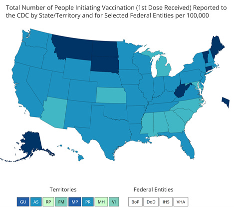
The CDC Tracker provides a map of the US for how many people have received at least one dose of the vaccine, adjusted for population. Using this method of looking at vaccine data, Georgia is ranked second to last, with a vaccination rate that is 708 per 100,000 residents. The southeastern US is all in the bottom color tier for distribution of the vaccine so far. This is not dissimilar from what we see for testing turnaround time. The top three states for doses administered per 100,000 residents are South Dakota (2,985), West Virginia (2,780) and North Dakota (2,778). In other words, South Dakota has vaccinated more than three times as much of their population as Georgia has.
A college student in Vermont, Benjy Renton, has been tracking the COVID-19 pandemic and has given us another way to look at the data in chart form that I think is really helpful. It ranks the vaccine rollout by state and also tells us how non-state jurisdictions (i.e. Federal Bureau of Prisons, Department of Defense, Veterans Affairs, Indian Health Services) are doing with their supply of vaccines. The chart he produced looks at percentage of vaccine doses that have been administered compared to the state’s supply, so different than how CDC presents it. As of January 2nd, Georgia is ranked last as far as states go, with 16.9% of the state’s doses administered. No matter which way you look at vaccine administration, whether doses per 100,000 or percent of available doses administered, Georgia has a lot of room to improve.
Funding and staffing for public health departments at all levels have been dramatically reduced over the past decade. Operation Warp Speed invested heavily in the development of vaccines and their distribution to the states. But there was no money set aside for the states to perform the "last mile" of vaccine delivery. Congress just approved a bill (and the president signed it) that will allocate money to the states for vaccine deployment, but we don't know when or how much of the money will get to Georgia. In the meantime, Georgia's regional health districts are diverting some of their staff from testing to vaccine administration.


That sounds good on paper. I mean, we all want a vaccine right now and we are all frustrated. The majority of testing is performed by commercial laboratories anyway, not the state health lab. So perhaps this won’t move the needle a lot, but public health districts are the most accessible testing locations for people without health insurance, who might not have a physician. COVID-19 testing shouldn’t just be for those with insurance, not when so many people have lost their jobs in 2020. Many “essential” jobs don’t come with health insurance, and they are among the people most exposed to the virus. The reality is that we need to fully fund and support both testing AND vaccinations. As our pandemic grows during this surge, we need to be doing more testing, not less. In short, the state needs more money and more people. Without it, they're having to make painful decisions to curtail testing availability (that will have a more immediate impact on the pandemic) to divert effort to vaccinations (a long term impact on the pandemic). I understand the desire to vaccinate, to feel like we are making forward momentum against this virus wholeheartedly. But this policy change will drive our percent positive rate higher and we will miss more cases. Combined with growing pandemic complacency and fatigue, flying blind not knowing where the cases are is a recipe for catastrophe. The new Congress was sworn in yesterday and the Georgia legislative session is about to begin later this month. The people who can do something about funding are about to start meeting. I very much hope that funding public health (to include testing AND vaccination efforts) is a top priority. Give public health (at all levels) the support it requires.
I’ve had a number of readers who are current or retired healthcare workers who expressed a desire to donate their time and effort for the vaccine deployment. I checked with a colleague at DPH and they told me that the best place to direct you is to Georgia Responds, the DPH volunteer registry. For those without medical training, I have asked about how to register to fill some of the other roles at a vaccine clinic (i.e. line management, reception and paperwork, etc) but my contact was unsure where best to send you. If I hear differently, I will pass that information along.
The World

Globally, the SARS-CoV-2 virus that causes COVID-19 disease has sickened >85 million people (+3.9 million since last week) and killed at least 1,842,400 (+73,000 in the past week) as of this morning.
The US is ranked in the second highest color category for hot spots. We are ranked #10 in the world for average daily case rate per 100,000 people over the past 7 days (last week, 9th) with a rate of 64.2 compared to 55.7 last week. So our case rate is getting worse. The top five countries for average daily case rate per 100,000 in the past week are Gibraltar, Czech Republic, San Marino, Lithuania and the United Kingdom.
For deaths, the US average daily death rate per 100,000 over the past week is 0.8 (previous week was 0.7), and we are ranked #20 in the world for this (last week we were ranked #23). The top five countries for average daily death rate per 100,000 in the most recent week are Liechtenstein, Lithuania, Slovenia, Slovakia and Croatia.
The United States

As of this morning, there have been over 20.6 million cases (+1.4 million in the past week) and 351,682 deaths in the US (+33,882 in past week). Keep in mind that both of these numbers are probably an under-count of the situation in our country.
This week we see things have intensified along a stretch from Eastern Kansas and Oklahoma northeast into New York state. The southeast US is also seeing more disease this week than previously. We should remember that some of this improvement may be an artifact of delayed reporting over the holiday. The top five states in the nation for average daily case rate in the past 7 days are Arizona, California, Tennessee, Oklahoma, and Arkansas. Georgia is back in the top 10, at #10. There are two southern states in the top 10 - Tennessee and Georgia. Other southern states are just outside of the top 10. The top five states in the nation for average daily death rate in the past 7 days are Kansas, Wyoming, Pennsylvania, New Mexico and Indiana. There is just one southern state in the top 10 for the metric - Mississippi (#6).
Next, let’s look at some of the latest data from the US Department of Health and Human Services (COVID-19 Community Profile Report) for counties and cities. It is formatted in much the same way as the White House Coronavirus Task Force reports but with one key difference - this resource DOES include Georgia’s antigen cases in their total whereas the WHCTF does not. So this resource is the best head to head comparison we have for how Georgia is faring relative to other states.
First, I want to look at age-based trends in test positivity. This screen shot is going to be hard to see. If you want to see it in its original form, then click on this and then scroll to page 22. We are in FEMA region 4, so top row, fourth block. The x-axis is time, for every 10 days, starting November 4th. The colors represent different age groups. What it shows is that every age group in Georgia has had a >5% positive rate since early November. The best rate is among children less than 5 years old, but their positive rate is now more than 10%. Middle and high school aged children have the highest percent positive rate, at about 20%. What this means is that we aren’t testing any population widely enough to identify most cases. But we especially aren’t testing 12-17 year olds enough. If one in five of those tests is coming back positive, that means there are a lot of infected 12-17 year olds in Georgia that we don’t know about. That has implications for face to face instruction this spring.

This next graph is easier to read and time is measured in months. The high positivity rate (top graph below) for 12-17 year olds is also noted nationally (red line below). In second place are 5-11 year olds. All other age groups are clustered together, at about 12-14%. Remember, high percent positive rate means that we are not testing widely enough. That makes sense when you look at the bottom graph that shows how many tests we are performing per 100,000 people in a given age group. Children (0-17) are the least tested age groups in the nation. So it makes sense that they have a high positive rate - we are not testing them widely at all. Missed cases can contribute to ongoing disease transmission. Don’t worry about the dropoff for January, it’s a function of the fact that we’re only 4 days into the month so far.

Next let’s look at the map below of rapid riser counties. Having *any* color on this map is a sign of increasing disease. Green is low-level increase and red is high-level increase. What you’ll notice is that the middle of the country is largely blank here. The upper Midwest and northern Plains states are relatively quiet, things are holding steady or decreasing. Instead, the counties of concern are the coastal states and sunbelt. There are many red and pink counties in Georgia. I would not be surprised, based on this map, if we don’t climb higher in the national rankings next week.

The table below tells you where we are this week and how that compares to the previous week (in parentheses). The data for everything but the percent of inpatients with COVID-19 comes from the New York Times coronavirus tracker and is current as of this morning. The hospital data comes from the HHS Community Profile Report from 03Jan2021. Keep in mind that some states did not report data over the holiday, so the rankings might not be accurate assessments of how states compare this week.
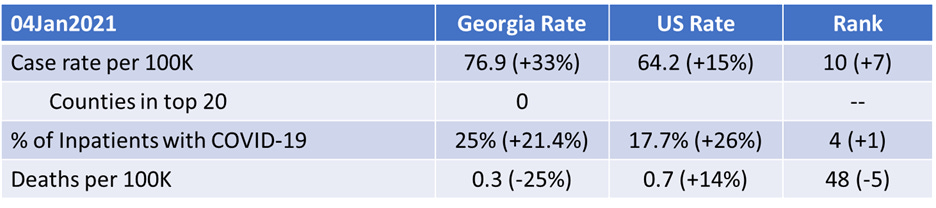
In spite of the holiday data reporting delays, Georgia has seen some dramatic increases in their rankings for case rate per 100,000 (+33%) and the percentage of hospital inpatients with COVID-19. Georgia currently does not have any counties in the list of the top 20 counties for disease rate in the nation. But Upson county is #21. So we aren’t exactly in good shape.
Next, let’s look at how seasonal influenza is impacting different states across the US. You can consult FluView any time you’d like to see this map and other data visualizations. You can read the weekly report from Georgia Department of Public Health here. The maps below show last year’s map for the 52nd week of the year (left side) and this year’s map for the same week on the right side.

Most of the country remains in the minimal zone for influenza, however Mississippi crept up into the moderate category. Compare that to where we were a year ago for week 52 in the map on the left. The things we’re doing to limit the transmission of COVID-19 are also interrupting the transmission of influenza. Of course, COVID-19 is more transmissible than influenza so we aren’t seeing the same impact for COVID-19. But it’s a pretty great way to see what is possible through collective effort. Imagine a map that looked like this for COVID-19 if we could get more people to wear a mask. It is a good thing to see influenza levels as low as they are. So many of us were worried about how co-infections of COVID-19 and influenza would complicate already difficult cases of COVID-19 and strain our healthcare system. I think we can agree that healthcare workers have their hands full as it is. Remember, it’s not too late to get your flu shot. Please do so, if you haven’t already.
Georgia
Normally, in this part of the newsletter I would give you an updated risk map for Georgia, calculated and formatted in the same way as the Brown University School of Public Health but including Georgia’s antigen cases (which DPH does not for any of their graphs or maps). Evidently the person responsible for this tool moved from Harvard to Brown. However, the map isn’t particularly interesting this week since the entire state is in the red category except one county, Liberty county, which is in the orange category. According to the tool’s color coding, that means that 158 of Georgia’s 159 counties have disease rates that are beyond the point that contact tracing can isolate and manage cases. Georgia is on fire with COVID-19.

I would argue that a government intervention of some kind is necessary, whether that’s a mask mandate, a ban on gatherings, limiting indoor dining and bars and prioritizing outdoor service, etc. None of these things will be popular, but they also wouldn’t be forever. If asking people to do the right thing were a viable strategy, it would have worked by now. It hasn’t, so we need to do something else. This surge shows no sign of slowing and our hospitals are strained - today we passed 90% of the state’s ICUs full, something that Georgia Emergency Management Agency used to code as in the red zone in their situation reports. At some point, Georgia needs to decide whether lives matter more than money.
Let’s discuss today’s numbers for Georgia.
Testing: a low output day for PCR testing, with 20,549 new results reported, 20.4% of which were positive. Antigen testing identified 26% of today’s cases.
Cases: cases are often lower on Mondays due to weekend effect. We should expect the numbers to increase tomorrow as laboratories clear through their backlog. Today there was a net increase of 5163 newly reported cases (4030 by PCR, 1133 by antigen test). 36% of the cases came from nonrural counties outside of the Atlanta metro, 25% came from the Atlanta suburbs, 21% came from rural counties and 11% came from the Atlanta counties of Fulton and DeKalb. The top five counties for 14 day case rate are Madison (2316), Miller (1923), Upson (1877), Montgomery (1798) and Toombs (1640). These are all rural counties.
Hospitalizations: today we breached the 5000 mark for the number of patients currently admitted for COVID-19, at 5124. We only crossed the 4000 mark 8 days ago, and before that it took 10 days to go from 3000 to 4000. So this is a pretty rapid rise and it is accelerating. COVID-19 patients represent 31.2% of all patients currently hospitalized in Georgia and this varies by hospital region.

As I mentioned earlier, 90% of the ICU beds in the state are full. According to HHS, 42% of Georgia’s ICU beds are occupied by COVID-19 patients. The demand this disease is placing on our healthcare system is intense. Two regions are coping with an overage, regions B and G. Nine regions (of 14) are using >90% of their ICU beds.
There were 112 new hospital admissions for COVID-19 today and 5 admissions to the ICU. Both of these are low numbers but typical for a Monday.
Deaths: there were 7 newly reported confirmed deaths compared to yesterday’s total. Four of these deaths came from the Atlanta counties. Death reporting on Mondays is typically low due to weekend effect.

References
https://covid.cdc.gov/covid-data-tracker/#vaccinations
https://beta.healthdata.gov/download/gqxm-d9w9/application%2Fpdf
https://dph.georgia.gov/covid-19-daily-status-report
https://covid-gagio.hub.arcgis.com/
Georgia COVID-19 Updates is a free newsletter that depends on reader support. If you wish to subscribe please click the link below. There are free and paid options available.
My Ph.D. is in Medical Microbiology and Immunology. I've worked at places like Creighton University, the Centers for Disease Control & Prevention and Mercer University School of Medicine. All thoughts are my professional opinion and should not be considered medical advice.