The Daily Digest, 02Oct2020
Georgia COVID-19 Updates

Happy Friday! We made it to another weekend. It was a big news day in that we learned that the President of the United States and the First Lady have tested positive for COVID-19 and experiencing symptoms. Hopefully they have mild, uneventful cases of the illness. **UPDATE** in the time I’ve been writing this, I got a news alert that the president is being hospitalized, perhaps for observation. I hope he has a speedy recovery. But it serves as an important reminder that this virus can infect anyone. It’s a good time to refresh our memories of the things we can do to limit disease transmission, including the following:
Wear a mask
Avoid crowds and indoor gatherings (this includes indoor restaurant dining), keep these indoor encounters as brief as possible
Maintain a distance of 6 feet between you and others with whom you do not live
Wash your hands or use hand sanitizer
Avoid unnecessary errands, or find alternate delivery mechanisms
If you do not feel well, even if you think it’s just allergies, stay home
With that, let’s get on to today’s update.
Testing
Today the state of Georgia reported 15,621 new PCR test results through Electronic Laboratory Reporting (ELR). Of those, 907 were positive, or 5.8%. However, there were 1300 new cases today (net increase), so just under 70% of the cases were reported through ELR. The other 393 cases were reported by phone, email, fax, etc. Those sorts of reports often do not provide total tests performed, which is necessary for calculating the percent positive rate. When the reporting is low like it is today, that means that there are an unknown number of total tests that go with that 393 number and it makes our percent positive rate a bit unreliable. This is one of many reasons why we have to be careful about getting too excited about a single day’s data and, instead, we need to be paying more attention to trends.
Today, I’d like to talk about two open questions when it comes to testing in Georgia: (1) are we testing equitably across the state by county type? and (2) with the rapid antigen test now in use, how might this play a role in our current view of the pandemic? I have new data for both of these.
Testing by county type
I’ve discussed previously that Georgia is really fighting two very different pandemics right now - the one happening inside the Atlanta metro and the one outside of it. That’s because case rates and death rates per 100,000 are higher for rural and nonrural counties outside of the Atlanta metro than the Atlanta counties or Atlanta suburbs. I’ve wondered if that’s a function of not testing widely enough outside of the Atlanta metro and so, therefore, we don’t know well enough where the cases are to advise isolation of cases and quarantine of close contacts. Previously, I’ve tried to get the data to identify these trends through the county indicators report from DPH, published weekly, but the data are hard to use and subject to my data entry error since you have to hover over the graph to identify and transcribe the data manually. As a result, I really only had the time to look at the top counties for disease rate for each category, not a representative sample. However, yesterday, DPH expanded the data that are available for download in each day’s report and it included total tests performed each day, for each county. First let’s look at how the percent positive rate (just for PCR tests) have varied over time for each county type, below.
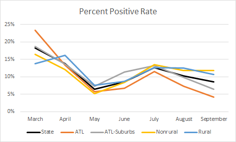
The statewide average is in black. Consistent with my hypothesis that we might not be testing widely enough outside of the Atlanta metro, and that might contribute to their higher case and death rate, rural and nonrural counties have a percent positive rate that is above the state average and above 10%. Meanwhile, the Atlanta metro counties are below the state average, with the Atlanta counties of Fulton and DeKalb performing the best. Next, let’s look at how much of the population is being tested in each county type. The color coding is the same as the previous graph.

This graph surprised me a bit. Atlanta is well above the state average for testing its population. Nonrural counties track along with the statewide average and are just slightly above it in the most recent months. I was expecting rural counties to be below that state average but I was *not* expecting the Atlanta suburbs to be below the state average and certainly not dead last, consistently, for testing per population.
Lastly, let’s zoom in on what happened in the most recent month, in terms of how well we’re doing on test rate and how that compares to case rate for each county type, just for the month of September (based on date of report). You want to see a really big difference between the test rate and the case rate for each county. The closer these bars are to one another, the less likely that we’re testing enough people.

It can be tough to eyeball the differences when the bars for the case rate are as small as they are on this graph. So I’ve calculated the difference between each. The difference matches up well with what we’re seeing for test rate. Atlanta leads the way, with a difference/delta of 6973. Next are nonrural counties outside of the Atlanta metro, with a delta of 5632. Georgia’s delta is 5479, followed by rural counties (4849) and Atlanta suburbs (3122).
So as the state is thinking about allocation of resources, targeted screenings, and public messaging campaigns, it might be helpful to know that rural counties and especially the Atlanta suburbs are underperforming. Despite this, the Atlanta suburbs have a case and death rate that is below the statewide average. But given their large population, it’s important to keep close tabs on what is happening there.
Antigen tests are here
Today, the Department of Public Health issued a press release announcing that 207,000 rapid antigen tests have arrived from the federal government of 3 million that are expected before year’s end.
These tests are fast, easy to perform, less invasive for the patient, do not require extra equipment and are less expensive. They function in many ways the same as a home pregnancy test, but using a nasal swab instead of urine. The downside is that they are less reliable than the PCR test that is considered the gold standard. The PCR test is looking for the genetic fingerprint of the virus and for that reason it is really, really accurate. But, just because it picks up the presence of the virus doesn’t mean that the virus is infectious. Inactivated virus will still have genetic material, especially later in the disease course when a person is recovering. This is part of why it was problematic to require a negative test result prior to returning to work. The antigen test is looking for the presence of viral proteins, those red spikes that the COVID graphics all show. Proteins are less hardy than DNA or RNA (RNA, in the coronavirus case). For example, I can break open a cell and get the genetic material out to run a PCR test, but the process usually inactivates (science word: denatures) all the proteins in the cell. So if the test can detect these proteins, it might be more indicative of a current infection. The rapid antigen test generally is considered to be as reliable as the PCR test in identifying positives, but is less trustworthy when identifying negative test results. So it is recommended to follow up those negatives with a PCR test. In this sense, it is very similar to the rapid strep test that you might have performed in your physician’s office, except in that case, the gold standard is culturing (growing) the organism from a throat swab, rather than PCR.
With its advantages, the rapid antigen test is likely to become very popular, especially in areas where we expect disease to be occurring and where we need to quickly identify those who need to be isolated and quarantine others. It is therefore ideal for places like nursing homes, K-12 schools, colleges and universities, prisons, military barracks, etc. As these tests gain in popularity, there may be a shift toward them at the expense of the PCR test, which is currently the only way that the state of Georgia confirms a case of COVID-19. The CDC changed the case definition on August 5th to reflect the introduction of this new test, calling those identified through rapid antigen test as “presumptive” cases. Some states call them probable cases, to distinguish them from the PCR-confirmed cases. But it has been an open question just how popular these tests are in Georgia since they became available. A follower of the newsletter, Haley Ritger, sent me the results this morning of an open records request for the number of tests performed for PCR, antigen and antibody (serology) tests since the start of the pandemic. With her permission, I’m sharing those data with you below, in graph form and the original can be found here. Each week’s data are presented as a stacked bar, sort of a vertical pie chart, showing us the proportion of each test performed among total tests.

We can see that the PCR test was the only test we had until mid-April and then the antibody test (that looks for recent or past infection) came online. But the initial popularity of that test waned as we learned that there were big problems with reliability of the test. The antigen test entered the scene during the week of July 19th and have ebbed and flowed in relative use since then. One of the open questions was how popular have these tests been, and how many “presumptive” cases are they identifying that we aren’t seeing in the case and hospitalization totals because they aren’t used to confirm a case? We still can’t answer the second question, but at least we can answer the first. Since the test came on the market, the rapid antigen test has made up anywhere from 1 - 10% of the total tests performed each week. Thank you, again, to Haley for sending me the data. Similarly, I welcome all data that folks want to share. Just please be kind and respectful when you write an open records request. I imagine that the DPH gets a lot of them and I think they do a better job than other states I’m working with at getting that information to us when we ask for it.
Whew, that’s a lot of talk about testing. I’ll try to be less wordy and hit the highlights for cases, hospitalizations and deaths today.
Cases
Net increase of 1300 cases, updated statewide total is 320,634
41% came from nonrural counties, 31% from rural counties, 20% from Atlanta suburbs, 12% from Atlanta. Note, these don’t add up to 100% because of flux in the unknown and non-Georgia resident categories.
The latest school-aged surveillance report came out today. Many things are going down, but whether this is real or an artifact of the antigen test impact is unclear. There were some interesting things to note, however:
Emergency Department visits for influenza-like illness are climbing for 0-4 year olds. Influenza looks a lot like COVID-19, and influenza season hasn’t fully kicked off yet either. Children in this age group are less likely to wear masks because we don’t recommend them for kids under the age of 2. Whether this increase is COVID in disguise, or reflects anxious parents with nonverbal or semi-verbal kids, is unknown. I remember all too well panicking over everything when my boys were young.
Testing for COVID-19 is also picking up among those aged 0-4. The y-axes for these graphs are too compressed to be informative, but it’s possible that positives are picking up too, or leveled off after recent increase.

There are more school-associated outbreaks this week than in the past two weeks. The state does not distinguish K-12 versus college/university in the “school” category.


Hospitalizations
123 new hospital admissions for COVID (low for a weekday) as well as 37 new ICU admissions (consistent with other days this week).
30% of adult ventilators are in use, for all reasons, not just COVID-19
There are 1270 people currently hospitalized for COVID. We haven’t been below 1300 since 28June. So this is really good.
Two hospital regions are using >90% of their ICUs: region E (94.3%) and H (90%)
Deaths
43 newly reported deaths. New statewide total is 7106. The case fatality rate ticked up today to 2.22%. This number is high for this week, but more or less an average weekday number for us based on the last few weeks.
42% of the deaths came from rural counties, 35% came from nonrural counties outside the Atlanta metro. 14% came from the Atlanta suburbs and 9% came from Atlanta. Note these may not add to 100% because of changes in the unknown and non-Georgia resident categories.
References
https://dph.georgia.gov/press-releases/2020-10-02/207000-abbott-binaxnow-rapid-covid-19-tests-arrive-georgia
https://www.cdc.gov/coronavirus/2019-ncov/lab/resources/antigen-tests-guidelines.html
https://wwwn.cdc.gov/nndss/conditions/coronavirus-disease-2019-covid-19/case-definition/2020/08/05/
https://drive.google.com/file/d/1yzHHSGAux-iun23wGPuD5ompg3LMQ_wD/view?usp=sharing
https://epidemiologyschoolreport.s3.amazonaws.com/SchoolAgeSurveillance921.html
https://dph.georgia.gov/covid-19-daily-status-report
https://covid-gagio.hub.arcgis.com/
Georgia COVID-19 Updates is a free newsletter that depends on reader support. If you wish to subscribe please click the link below. There are free and paid options available.
My Ph.D. is in Medical Microbiology and Immunology. I've worked at places like Creighton University, the Centers for Disease Control & Prevention and Mercer University School of Medicine. All thoughts are my professional opinion and should not be considered medical advice.