

The Daily Digest, 02Nov2020
Georgia COVID-19 Updates

The World

Globally, the SARS-CoV-2 virus that causes COVID-19 disease has sickened > 46.6 million people (+3.5 million since last week) and killed 1,201,400 (+46,500 in the past week) as of this morning.
The US is ranked in the top color category for hot spots, where the dark red represents counties with >14 average daily case rate per 100,000 for the past week. The hottest spots right now are in Europe. We are ranked 30th in the world for weekly case rate over the past 7 days (last week, 33rd). The New York Times coronavirus tracker changed the way they report the data this week - from weekly case rate per 100,000 to average daily case rate per 100,000 over the past week. Using this new method of reporting, the average daily case rate for the US is 25 per 100,000. The top five countries for average daily case rate per 100,000 in the past week are Belgium, Andorra, Czech Republic, Luxembourg, and Slovenia.
The change in the way the NYT coronavirus tracker reports cases is also true for deaths. For deaths, our average daily death rate per 100,000 over the past week is 0.2 and we are ranked #39 in the world for this (#30 last week). The top five countries for average daily death rate per 100,000 in the most recent week are Czech Republic, Belgium, Andorra, Montenegro, and Armenia.
The United States

As hot spots go, they didn’t move that much this week but got more intense. They are mainly concentrated throughout the Midwest. There are increases along the I-25 corridor in Colorado and in Omaha, Nebraska. As of this morning, there have been over 9.2 million cases and 230,937 deaths in the US. Keep in mind that both of these numbers are probably an under-count of the situation in our country. Georgia is about the same as last week, but they do note increases along the Alabama border (Stewart county). Note, the New York Times coronavirus tracker *IS* now including the antigen test-identified positives that Georgia DPH reports each Monday in the County Indicators Report.
Cases: Georgia is ranked #37 in the nation for average daily case rate per 100,000 over the past week, at a rate of 18. Of the top 10 states for average daily case rate per 100,000 over the past week, none are in the South.
Georgia has no counties in the top 20 counties in the nation list for cases per 100,000 in the past week. We also don’t have any cities in the top 20 for case rate per population.
Testing: In the past week, Georgia increased slightly in the rankings from 40th in the nation (198 tests performed per 100,000 in the past 2 weeks) to 43rd in the nation, with a testing rate of 192 tests per 100,000. Meanwhile, the national average is 361 tests per 100,000. The Harvard Global Health Institute together with the New York Times, estimates that Georgia is performing at 40% of the ideal testing target (down slightly from 46% last week).
Hospitalizations: Georgia is now ranked #11 in the nation (down from #4 last week) for proportion of inpatient beds occupied by COVID patients at 9.7% (down very slightly from 9.8% last week). The top three states in the continental US for this metric are South Dakota, Montana and North Dakota. Meanwhile, the hospitalization rate for Guam is 19.5%. These data come from the Health and Human Services dashboard which was last updated 30Oct2020.

Deaths: For average daily death rate per 100,000 over the past week, the rate for Georgia is 0.2 and we are ranked #33 for this. There are no southern states in the top 10 this week.
Influenza: Here’s the latest look at FluView, showing how influenza-like illness compares across states. The map below depicts how states compare when considering the average percent of outpatient (meaning, not warranting a hospital admission) visits for influenza-like illness for the current week compared to non-influenza season weeks.

Compared to last week, ILI activity decreased in Connecticut. However, ILI activity increased in Idaho, North Dakota, Oklahoma, Kentucky, and New Hampshire. Georgia remains in the most minimal of the minimal section. Keep in mind that influenza is not a mandatory notifiable disease for public health departments like COVID-19 is. But there is a robust surveillance network for tracking trends. So we aren’t likely to see case counts and death counts like we do for COVID-19 because we are seeing estimates for influenza rather than actual numbers. Both diseases feature a wide spectrum of disease severity that can make it hard to identify all cases. You can read the weekly report from Georgia Department of Public Health here.
Georgia
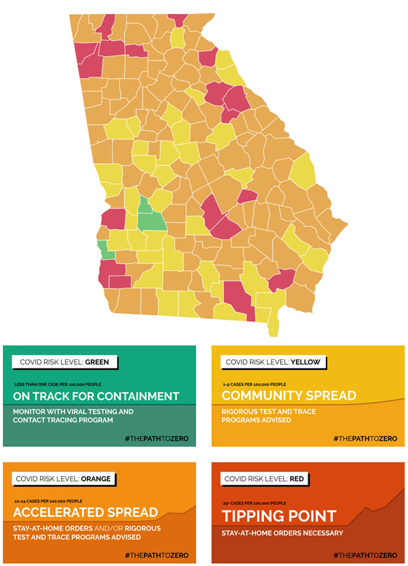
Note that the color categories for these counties are not comparable to the color categories in the White House Coronavirus Task Force reports. The former is concerned with average daily case rate per 100,000 in the past week. The latter is concerned with weekly case rate per 100,000.
There are some noticeable shifts this week. There’s more red in the north east counties of Oglethorpe, Wilkes and Taliaferro. There are also some shifts in the northwest corner of the state. There are three green counties which is the same as last week. Meanwhile, there are 37 yellow counties this week, compared to 49 last week. For yellow counties, there is community spread that might be manageable with adequate testing and contact tracing. There are 119 counties that have a daily average of >10 cases per 100,000 people which are color-coded orange and red (up from 107). So they remain counties of concern.
For today, here are the net increases for each key metric for Georgia.
Testing: 12,589 new tests (a low day for us, but typical for a Monday), 8.4% were positive. 112% of today’s cases were identified through electronic laboratory reporting (ELR), so there are a few duplicate results in today’s report. The state counts tests regardless of whether they come from the same person in their calculation of percent positive rate - it is all positive tests divided by all tests performed (positive and negative). However, multiple positive tests from the same person are de-duplicated when case counts are tallied. So the case count is where the correction is made for duplicates. Only 5% of the newly reported cases were backdated prior to the 14d window of uncertainty. So 95% of the cases reported today are recent.
Cases: 939 cases were newly reported today. Mondays are often low reporting days due to weekend effect, but for the past two weeks the Monday number has been >900. If that’s our low day, then it does make you worry for what the rest of the week will bring. The new statewide total is 362,921. Of today’s cases, 34% came from nonrural counties outside of the Atlanta metro. Atlanta suburb counties contributed 32% of cases.
Hospitalizations: 15 new COVID hospital admissions and 2 new ICU admissions (these are low numbers for Georgia, and less than we saw last Monday). There are currently 1424 COVID patients hospitalized and this number is 19 additional patients compared to last Monday. Adult ventilators are being used at 27% of our state’s capacity as of today, and this is consistent with where we’ve been recently and where levels were prior to the summer surge.
There are four hospital regions that are using over >90% ICU beds: region C (157.1% <-this is likely a typo), G (91.6%), H (97.4%), and N (94.8%).
Deaths: 18 newly reported deaths. It should be noted that nursing homes typically do not report over the weekends, and Mondays tend to be low count days for this reason. Thirteen of the deaths reported today came from outside of the Atlanta metro with rural counties leading with 10 newly reported deaths. The new statewide total is 7999. The case fatality rate is decreasing and is now at 2.20%. During the summer surge we saw the CFR decrease as deaths were diluted by large increases in cases. It’s too soon to know whether we’re seeing the same thing now, but that’s the trend we saw in the past.
The Georgia Department of Public Health County Indicators report is released on Mondays. This report provides a lot of county level data, including testing, confirmed and probable cases (i.e. those identified through the rapid antigen test) and the counties of concern as far as DPH is concerned. In the most recent week, there were 2,595 antigen test-identified cases reported, 258 more than the week prior. In the map below, you’ll find how many of the week’s new cases were due to antigen test positives. These would be in addition to what is reported for each county in the daily situation report. If you click on the image it will take you to a live version of the map where your county’s information (and %) will pop up to make interpretation easier. Bleckley county was this week’s most heavily impacted county, with antigen test-identified cases representing 150% of what the confirmed case total for the week indicates. It means there was a lot more disease there than we previously realized.

Here’s a comparison of where the emerging counties are (this is code for “counties of concern”) last week compared to this week, on the right.

The map is subdivided according to public health districts, not hospital regions. According to the new map, it seems that things have calmed for Fulton and DeKalb, but several suburbs remain in the red. Similarly, this map would indicate that things have calmed in northwest Georgia, shifting eastward to the Atlanta suburbs. Notably, this week’s map indicates greater intensity for the southern border with Florida and the Georgia coast.
The White House Coronavirus Task Force reports are produced and released on Sundays but I usually don’t get a copy until Monday/Tuesday. So I’ll be back with that analysis on Wednesday.
References
https://www.nytimes.com/interactive/2020/us/coronavirus-us-cases.html
https://www.nytimes.com/interactive/2020/world/coronavirus-maps.html
https://protect-public.hhs.gov/pages/hospital-capacity
https://globalepidemics.org/key-metrics-for-covid-suppression/
https://www.cdc.gov/flu/weekly/index.htm
https://dph.georgia.gov/covid-19-daily-status-report
https://covid-gagio.hub.arcgis.com/
https://dph.georgia.gov/epidemiology/influenza/flu-activity-georgia
https://dph.georgia.gov/county-indicator-reports
Georgia COVID-19 Updates is a free newsletter that depends on reader support. If you wish to subscribe please click the link below. There are free and paid options available.
My Ph.D. is in Medical Microbiology and Immunology. I've worked at places like Creighton University, the Centers for Disease Control & Prevention and Mercer University School of Medicine. All thoughts are my professional opinion and should not be considered medical advice.