

The Daily Digest, 01July2020
Georgia COVID-19 Updates

Wow. Everyday I wince and brace for impact when I check the Georgia Department of Public Health website, as I’m sure many of you do also. Today was a day that sort of takes your breath away. We didn’t just surpass our previous record for new cases, we blew it away.
It’s hard to ignore the mental impact of all of this strain that we’ve been in for months now. As we begin a new month, I’m reminded that we’ve been living in this dystopian situation for 4 months now here in Georgia. I spoke with a pastor this week and we talked about funerals in the time of COVID-19 and the way that grief is abbreviated and not as full as we are accustomed to experiencing. In the time that families need their loved ones for comfort the most, we have to keep everyone at arm’s length. Even without losing a loved one in this, but supporting friends who have, and seeing the data everyday it feels like I’ve been living through the grief process for a long time. I don’t want to turn this newsletter into a diary entry, but I just wanted to let you know that if you’re struggling with all of this you are not weird or abnormal. A lot of us are having a hard time. And hard times are going to continue for a bit, unfortunately.
The news I have today isn’t good. I can’t promise that you’ll feel better after reading this. But let’s understand what’s happening so that you can make data-driven decisions.
Testing
It was a good day for testing, with 21,508 tests results reported today. Using a 7-day average to observe the trend, you can see that we are right about at our previous peak output for testing. But rather than reaching that peak through large spikes, we have more consistent testing and I think this is a good thing.

Cases
As I stated in the introduction, we set a new record today and it was a big one. Our previous record was 2225 (set last Saturday) and today we had 2946 new cases. This means that of the tests reported today, we had a 13.7% positive rate. On March 30th, our total case count was 2809. So today alone, we reported as many cases as we did in almost all of March. The total case count now is 84,237. To put that number into context, the Clemson football stadium has a seating capacity of 86,092. Not all of these folks are sick at once, but that’s the impact so far. Understand that this case count is likely an under-count because we had limited testing capacity in the early days and an estimated 1 in 5 infected persons will not show symptoms and might not seek testing. Below you can see how new case reports (by date of report) have varied over time.

Below you can see how cases and deaths have accumulated over time. We’ll talk about deaths in a moment, but I think seeing these together shows something interesting. While deaths have leveled off, cases have curved upward.

A new resource came out today from a group at Harvard University who is trying to make data more meaningful for the public - yay! I think it’s a neat tool, but when I worked with it I noticed that it’s working with data for Georgia that are 4 days old. I’m hopeful they’ll be able to sync their data in real time or at least within the last 24 hours. Here’s how they show the map of Georgia and then I’ll show what the colors mean.
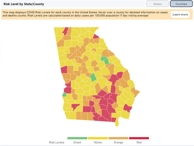
So remember that the map is built on old data. We were talking about Troup county on the Alabama border last week and we know that the Georgia coast is a much hotter spot this week, but this map doesn’t show that yet. Still, it shows only four of Georgia’s 159 counties (2.5%) are on track for containment according to the color coding provided below. I know there has been a lot of confusion over the Department of Education decision tree guidance regarding reopening schools in a few short weeks. The guidance is helpful, but it isn’t actionable unless a school administrator has a way to identify their community’s level of disease spread. A tool like the Harvard one may be useful in that scenario. But I think this tool has broader application beyond schools as well.

For today, here are my counties of concern. To make this list a county needs to have at least 5% overnight increase AND >25% 7-day increase. I’ve kept a couple on the list for today that don’t meet the first threshold - they could have just had a low testing output day. If they continue to have smaller 24-hr increase tomorrow then they’ll fall off the list. Those affected counties are shaded in tan. I’ve highlighted counties with >50% 7-day increase using red text.

A lot of these counties are clustered in the south and eastern parts of the state. Almost the whole coastline is impacted. Central Georgia is also heating up with increases in Bibb and Jones counties. There’s a decent mix of rural and nonrural counties and notably none of these are associated with the Atlanta counties or its suburbs. That’s not to say that the disease isn’t spreading in those counties - but rather that they have more of a steady increase rather than spikes, and they haven’t surpassed the threshold for inclusion on this list.
Hospitalizations
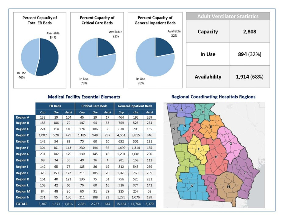
It was a big day for hospitalizations too. Current hospitalizations increased by 111 (+7.6%). We have now surpassed the highest recorded data point previously provided by Georgia Emergency Management Agency. This is likely also an under-count since these cases do not account for those who tested positive for COVID-19 and then required hospitalization afterwards.

Across the state, 78% of our critical care beds are in use right now and that is a key resource for managing the most severe forms of COVID-19. Hospital regions E and H have been plagued with low critical care bed availability for a while now and today we see that they have 10 and 4 beds, respectively. Keep in mind that these beds tracked on the GEMA situation report are taken up by non-COVID-19 patients also for other ailments, elective procedures, etc.
Deaths
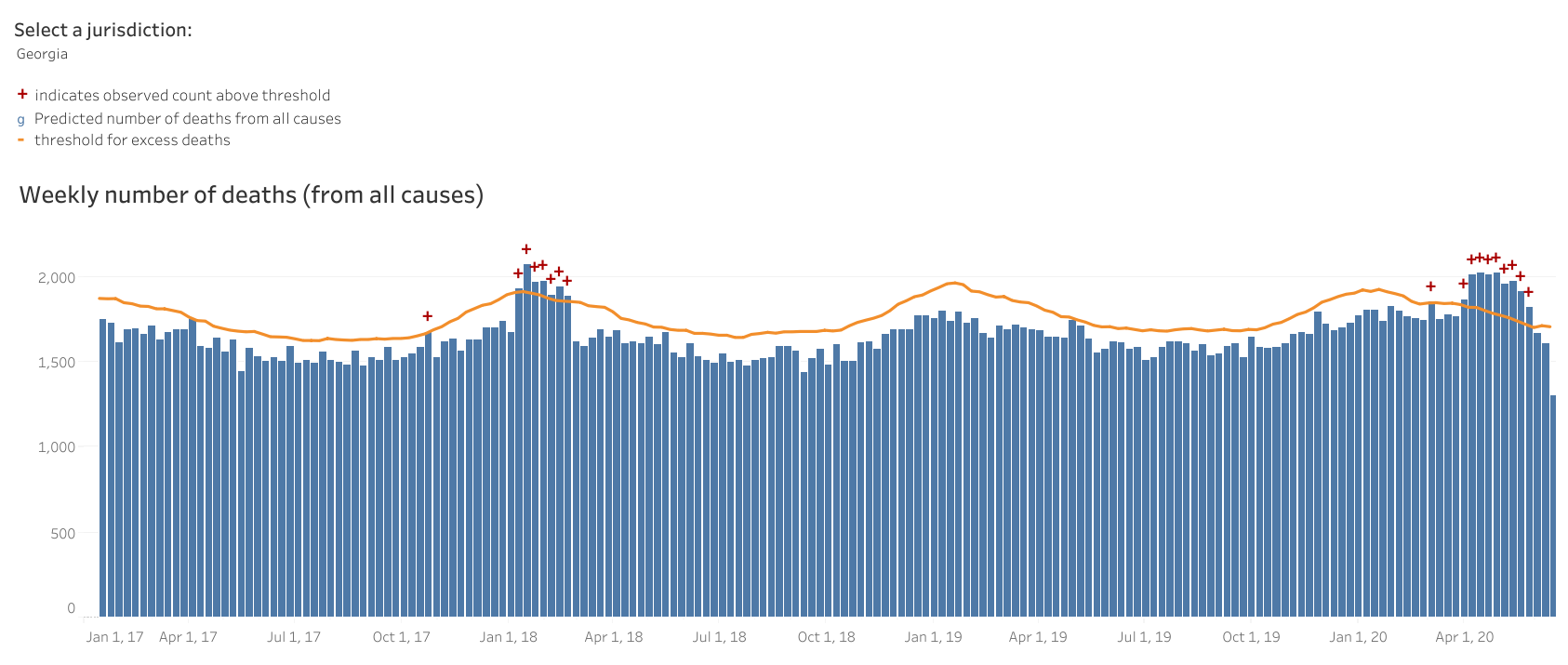
There were 22 deaths reported today - a medium-low day for us. About half of these deaths came from nonrural counties that aren’t part of the Atlanta metro. The new statewide total is 2827. Like cases and hospitalizations, this might be an under-count too. In order to see the impact that COVID-19 has had on our death rate, we may have to rely upon looking at all deaths that have happened in 2020 and how do they compare to deaths at this time in previous years. Deaths above a particular threshold in this analysis are called excess deaths. Here is the excess death chart for Georgia. Anything above the orange line is excess. You can see that we have been above the threshold for about 2 months.
References
https://dph.georgia.gov/covid-19-daily-status-report
https://www.facebook.com/GEMA.OHS/photos/pcb.10158127697436391/10158127696586391/?type=3&theater
https://www.cdc.gov/nchs/nvss/vsrr/covid19/excess_deaths.htm
https://www.georgiainsights.com/uploads/1/2/2/2/122221993/georgias_k-12_recovery_plan.pdf
https://globalepidemics.org/key-metrics-for-covid-suppression/