

The COVID Digest, 26May2022
Long COVID

National
Below we can see the Community Transmission Level maps from CDC for the week of 12May and today, 26May, so roughly 2 weeks apart. You can see how much COVID-19 has intensified over a short amount of time. The number of high and substantial counties (red and orange, respectively) has risen from 64% to 77% in two week’s time. And because of the popularity of home antigen tests, the end of federal reimbursement for the uninsured to get tested, people who now discount COVID-19 symptoms as “allergies,” etc, these maps represent the best case scenario. The true disease burden is likely far worse than what we see below.

These maps are important for estimating the risk that you will be exposed to COVID-19. That can be pretty important if you’re immunocompromised, have an underlying condition, hoping to avoid Long COVID, or just have events and plans that you don’t want to miss because of a preventable infection.
Long COVID
Speaking of Long COVID, the CDC’s Morbidity and Mortality Weekly Report released a large study this week that shows Long COVID is more common than we may have thought. This is important because we’ve had a lot of anecdotal estimates of the prevalence of Long COVID or small studies with relatively few people. In this study, they looked at the electronic health records of people who received a diagnosis of COVID-19 or positive COVID-19 test result in an emergency room, inpatient or outpatient facility between March 2020 and November 2021 (so before Omicron), a total of 353,164 unique individuals. They paired each of these positive cases with a person who also visited for care during that time but did not have a COVID-19 diagnosis or positive test result (1,640,776 control patients). They followed each of these patients for a month to a year, on the lookout in their electronic health record for new medical conditions. For those 18-64, 38.2% COVID-19 survivors had a new condition compared to 14.4% of controls. For those 65+, 45.4% of COVID-19 survivors had a new condition compared to 18.5% of controls. The risk difference between those with COVID-19 versus those without is one in five COVID-19 survivors aged 18-64. For those 65+, one in four COVID-19 survivors developed a new condition. Some of the most commonly found conditions are shown below.

This sort of flies in the face of those who insist that COVID-19 is mild and we should just move on. If we are resigned to the idea that everyone in this country is going to get this infection and there’s a one in five risk of developing a long term condition that could result in disability (even with mild infections), that means about 65.6 million newly disabled Americans, not including the people who don’t survive the initial infection. How do we take care of this many people? For those who are primarily concerned with the economy, who see these infections and deaths as numbers of people in or out of the workforce, how will 65 million sidelined people who might otherwise be able to work impact our economy? Are the short term gains of powering through mass infection to keep the economy running for two years worth the decades’ long harm in lost productivity, quality of life, and dreams cut short yet to come?
And as a reminder, this study looked at the numbers prior to Omicron. It’s possible things have gotten worse since then. Telling people they can go back to work and school on day 5 of their infection (while they are still positive) and that masks are no longer required on mass transit and in crowded spaces as cases soar all but guarantees preventable mass-disability. It feels like our government knows this information (it’s their study, after all) but is paralyzed and unable or unwilling to do anything about it. We don’t seem to have a functioning government and that is rather scary.
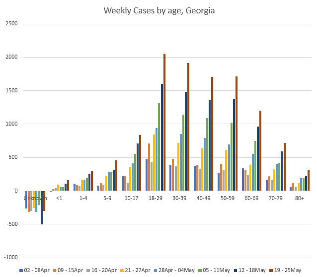
Georgia
Let’s take a deep dive on the Georgia data this week. Cases (PCR + antigen) are rising fast for Georgia. The graph below comes from the Georgia Department of Public Health.

And if we break down the PCR cases by age group (GA DPH does not provide demographic data for antigen test-identified cases), then we can see that cases are growing among all age groups. That growth is rather intense for those 50-59 (+526% since the week of 02-08Apr) and 5-9 year olds (+505%). For those aged 5+, the growth over the past 8 weeks is at least +253% (60-69). Keep in mind that on average, 1 in 5 of these adults being infected will likely develop Long COVID. And we are still near the base of the surge that is gaining momentum right now.
Not only are cases rising, but so are hospitalizations and ICU admissions associated with COVID-19. The graph below shows these metrics since the week of 05Apr2020, when Georgia first began providing these data to the public. Hospital admissions are shown in orange and correspond with the left y-axis. ICU admissions are shown in gray and correspond with the right y-axis. We can see that these metrics trend together, with the exception of Delta and Omicron. For these most recent waves, there were approximately the same number of patients admitted to the hospital at the peaks compared to previous waves. But ICU admissions have been less at peak with each successive wave since the summer surge of 2020 (which incidentally began 2 weeks after Memorial Day weekend - make good choices this weekend). This decoupling of hospital admissions and ICU admissions could be a result of vaccinations that lessen the severity of COVID-19 complications. Another grim possibility is that COVID-19 had already killed a lot of the most vulnerable in previous waves. In any case, both hospital admissions and ICU admissions are trending up together in recent weeks for Georgia.

Let’s look at the age breakdown for hospitalizations, like we did for cases. For some age groups, hospitalizations are high, but not necessarily higher than they were 8 weeks ago (i.e. 10-17, 30-69 and 80+). But hospital admissions have risen from 0 to 8 for 5-9 year olds, +100% for 18-29 year olds (or twice as many as 8 weeks ago), and +20% for 70-79 year olds. That 18-29 year group is particularly striking.

Another thing to pay attention to is how many patients are currently in the hospital with COVID-19 (called patient census). The graphs to follow come from the Georgia Geospatial Information Office data hub. First, let’s look at the whole state. You can see that the patient census curve is bending upward. We’ve seen this before right before hospitalizations surge upward and hospitals become overwhelmed. There are a lot of people engaging in magical thinking that somehow this wave will be different, simply because they say so. We should prepare as though this will happen again until it doesn’t.

At this point, because a lot of the recent case growth is associated with populated areas, the COVID-19 patient census for the state more or less mirrors that of Atlanta. Below, you can see the patient census curves for Regions D (Atlanta) and N (Northwest Atlanta suburbs). Both look poised to start exponential growth day now.

I hope that you are able to be with people who matter to you this weekend and that you’re able to do so as safely as possible. I hope that you will continue to care about the harm that we can prevent. Thank you for reading.
Thank you for your support of the COVID Digest.
My Ph.D. is in Medical Microbiology and Immunology and I am Chair of the Division of Natural Sciences and Mathematics at the University of Saint Mary. I've worked at places like Creighton University, the Centers for Disease Control & Prevention and Mercer University School of Medicine. All thoughts are my professional opinion, do not represent the views or opinions of my employer and should not be considered medical advice.
I agree 100% with Ms. Schmidtke that some people have magical thinking . Just look at the graphs that are posted. I will be wearing a mask, and being cautious as long as I feel like I should. What shocks me is the number of doctors that are no longer wearing masks.
I just saw on the Mayo Clinic site that GA. currently has a 12.3% positivity rate. Is this correct?