

The COVID Digest, 24Sep2021
On the road from Omaha

This weekend my family is camping near Omaha as we are helping my in-laws to downsize from a house they owned for 50 years into an apartment. It’s great to live close enough to help with this kind of thing, but it’s bittersweet all the same. To be honest, my in-laws were the people I was most afraid for with respect to surviving the pandemic. We haven’t always gotten along but I remember being so relieved when they got their vaccines back in February.
My 10-year old never did test positive for COVID-19 during quarantine so it really was more of a childcare problem than a healthcare problem. He is back to school eligibility now and we are all super thankful.
Let’s move on to the latest statistics for COVID-19 in Georgia. There’s something weird in the data this week. Take a look and see if you can spot it.

This week, here’s how the four metrics in the graph above compare to the previous week’s totals:
Cases are down 21%
Hospital admissions are up 26%
ICU admissions are about the same as the previous week
Deaths are up 16%
The strange thing is what happened with hospital admissions for COVID-19. In the past we’ve seen cases and hospital admissions trend together with pretty high fidelity. It’s possible that the bounce in hospital data is due to the Labor Day holiday - either the product of delayed reporting (though that’s not as common for hospitalizations) and/or people who were exposed during Labor Day activities now needing a hospital. We’ll talk more about this in a bit. Deaths continue to rise, nearly to record-setting levels. So without a doubt, the delta death wave is going to be as bad if not worse than the winter surge. Many had hoped that we wouldn’t see so many deaths this time around due to the availability of the vaccine and the way that it was prioritized for older adults who are most at-risk of death.
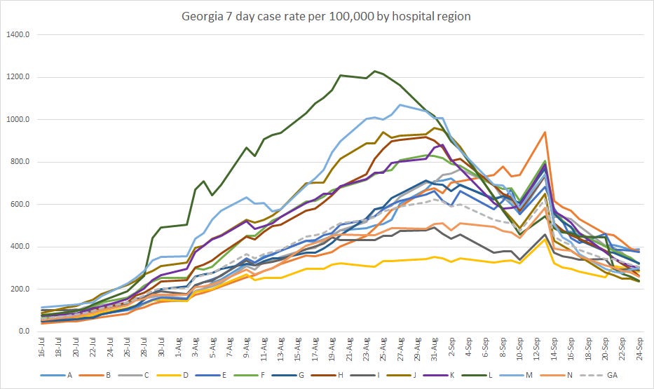
If we look across Georgia’s hospital regions, we can see that almost all regions are in decline, but a few have leveled off. The regions correspond to the map below.

But let’s talk a bit more about hospitalizations. Remember, we’ve seen an increase in the past week for new COVID-19 admissions. Let’s see how those hospital admissions were distributed across age groups. The increase was observed for every age group 10 and older. It’s unclear if this will be a one week thing, or part of a larger trend. We are about 2.5 weeks after Labor Day now, which is right when we might expect to see some things increase. It might just be that the delta variant found the unlucky people that might be more in need of a hospital bed.

The graph above can be confusing when you look at the graph below that shows COVID-19 patient census where the trend is continuing downward. But the two graphs measure different things. The bar graph above is measuring new COVID-19 hospital admissions. The graph below is measuring how many COVID-19 patients are currently hospitalized each day.
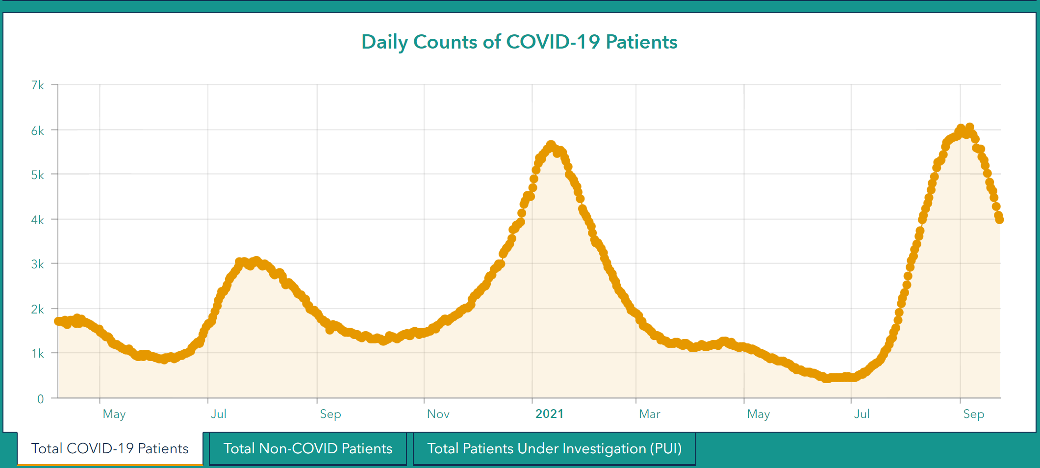
Current hospitalization is the result of admissions minus discharges. During the run up of the delta wave, there were more admissions than discharges so we saw an upward trend. Now that patient census is turning down, that means that discharges are outpacing admissions (usually a good thing). We know there are more admissions this week than last week. But the trend continues downward for patient census. That means that as big as admissions are, discharges are even greater. And it’s unlikely that healthcare workers suddenly figured out a miracle treatment for COVID-19. Given the high number of deaths this week, it’s likely that the downward trend isn’t entirely due to discharges alone. It is likely that people are dying and freeing up a bed, rather than being discharged. So for as wonderful as it might feel to see the patient census decline as it is, understand that it is with a great cost.
But things are getting better. Survival rates for those entering an ICU for COVID-19 are not great, despite the heroic actions of intensive care specialists, nurses and respiratory therapists. So one way to limit deaths is to limit ICU admissions. We’re starting to see ICU bed usage trend downward. Like patient census, this is not new admissions, but how many beds are occupied. You can see that we came perilously close to 100% usage with the delta wave. But things are trending down again.

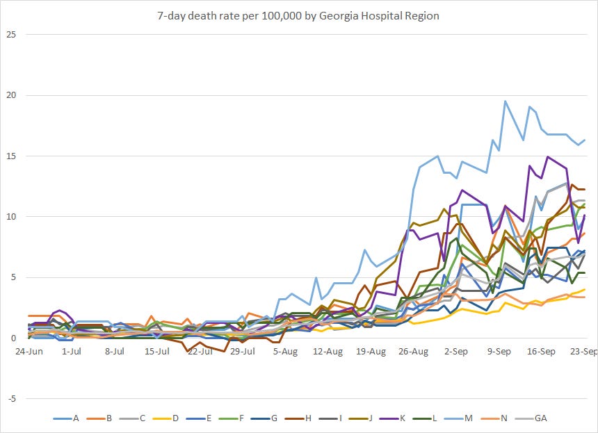
As mentioned above, deaths continue to rise this week. If the trends of the past continue here, we might expect this next week to be the peak of the delta death wave. The reason I say this is that the death surge began 4 weeks after the case surge began. And it’s been 3 weeks since the cases peaked. The graph below shows how death rate compares across Georgia hospital regions. Hospital region M continues to have the highest death rate. Hospital regions F (Henry, Bibb, Houston counties) and H (Milledgeville - Dublin, etc) has a rising death rate also. But the death rate of hospital region D (metro Atlanta) is creeping up slowly too. Remember, this graph is based on deaths by county of residence, grouped by hospital region, not location of death.
Lastly, let’s take a look at which age groups are most impacted by the surge in deaths. Deaths continue to rise for all age groups 30 and older. A reminder, most if not all of these deaths are preventable with a free, safe and effective vaccine. You can find your nearest dose at www.vaccines.gov.

This week I was invited to join the University of Kansas Health System’s Morning Medical Update to talk about COVID-19 disease trends and lessons learned from the way that the delta variant impacted the state of Georgia. It is my hope that painful as these lessons were to learn, other states can avoid similar needless death and suffering. If you’d like to see my summary of the data you can watch the episode here.
The last thing I wanted to share was an update to the COVID-19 Event Risk Assessment Tool from Georgia Tech. One of its developers, Dr. Joshua Weitz, reached out to me to make sure I saw it and it is really pretty neat. In addition to being able to see the risk of someone being COVID-19 positive at an event size of your choosing by county, you can now play a game in the middle of the page that helps you to see if you are underestimating or overestimating risk for different settings in your county of interest. For the most part I was spot on, but I was surprised that the risk for a small setting of 20 people wasn’t higher than it was in my county. I hope you’ll consider trying it out and adjust your risk tolerance, especially if you’re underestimating risk.
The screenshot below shows the risk for a group of 25 people, like a classroom, for Cobb county. The numbers are hard to read, but the risk of someone being positive in that setting is 43%, just short of a coin toss. You can find your county and toggle the settings to learn more about your area.

Unless otherwise noted, the source data for all of these graphs is from the Georgia Department of Public Health daily status report and the Georgia Geospatial Information Office COVID-19 Data Hub. Many thanks to the public health data heroes at these organizations for providing these data to the public on a near-daily basis. Not all states offer this level of transparency.
The COVID Digest is a free newsletter that depends on reader support. If you wish to subscribe please click the link below. There are free and paid options available.
My Ph.D. is in Medical Microbiology and Immunology and I am Chair of the Division of Natural Sciences and Mathematics at the University of Saint Mary. I've worked at places like Creighton University, the Centers for Disease Control & Prevention and Mercer University School of Medicine. All thoughts are my professional opinion, do not represent the views or opinions of my employer and should not be considered medical advice.