

The COVID Digest, 20May2021
Georgia COVID-19 Updates

The rural - urban divide
This week a new article in the Morbidity and Mortality Weekly Report (MMWR) came out that discusses the rural - urban divide when it comes to vaccinations. Georgia is one of three states where county of residence data was less than 80% of the vaccine recipients. So we are a little limited on what we can see with respect to Georgia. But we can see a lot from the national picture. They collected data from December 14, 2020 through April 10, 2021 for 49 states and the District of Columbia for people who had received at least one dose of a COVID-19 vaccine. Using the county of residence they were able to classify people as coming from different population types including large central metropolitan (Georgia has just one - Fulton), large fringe metropolitan (ex. DeKalb or Carroll), medium metro (ex. Chatham, Muscogee), small metro (ex. Bibb, Lowndes), micropolitan (ex. Laurens, Tift) and non-core (ex. Dodge, Rabun). This is one way to classify the rural-urban spectrum. Another is the two-level urban-rural classification where micropolitan and non-core counties are rural and everything else is considered urban. Using the population data provided in the HHS Community Profile Reports, Georgia’s population has the following breakdown for the two different ways of defining rural versus urban. Remember, this isn’t based on how many counties fit into these categories, but how many people fit into them. Using the 2-level classification, 17% of Georgia residents live in a rural county.

Using the two-level system, they found significant vaccination disparities nationally where 45.7% of the urban population had received 1+ dose compared to 38.9% of the rural population. For Georgia, the difference was 20.7% versus 12.9%. But, again, we have to be really careful about reading too much into the Georgia data since the state had a lot of missing data for county of residence. Nationally the disparities also existed for rural versus urban across sex and age.
For some states, including places like California, Colorado, Georgia, Kansas, and Minnesota, more urban than rural residents had to travel outside of their county of residence to get their first vaccine. In a lot of the states, the opposite was true, where rural residents were more likely to have to travel outside of their county of residence. If we look at the breakdown across the 6-level system, we can see that the large fringe metropolitan areas were the ones least likely to be vaccinated in their county of residence, but were the largest group to find the vaccine in an adjacent county. Non-core, the most rural of rural county types, were the second most likely county type to show this trend. Proximity to a vaccine may mean you need transportation to get there. Transportation is a significant barrier to access for some.

Again, the data for Georgia from this study are problematic because of incomplete data. This was also the case for South Dakota and West Virginia. This is an ongoing problem for the state, in terms of what is reported to HHS. But it might help us to estimate the trend. When we look at rates of disease we often identify disproportionately impacted populations by comparing disease burden and metrics against that population’s share of the overall population. The graph below helps us to do that. The breakdown of how much of the Georgia population fits into each class is shown in blue. The proportion of people who had received 1+ dose by April 10 divided into their respective county type is shown in red. What we want to look for are county types that are outperforming or underperforming (red bar) compared to their share of the Georgia population (blue bar).
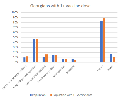
Starting with the 2-level classification system on the right, urban counties in Georgia are outperforming but rural counties are underperforming when it comes to getting 1+ dose of the vaccine. If we look at the 6-level system we see that large central metropolitan (Fulton county) and medium metropolitan county types are outperforming, where the others are even (micropolitan) or underperforming.
And this got me thinking about whether we are targeting the vaccines to where they need to go, and also whether certain populations recognize how COVID-19 has impacted their community. Of course, we need as many people vaccinated as possible and I’m thrilled by the success of the outperforming counties. But let’s look at how COVID-19 has impacted the rural-urban divide as of yesterday (19May2021). In the graph below, we are looking at the 2-level classification. What we can see is that urban counties make up 83% of the Georgia population. They have had the expected proportion of cases (82% is pretty close to 83%) but are underperforming on hospitalizations and deaths. That’s a good thing! The opposite is true if we look at rural counties. Like the urban counties, rural counties have the expected share of cases since the start of the pandemic. But they are outperforming when it comes to hospitalizations and deaths. This tells us that rural counties are being harmed disproportionately.
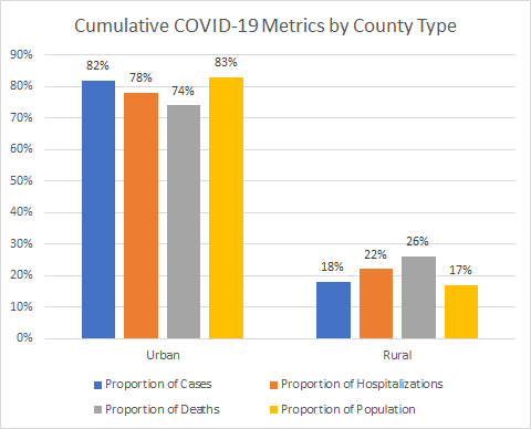
We can drill deeper into the county types using the 6-level classification scheme. Here we can see that both rural county types (micropolitan and noncore) show the same sort of trend as we saw in the graph above, which makes sense. But what we didn’t see before is that the same trend exists for the smallest of urban counties in the 2-level classification - small metropolitan. And medium metropolitan counties are experiencing cases, hospitalizations and deaths at a proportion that is predicted by their share of the overall population.

Of course, this analysis isn’t looking at disparities by age group, or race/ethnicity. But we can see from these data that the three county types on the right of this graph are disproportionately harmed by the pandemic and are vulnerable. These counties represent 32% of the Georgia population but 72% of the counties and only 26% of the population who has received 1+ dose. Seems like we have an excessive number of counties to serve the population, but that’s another argument for another time. If you live in one of the counties listed below, understand that even if you haven’t been directly impacted by COVID-19, your community has been hit harder than other parts of the state.

Even if you don’t perceive COVID-19 to be a risk to your personal health, it is disproportionately harming your neighbors. And your community is more than likely behind other parts of the state on vaccinations. Keep that in mind as you consider whether to unmask in public while unvaccinated. Even better, let’s get vaccinated and help our communities as much as possible. And understand that some of your neighbors might have challenges in accessing the vaccine due to work, transportation, childcare, language, awareness, fear of needles, etc. The same people who have been dismissing the deaths and suffering of others this whole time are the same people who are shrugging off essential workers and others who have had access challenges when it comes to the vaccine. I’ve had more than one person tell me, “they’ve had their chance to get vaccinated. It’s their problem.” But just because accessing the vaccine was easy for you does not mean it’s easy for your neighbors. Eligibility is not the same thing as access. Only paying attention to your lived experience and opportunity is more than a bit self-centered, especially with a disease that moves silently among us. People are not expendable. If we can help them, then we should.
In many ways, the study and the way I analyzed the burden on Georgia communities is confirmation of what we already suspected. But it was a new way to look at the pandemic and I wanted to share with you.
The latest on Georgia
Testing
Today there was a net increase of 18,335 newly reported PCR tests and 3% were positive. There was a net increase of 6073 newly reported antigen tests and 3.5% were positive. If we look at the positivity rate over time, you can see that the positivity rate for both tests is really coming down over the past three weeks. Where we used to see big spikes and dips in positivity, things have stabilized on a continued downward trajectory. We’ve been at or under 5% for both since May 7th.

Cases
Today there was a net increase of 649 newly reported PCR cases and 184 antigen cases for a combined total of 833. The state’s 7-day case rate per 100,000 is 30% below the spring surge peak last April. We haven’t seen a case rate this low since June 3 of last year. There are four counties in the red zone by the Brown University School of Public Health criteria for case rates. These include Candler, Charlton, Chattahoochee and Stewart.
Hospitalizations
Today there was a net increase of 117 new confirmed COVID-19 admissions to the hospital and 26 admissions to the ICU.
Deaths
There was a net increase of 20 confirmed and 2 probable deaths newly reported today. Whereas the case rate has decreased enough to reach levels below the baseline before the summer and winter surges, deaths have not accomplished this yet. But it’s within sight. The 7-day death rate per 100,000 for the state is 16% above the pre-summer surge low point.

References
https://www.cdc.gov/mmwr/volumes/70/wr/mm7020e3.htm?s_cid=mm7020e3_w
https://globalepidemics.org/key-metrics-for-covid-suppression/
https://dph.georgia.gov/covid-19-daily-status-report
https://covid-gagio.hub.arcgis.com/
https://beta.healthdata.gov/dataset/COVID-19-Reported-Patient-Impact-and-Hospital-Capa/6xf2-c3ie
https://beta.healthdata.gov/Health/COVID-19-Community-Profile-Report/gqxm-d9w9
Georgia COVID-19 Updates is a free newsletter that depends on reader support. If you wish to subscribe please click the link below. There are free and paid options available.
My Ph.D. is in Medical Microbiology and Immunology. I've worked at places like Creighton University, the Centers for Disease Control & Prevention and Mercer University School of Medicine. All thoughts are my professional opinion and should not be considered medical advice.