

The COVID Digest, 17Apr2022
Georgia goes to weekly reporting

This past Friday was the last day that Georgia will be reporting data on all business days. Starting this week, we can expect a report of the week’s data on each Wednesday. I’ve been collecting data from Georgia’s daily reports since 11Mar2020. There is a part of me that is relieved to not have to check the data every business day. But it’s a bad time to be doing this. See, the impetus for this change across multiple states to go to weekly reporting is the notion that the pandemic is finally over and we need to focus on other things. But that’s also happening while cases are surging in the northeast and starting to pick up elsewhere in the country. The political narrative that the pandemic is “over” is going to fall apart pretty quickly. Meanwhile, we won’t have timely and actionable data to understand the situation.
Using case rate and test positivity, the community transmission map from CDC serves as an early warning of where the trouble spots might be. Here we can see that the northeast is solidly red along with Alaska, Hawaii, and Puerto Rico. CDC recommends that only healthcare facilities use this information so that they can plan.

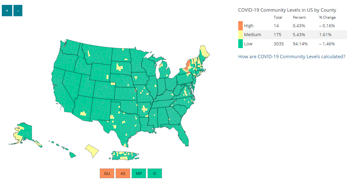
Compare that to the Community Levels map that CDC wants ordinary Americans to use, below, which lets you know how hospital bed availability stands for your local community, should you need to be hospitalized for COVID-19. With its stop light inspired color coding, everything looks great. But as we know from past experience, cases lead to hospitalizations which lead to overburdened hospitals. Rather than helping Americans to see what the amount of disease transmission in their area is like, a map like this contributes to complacency with respect to disease protections. This, in turn, fuels more infections and potentially more hospitalizations. If you look at an area like Puerto Rico, Alaska or New Mexico, you can see that you can have a lot of disease (see community transmission map above) and still appear green on the hospital-oriented Community Levels map (below). By recommending this map, the CDC is effectively telling us to ignore early warning signs.
Meanwhile, test positivity is rising for every region of the country. The graph below comes from the HHS Community Profile Report. Test positivity has risen for every surge the United States has experienced. For now, case rate is only rising for the northeast. Former FDA Commissioner, Scott Gottlieb, estimates that “we’re probably only picking up one in seven or one in eight infections” on Face the Nation last week.

One does have to ask, when cases and test positivity are starting to rise, why are we making it harder to see what is happening with less frequent data reporting? What is the benefit of doing this for ordinary Americans? For all the talk of individuals needing to determine their individual level or risk, they can’t do that very well if they don’t have access to the data. It’s like telling people to dress for the weather, but not giving the weather report.
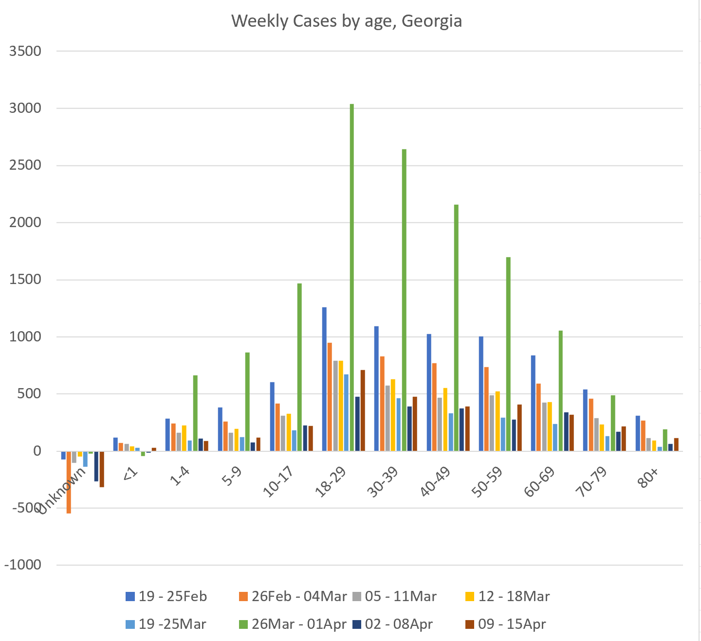
Meanwhile, the weekly case total for Georgia rose by 26% this week. The case total is shown in the blue graph below and obscured slightly by the ICU admissions (down 14% compared to last week).

We can see where the increase in Georgia cases came from in terms of age groups with the graph below. It shows 8 weeks’ worth of weekly totals for each age group. There was a large data dump the week of 26Mar - 01Apr, so try to overlook the green bars for now. We can see increases in the most recent week for age groups like infants <1 year old, 5-9 year olds, 18 - 59 year olds and those 70+. In other words, large swaths of the population.
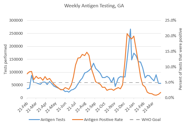
It’s too soon to know whether this is just noisy data or the start of a surge. We will want to pay attention to the data that come out on Wednesday and in the week that follows. Remember, we will only see data weekly and we may not see test positivity at all anymore. According to the press release that DPH sent out, they will no longer be reporting the PCR/Molecular reported today, nor will they report Total Antigen. That’s where the test positivity calculation comes from. So here’s the last look we have of antigen test positivity. Note that antigen test positivity (red line) is scooping upward as it has at the start of other surges.
Keep reading with a 7-day free trial
Subscribe to The COVID Digest to keep reading this post and get 7 days of free access to the full post archives.