

The COVID Digest, 12Mar2022
The Wizard of Oz effect

This week has been an interesting experience in watching efforts to distract and gaslight people from the realities of what’s happening with COVID-19. I want to point out that this sort of thing happens after every surge, when those who seek to minimize the importance and relevance of COVID-19 try to tell us that we overreacted, this disease isn’t a big deal, and that we need to just move on. And yet, the disease that keeps coming back, that keeps killing people and that wreaks havoc on hospitals and society at large proves the naysayers wrong every time. Why do we keep falling for this strategy to soothe and distract us when it is repeatedly wrong?
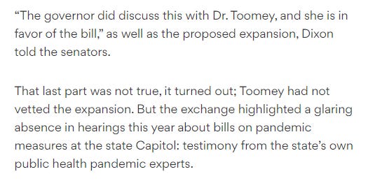
Take for example the (incorrect) talking point that COVID-19 is mild in kids and therefore transmission in kids is something we shouldn’t worry about. Meanwhile, Omicron has been deadly for kids. In fact, 25% of all the pediatric COVID-19 deaths that have been recorded in Georgia since the start of the pandemic (going on 2 years now) were since Christmas 2021. For the nation, Omicron has caused one third of all pediatric COVID-19 deaths. The risk of harm to kids is not zero and not getting better. Meanwhile, the Georgia house has passed a law that would ban schools from requiring universal masking, or allow parents to opt out of a school-wide policy. The ban is set to last five years. What’s worse, the proponents of the bill are not involving public health expert testimony in their considerations and are making up support from the state’s public health commissioner that doesn’t actually exist. In short, they’re lying to score political points.
Meanwhile, yet another study came out showing the benefit of enacting a mask requirement in schools during a surge. The graph below shows the case rate per 100,000 people before and after implementation of a mask requirement. The study period is part of the Delta surge in the South.

Combine that with another story that came out this week that schools in Georgia are no longer required to report their COVID-19 data to the Georgia Department of Public Health. The data from schools has been important for generating the School Aged Surveillance Data Report, including the outbreak data in schools and daycares.

It is easier to avoid closing schools due to COVID-19 ever again, even in the midst of surging disease, if we deny school administrators, parents and advocacy groups access to the data by never collecting it in the first place. Why is there this goal to have widespread infection of children with a preventable disease that appears to cause brain damage? A helpful roundup of recent studies can be found here.
The CDC Director is also trying to distract us from reality. She appeared on 60 Minutes last week to talk about how wonderful everything is with COVID-19. Below is her tweet that uses the new community transmission level criteria that lump what was previous low, moderate, substantial and high categories into the new “low” category.


But the same CDC website also provides the former community transmission level criteria, which show that 64% of the counties in the US are in the high or substantial category (red or orange) - where masks should still be worn.

Meanwhile, the SARS-CoV-2 virus isn’t part of these negotiations over its “end.” In fact, it continues to spread and evolve. While humanity is in the “let’s move on” phase of the pandemic, SARS-CoV-2 is in the “mess around and find out” phase of the pandemic. A new variant, related to Omicron, is surging in Europe leading to increases in both cases and hospitalizations. America has naively hoped that what happened in Europe would stay in Europe in past surges and has been proven wrong every time. So we should expect that a case curve like this is heading to the United States in the near future.

While there has been a false (but hopeful) narrative that viruses can only evolve to get milder, this is again humans trying to put limits on what a virus can do through bluster without actually doing any of the work to limit viruses in the first place. Some early evidence (see a recap here) shows that this variant is more transmissible than Omicron. And since American leadership was content to feed its citizens into a chipper in order to keep businesses open, I think we are looking at more death in the coming months. That’s because the BA.2 variant is in all of the US FEMA regions. It’s already here and growing.


It’s a good time to stock up on COVID-19 test kits and high quality masks. Because manufacturers in the US are going out of business or turning their attention elsewhere. After all, if the US government has declared this thing is over, is there really a buyer for the goods they might sell? A quote from the linked article below.
Congress is surprisingly taking all COVID-19 funding out of the budget bill this year. So all the promises that the President made during the State of the Union with respect to COVID-19 will be unfunded, and therefore nonexistent. They are empty promises now. Money for new treatments, vaccines, testing, etc, will not be there after all. And so the efforts to say that “everything is fine” and COVID-19 mild and over while the US continues to average 1000 deaths per day during a lull between surges reminds me a lot of the Wizard of Oz. Don’t pay attention to that graph over there. Don’t pay attention to the uptick in hospital demand when it starts to happen. When cases start to surge, the CDC Director will still be tweeting about how 90% of counties are in the (absurd) “low” category. The thing about exponential growth is that everything looks fine until a small increase becomes a gigantic increase. We don’t have a lot of time to pivot, which is why it’s important to pay attention to increases when they are small. Instead, everything is sunshine and rainbows and we are beating this virus with a loud, booming voice and slick public relations.

We may be seeing the beginning of an upward trend in Southeast Georgia. There are two regions that are showing a big swing up in the most recent week - regions M and J. It’s across multiple counties in both regions. Test positivity and hospitalizations appear to remain flat for now, however. It’s possible these regions are served by the same lab facility and this uptick is the result of a data dump. I certainly plan to keep an eye on things for the next week to make sure that’s the case.

But again, we can see what’s coming from Europe. It’s important to remember that the leaders who are telling you that COVID-19 is not a big deal, that it is over, will not be there to say they’re sorry for getting it wrong when the next surge comes. They will say there was no way they could have seen this coming. They have taken steps that will make it harder for us to see the next surge coming until the mass of humanity arrives at hospitals needing care. They have taken steps to confuse the public by saying everything is fine, to make it harder to find masks and tests by signaling the end of the pandemic. Make no mistake, minimizing the importance of COVID-19 results in a lot of death. We are on our own against this threat.
Paid subscribers will get a separate email tomorrow that recaps the week’s data nationally and regionally. Thank you for your support.
References
Unless otherwise noted, the source data for all of these graphs is from the Georgia Department of Public Health daily status report and the Georgia Geospatial Information Office COVID-19 Data Hub. Many thanks to the public health data heroes at these organizations for providing these data to the public on a near-daily basis. Not all states offer this level of transparency.
Thank you for your support of the COVID Digest.
My Ph.D. is in Medical Microbiology and Immunology and I am Chair of the Division of Natural Sciences and Mathematics at the University of Saint Mary. I've worked at places like Creighton University, the Centers for Disease Control & Prevention and Mercer University School of Medicine. All thoughts are my professional opinion, do not represent the views or opinions of my employer and should not be considered medical advice.
I just am still in shock.
We’ve been abandoned by government at all levels.
My take-away from comparing the Covid-19 Community Level Map, referenced by the CDC director on 60 Minutes, and the Covid-19 Community Transmission Map which is also available on the CDC site, is that the two maps measure VERY DIFFERENT things, but the levels for each are presented with the same color and wording. High = Red, Medium = Orange, and Low = Green. The similar presentation and similar titles makes it appear that they are measuring the same thing. In fact, the Community Level Map, referenced by the CDC director to support the concept that Covid-19 risks are currently low, is based heavily on hospitalization rate, and Covid cases as a % of staffed beds. The community transmission rate, however, is based on Covid testing results. Measuring the hospitalization rate is important, however, the transmission rate in the community is a better indicator of risk if we are to effectively protect the most vulnerable populations in our communities.