

The COVID Digest, 10Oct2021
The latest COVID trends for Georgia

I apologize for the delay, readers! It was homecoming week at my new university and things were very busy. Thankfully, things continue to decline in Georgia for COVID-19 (a decline is a good thing). So we’ll hit the highlights today in what is hopefully a short newsletter.
First let’s look at how the big metrics moved this week.
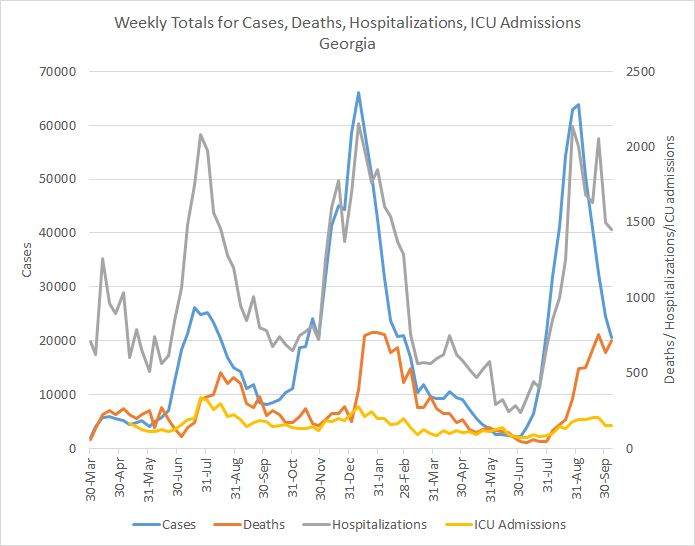
Cases decreased by 16%, hospital admissions decreased by 3%, ICU admissions were about the same and deaths rose by 13%. Despite the increase in deaths, it still appears that the peak occurred two weeks ago. We should anticipate some strange data reporting this week due to the Columbus Day holiday.
Test positivity continues to decrease for both PCR (left graph) and antigen testing (right graph, in red). Testing volume remains high for both methods. Hopefully the state can maintain this high capacity for the weeks to come so that test positivity drops below 5% (antigen testing is already there) and stays there.

Statewide, the 7-day case rate per 100,000 has decreased 69% since the delta wave case peak occurred on 13Sep2021. This is really good news. The only hiccup in the data right now is for hospital region N (northwest Atlanta suburbs) which has seen some bigger than usual case totals over the past three days. The graph below shows you hospital region N compared to the statewide average.

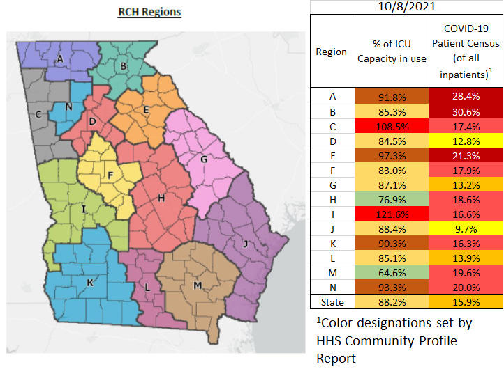
Things are better for Georgia hospitals, but still very intense in many areas. The chart below shows the percent of ICU beds in use and the percent of all inpatients who are there due to COVID-19. The stoplight color coding indicates that red is bad, green is good. There are two regions still using an excess of the available ICU beds (regions C and I) and this trend existed for all but two reporting days in September. What these regions share in common is a border with Alabama. So this could be neighboring hospital regions shouldering the burden of counties across the state line on top of their own. There are still three hospital regions (A, B and E) that are in the red zone for patient census. Regions D and J are in the best shape right now, with patient census in the yellow zone.
Now let’s turn to deaths. As noted above, deaths rose this week by 13%. If we examine the 7-day death rate per 100,000, we can see that for the first time in a while, the increase in deaths wasn’t coming from rural counties as a group.

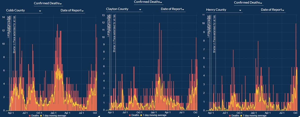
Instead, there was a bounce in Atlanta (Fulton and DeKalb counties) and the nonrural counties outside of metro Atlanta. But the Atlanta suburbs have been seeing a slower but more steady rise in death rate since late July that has yet to peak. The Atlanta suburbs are Cherokee, Clayton, Cobb, Douglas, Fayette, Gwinnett, Henry and Rockdale. The counties with the greatest increases in deaths, which might explain the Atlanta suburb rise as a whole, are Cobb, Clayton and Henry counties. You can see the confirmed deaths over time for these counties below from the Georgia Department of Public Health status report.
Instead of looking at population density as a way to compare deaths, we can also look at death rate by Georgia hospital region, so neighboring counties. The regions seeing the largest increases since 01Oct include regions M, B, and L.

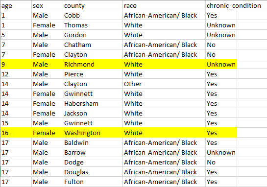
Lastly, this week was noticeable for deaths in that there were two newly reported pediatric deaths in the DPH status report. Those deaths are highlighted in yellow from the downloadable data files from the status report. They were a 9 year old boy from Richmond county and a 16 year old girl from Washington county. My deepest condolences go out to these families and the health care teams that suffered these losses as well.
To finish up this week, I’ll just point out that we are already seeing more influenza-like illness activity this year than last year. Just like “everything tastes like chicken,” influenza looks like a lot of other things. So this isn’t a perfect way to describe the incidence of influenza.

Another way to look at influenza also comes from the CDC FluView report. The graph below looks at influenza positive tests. Again, because influenza looks like a lot of other things a lot of those cases never get a test. So they wouldn’t appear on this graph either. But it gives us a look at the trend. Influenza positive specimens are on the rise and not far off from the peak of last season’s influenza peak.

With so many people removing their masks and resuming pre-pandemic activities, there is more opportunity for all sorts of respiratory illnesses to spread. We don’t have vaccines for all of them, but we do have a vaccine for influenza. And influenza kills people and adds to hospital burdens each year also. Let’s prevent the deaths and burdens that we can prevent. Please be sure to get your flu shot. In fact, you can get your flu shot and your COVID-19 shot at the same time.
Unless otherwise noted, the source data for all of these graphs is from the Georgia Department of Public Health daily status report and the Georgia Geospatial Information Office COVID-19 Data Hub. Many thanks to the public health data heroes at these organizations for providing these data to the public on a near-daily basis. Not all states offer this level of transparency.
The COVID Digest is a free newsletter that depends on reader support. If you wish to subscribe please click the link below. There are free and paid options available.
My Ph.D. is in Medical Microbiology and Immunology and I am Chair of the Division of Natural Sciences and Mathematics at the University of Saint Mary. I've worked at places like Creighton University, the Centers for Disease Control & Prevention and Mercer University School of Medicine. All thoughts are my professional opinion, do not represent the views or opinions of my employer and should not be considered medical advice.