Hello readers! This week’s newsletter will take a different form than usual. We’ll do a roundup of national and Georgia data. Then I’ll give some updates on my travels in the Mountain West.
National
This week, 89% of US counties are in the high or substantial category for COVID-19 disease transmission. This means that if you are in a red or orange county, the likelihood of being exposed to COVID-19 is very high. You should assume you will be exposed, rather than assume things are risk free.
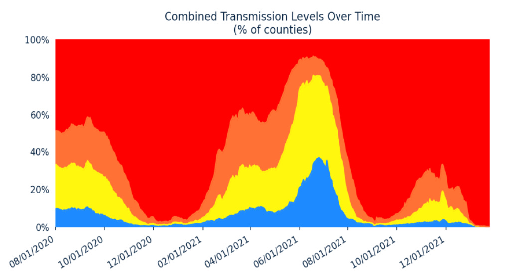
Looking at a map like this is to see the disease as a snapshot in time. It doesn’t provide a lot of context. The graph below shows the same information but over time. We can see that the proportion of US counties where the risk was low was as much as 70% of counties on 10Apr. But now, about 2 months later, only about 11% of counties are in that place.
The graph below comes from the Department of Health and Human Services, from January 2022, before they stopped including the community transmission level graph in their reports. It is similar to the graph above, but gives more historical context. With 89% of counties in the red or orange territory now, we are in a similar position to what was happening as we approached the peak of last summer’s Delta wave. Meanwhile, we know that we are vastly undercounting COVID-19 cases because of the popularity of at home testing, which does not get reported to the state.
So eventhough, people have moved on and are living “post-COVID life,” the reality is that there’s a LOT of disease out there. As much as we were experiencing with some of our worst waves in the past. Some people aren’t bothered by the risk of catching COVID-19, for some it is a life-threatening illness. For some, the risk of a disabling illness is enough to make them want to avoid it. And it is a weird thing to navigate this world of alternate realities - one where COVID-19 no longer seems to exist based on the behavior we can observe. And another where the risk is still high, but the supports and protections they once depended on are no longer there.
Georgia
Last week, I showed data from the Georgia Department of Public Health that indicated that cases might be leveling off - something that would be a bit of a first in that this could have been the first wave that was less severe than the one preceding it. But the data are up once again. It’s possible that the “leveling off” that we saw last week was an artifact of Memorial Day test center closures, etc.
The graph below shows the weekly totals for cases, deaths, hospitalizations and ICU admissions in Georgia. Because case totals are so high, they get their on y-axis (left side). Everything else is graphed using the y-axis on the right.
We can see that just like every other wave, cases and hospital admissions for COVID-19 trend together. This week, hospital admissions rose 29% compared to the previous week. Hospital admissions are outpacing the growth of cases (+18% this week).
K-12 aged children are seeing a decline in weekly casee totals over the past two weeks. This is most likely because K-12 schools have dismissed for the summer and that route of disease transmission has been cut off. But they are the only group seeing a continued decline. All other age groups in Georgia are seeing continued dramatic growth week to week.
Keep reading with a 7-day free trial
Subscribe to The COVID Digest to keep reading this post and get 7 days of free access to the full post archives.


