

The COVID Digest, 08Jan2021
Record-setting week for Omicron

Good morning! This week there are limited things to say about Georgia because the data coming in over the New Years weekend were so large that it broke the Georgia Department of Public Health dashboard. As a result, we only got 2 days’ worth of county level and demographic data. So today’s newsletter will feature what we can see from Georgia’s data and a look at national trends.
Georgia on my mind
Monday of this weekend started with an onslaught of data from the New Years holiday - data so overwhelming that they were not able to publish the daily report.

They were able to publish on Tuesday and Wednesday, but part of this update included the addition of ~2 million test results that had not previously been reported over the span of 2 years. This may explain why the Monday report was not published. For Thursday and Friday, problems with the Electronic Laboratory Reporting system prevented DPH from publishing at all. However, they were able to provide updated cumulative totals for the big statewide metrics and the hospital dashboards on the Georgia Geospatial Information Office hub were still performing as usual. So these are the data sources for what I’ll show next.
Based on the updated cumulative totals, we can calculate the weekly totals as I’ve always done and those results are shown in the graph below.
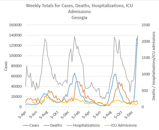
Cases rose by 31%, hospital admissions dropped slightly by 8% and ICU admissions rose 46%. Deaths decreased by 31% for the week. What to make of the disconnect now between cases rising and hospital admissions dropping slightly? If we look at the previous peaks for hospital admissions in gray, we can see that we’re right around the same spot. Some of us who monitor these data wondered previously if this was really the worst that hospitalizations were or the most that hospitals had the staffing to admit into the hospital. I am hearing of hospitals being overwhelmed. It could also be just week to week variation. We’ll want to keep an eye on that.
Prior to the data reporting problems with DPH, it did appear that the Atlanta metro *may have* begun to peak for new case rate (see the blue line below). However it’s impossible to know without new data.

In any case, what started in Atlanta with the omicron surge has since spread throughout the state. As of the last full DPH update on 05Jan2022, the 7-day case rate was more than twice as high as it had ever been before. Disease fanned out into rural areas throughout the state, marching southward. It’s possible that if we’d had complete reporting this week the entire state would be that dark maroon color in the map below.

A big part of the reason why the state’s overall patient census graph is nearly to previous surge peaks is because this surge hit Atlanta first and the population density there is large enough to drive the entire state’s patient census upward and fast. If (big if) Atlanta is really starting to peak, that might result in a short pause in upward momentum for COVID-19 patient census that is pushed further upward as the disease has since spread out to other areas of the state.
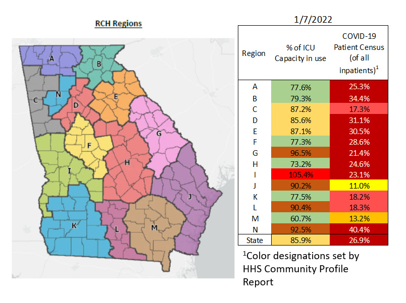
As of yesterday, 07Jan2022, 12 of Georgia’s 14 hospital regions were in the red zone for patient census (led by region N, northwest Atlanta suburbs) and 5 of the regions were using more than 90% of their ICU beds (led by region I).
Georgia Department of Public Health also shows us how healthcare workers are being impacted by the disease. We can see that the winter 2020 - 2021 surge was the worst for healthcare workers prior to the most recent surge. There was a rise during the delta wave but it was about equal to the spring of 2020, most likely due to the healthcare workforce being highly vaccinated. But that has changed dramatically in the omicron surge. This graph is based on date of symptom onset rather than date of report. So there is a 14 day window of uncertainty over to the right. When cases and deaths are added to this graph, that information is backdated to the start of symptoms or positive test, so for that reason the 14 day window is a bit unreliable. Generally, the numbers can go up but are less likely to go down as time marches on to the right. So for us to see some really big days in the 14 day window for healthcare workers is an ominous sign for future hospital staffing. There were three days this week where >400 new infections were reported among the healthcare workforce. That makes this the biggest surge experienced to date for healthcare workers. As more of these vital workers have to go into isolation, there are fewer people to staff beds in hospitals.

We are beginning to see staffed ICU bed availability decline as a result of both a decrease in total staffing for ICU beds and the increase in patient demand for ICU beds. When you look at this next graph, keep in mind that this many ICU beds are meant to serve a population of 10.6 million people.

National trends
Keep reading with a 7-day free trial
Subscribe to The COVID Digest to keep reading this post and get 7 days of free access to the full post archives.