Thankfully, the delta wave continues to recede from Georgia, but not without a heavy human toll. This week we saw the following changes in the metrics shown in the graph below:
Cases declined by 24%
Hospital admissions declined by 27%
ICU admissions declined by 27%
Deaths declined by 16%
Despite these improvements, Georgia is still ranked #6 in the nation for new 7-day death rate per 100,000 and #6 for confirmed COVID-19 hospital admissions per 100 beds according to the HHS Community Profile Report (dated 30Sep2021). In addition, 92.5% of ICU beds are occupied in the state and 43% of those occupied beds are filled by COVID-19 patients, again according to the HHS Community Profile Report. So while things do appear to be on the right track, it is important to remember that COVID-19 continues to place a significant burden on hospitals and we should do all within our power to limit disease transmission through vaccination, universal and appropriate mask wear, social distancing, etc.
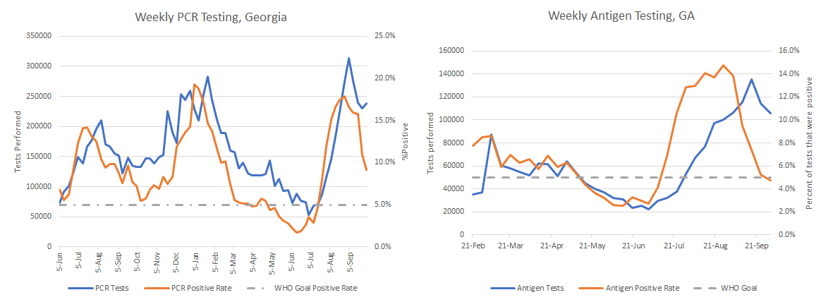
Let’s turn to testing and see how the state is doing. In the graphs below, PCR tests are shown on the left and antigen tests are on the right. The goal is to be at or below 5% for test positivity and the goal line is shown with a gray dashed line. Test positivity for both graphs is shown in red and the testing volume (how many tests were performed each week) is shown in blue.
This week we can see that antigen testing has stayed relatively high and the test positivity rate has dipped below 5%. As a reminder, getting below 5% is not the finish line. The goal is to stay below 5% and that can be a harder challenge. Another thing to remember is this is just the antigen tests that are performed in a laboratory or in a pharmacy. The antigen tests performed at home are not counted in total tests performed or the test positivity rate. Considering the graph on the left, we can see that test volume for PCR testing (considered to be the gold standard) increased slightly this week and the test positivity rate is declining rapidly. This indicates that although the state is still likely to be missing a lot of cases, the testing volume staying at this high level is helping to make sure that test positivity continues to trend down and in the right direction.
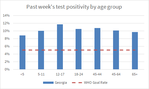
We can also look at the HHS Community Profile Report to learn more about how PCR test positivity compares across age groups. As for the graphs above, the goal line of 5% is shown with a red dashed line. You can see that all Georgia age groups are well above the goal line of 5% and the positivity rate is highest for 12-17 year olds.
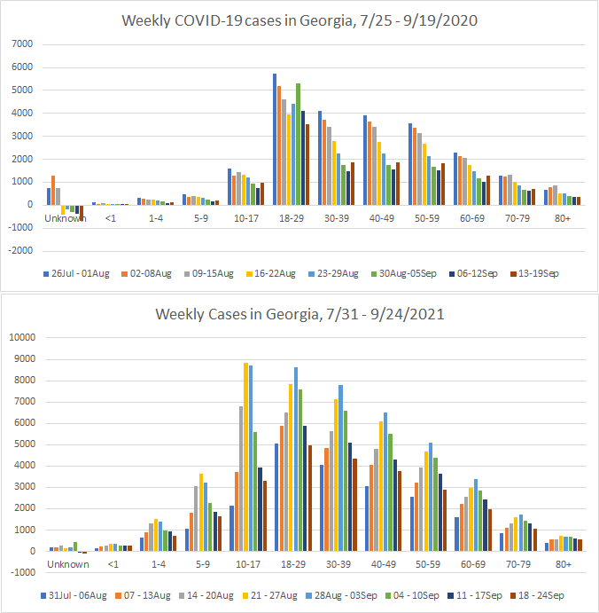
The Georgia Department of Public Health recently began producing a new data report called the COVID-19 Age Trends Report. One of the really neat things this report does is show the trends for age groups adjusted for population throughout the course of the pandemic and also offer case rates for this time compared to the same span of time a year ago. The graph below was particularly striking to me. First, I know it’s really small, I’m going to show you a blow up in a moment. We already knew that the delta wave was the biggest one experienced so far from other data. But I think it’s really interesting how the colors (corresponding to different age groups) are very different for the delta wave compared to previous ones. For example, the olive green color (12-17 year olds) has been a low to middle of the pack age group for the summer 2020 and the winter 2020-2021 surge.
But they have dominated during the summer 2021 (delta) surge. Children aged 5-10 year olds are the second biggest contributor to disease. All K-12 aged children surpassed the case rate observed for 18-22 year olds (kelly green color) who have historically always been the leading contributor to disease.
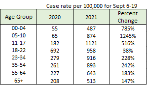
The Age Trends Report also shows the case rate for the most recent 2 weeks in 2021 compared to the same two weeks in 2020. I’ve reproduced the comparison in the table below. You can see that 2021 saw increases for all age groups. But the percent change for case rate (which is adjusted for population) was greatest for children.
Another way to look at this information is shown below, comparing roughly the first 8 weeks of K-12 school in 2020 compared to the same period in 2021.
Between the Age Trends Report, the comparison of case rate per 100,000 and the graphs shown above, we can see that the delta variant was a virus that came after Georgia’s children. And unfortunately, it was right around the time of delta’s arrival that a lot of adults decided to stop protecting children, including school superintendents who elected to abandon all disease mitigation efforts. An estimated ten percent of children who test positive develop Long COVID symptoms. In a classroom of 20 students who have all had COVID-19, that’s 2 children with a semi-permanent preventable disability that could impact their health and learning. Not to mention that these 20 kids might have had family members die of the disease too. It’s hard to look at these data and not think that Georgia failed its children in the delta wave.
There is hope on the horizon, however. The FDA’s VRBPAC (advisory committee that considers vaccines) has scheduled a meeting for October 26 to consider COVID-19 vaccines for children 5-11 years old.
Georgia COVID-19 deaths declined this week and it remains to be seen if we’ve seen the peak from delta or if this is just an anomaly in the data. The timing of the peak (if it is a peak) is around the time we were expecting delta deaths to peak. So that might be hopeful and reassuring news.
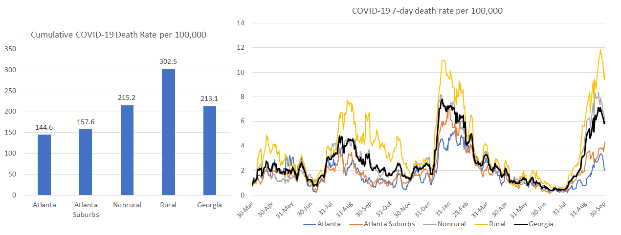
But even if things are getting better with respect to deaths, there has still been such a breathtaking amount of preventable, needless deaths during the delta wave. Regions that were hit especially hard by death in Georgia include regions M (Waycross and southeast Georgia), H (mid-eastern part of the state such as Milledgeville, Dublin, etc), F (McDonough, Macon, Warner Robins), and K (southwest Georgia, including Albany).
Rural counties have always been disproportionately harmed by COVID-19 deaths since the start of the pandemic (see graph below on the right). But the delta wave widened the gap. Now the cumulative death rate in rural counties is more than twice as high as that observed in the Atlanta counties. Again, these were deaths that didn’t need to happen and that’s what is most sad and frustrating. We can see that areas in the state that had higher vaccination rates (Atlanta and Atlanta suburbs) have much lower death rates than areas outside of the metro where vaccination rates are much lower.
We can see how vaccination rate has impacted cases, hospitalizations and deaths in this graphic below that was produced by Benjy Renton, another COVID-19 communicator like me. The three colors correspond to state vaccination rates in three tiers. Green for those where more than 65% of the total population has received at least one dose, orange for those states where 55-65% of the total population has received at least one dose, and blue for those with a single dose vaccination rate of less than 55% (this is where Georgia would fit).
What we see from this graphic is that the vaccines work spectacularly well and that states that failed to prioritize population-level immunity through vaccination have experienced cases, hospitalizations and deaths that didn’t need to happen. Their hospitals were slammed when they didn’t need to be. People missed work for themselves or for their children when they didn’t need to do so. People died who didn’t need to die.
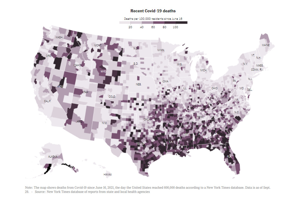
On Friday, the US surpassed 700,000 deaths from COVID-19 since the start of the pandemic. That’s more than the number of Americans who died from the so-called “Spanish Flu” (actually originated in Fort Riley, Kansas). The map below from the New York Times shows deaths per 100,000 people since mid-June, when the delta wave really got going, first in Missouri. What’s striking about this image is the concentration of high death rate in the South. I remember predicting in early July that although the delta wave first took off in Missouri, ultimately the South would be ground zero for delta. Myself and others sounded the alarm. Unfortunately, Southern leaders didn’t listen.
The reality though is that I can’t rule out that the South is done with COVID-19, reaching so-called “herd immunity.” When you have a variant as transmissible as delta, we need to reach at least 86% population-level immunity to see a protective effect for communities. At present, with 44% of the Georgia population fully vaccinated and an estimated 56% of the population infected at one time or another, the population-level immunity estimate for Georgia is 75% according to Georgia Tech. For Alabama, the estimate is 78%. Tennessee is at 82%. For Florida it is 85% (so they may be getting close). But just like 5% for test positivity isn’t a finish line, I don’t think “herd immunity” is a finish line either. Read more on this in the Twitter thread below.


So what this means is that we still need to vaccinate as many people as we can, including children when they are authorized to receive the vaccine, if we want to get back to “normal” without these continuing surges and disruptions of lives, economies, etc. I for one will be watching the data closely as we approach the winter holidays. Because the lifting of pandemic precautions even while vaccination rates remain low means more transmission of all diseases, not just COVID-19. And it appears that influenza (which also hospitalizes and kills people) is not sitting this year out. Please be sure to get your flu shot.
Unless otherwise noted, the source data for all of these graphs is from the Georgia Department of Public Health daily status report and the Georgia Geospatial Information Office COVID-19 Data Hub. Many thanks to the public health data heroes at these organizations for providing these data to the public on a near-daily basis. Not all states offer this level of transparency.
The COVID Digest is a free newsletter that depends on reader support. If you wish to subscribe please click the link below. There are free and paid options available.
My Ph.D. is in Medical Microbiology and Immunology and I am Chair of the Division of Natural Sciences and Mathematics at the University of Saint Mary. I've worked at places like Creighton University, the Centers for Disease Control & Prevention and Mercer University School of Medicine. All thoughts are my professional opinion, do not represent the views or opinions of my employer and should not be considered medical advice.


