

Evaluating risk this Memorial Day weekend
The COVID Digest, 27May2021

Memorial Day is sort of the unofficial start of summer for many of us. While it originated as a day to honor those killed while defending of our nation, for most it is an opportunity to gather with friends and loved ones to barbecue or otherwise have a good time.
But last year, Memorial Day events are thought to have kicked off Georgia’s summer surge. We are in a much different place this year. The state’s 7-day case rate per 100,000 is 23% less than this time a year ago. We also have safe and effective vaccines that have helped to limit disease burden. But with only 31% of the Georgia population fully vaccinated, the state still remains in a vulnerable position and its luck could run out.
I gave a teaching demonstration yesterday for a job interview and I included an active learning section where the audience had to do a risk assessment based on a question I get all the time: a friend wants to have 100 people over for a party. What is the risk, based on publicly available data, for hosting that event in the context of the pandemic? And I thought the results of my local analysis were so interesting that I want to show you how to do this for your local community also.
When we look at something like risk in this scenario, what kind of information do we need? One of my first things to consider is the weather forecast and the planned format for the event. Will the weather be compatible with outdoor activity? Because we know outdoor events are safer than indoor ones. We also need to consider local case rates and test positivity. Case rates tell us how intense the disease is locally, and test positivity tells us if that case rate is an underestimate of true disease burden. Below you can see how new case rate and recent test positivity rates are used together to grade the community transmission rate by the US Department of Health and Human Services. For the map on the left, you want to be in the yellow or blue counties as much as possible.

I think it’s also prudent to consider the local impact of COVID-19 on the hospitalized patient population. We don’t want to set up our friends and loved ones for a situation where healthcare resources are limited or add stress to an already stressed healthcare infrastructure. We want to get a sense of the local vaccination rate and/or population immunity to COVID-19. Finally, we want to estimate the likelihood that someone at that 100 person event might be positive for the virus. Thankfully, we have publicly available tools to answer all of these questions.
For my teaching demonstration, I chose the county where I live, Leavenworth County, Kansas. We want to pay attention to not just the values for each of the boxes below, but the context of what they mean (see the interpretation/color risk zone row). So your homework, if you choose to accept it, is to do this same risk collection for your local county.

For the top table, all of the information is going to come from the HHS Community Profile Report. You’ll want to choose the most recent Excel file (.xlsx at the end of the filename). This is a treasure trove of regional, state, county and local data. There are tabs at the bottom of the spreadsheet, and I want you to focus on the “counties” tab for now. When you select this, every county in America will be shown. In column F for State Abbreviation click on the drop down menu and de-select “select all” and then only select the state of interest. This will filter the counties to only your state of interest. Then scroll to the right to find the columns for cases per 100k - last 7 days (column Q), test positivity rate (column AK), and % of inpatient beds occupied by COVID-19 patient in column BD. Use these to fill in the top table for your county of interest. To fill in community transmission category, find column AI.
Next, we need to look at population immunity. This is the bottom table. Remember, there are two ways to reach immunity from COVID-19. They are natural infection (which carries a much higher risk of hospitalization and death) or vaccination. So when we want to estimate how much of the population is immune, we need to consider both. Dr. Joshua Weitz and his team at Georgia Tech have a helpful estimate tool to do just that at a state and national level. When you get there, you can choose as many states as you want and/or the United States as a whole. There’s a couple more options to choose here in the top left. I recommend choosing fully vaccinated (since we want to see those who are immune) and an ascertainment bias of 3. Because we know there are a lot of asymptomatic COVID-19 cases that will never get a test, ascertainment bias is a way to factor that population into the mix too. I usually choose the mid-range bias, but in another Georgia Tech tool we’re going to use in a minute, the only options are 3 and 5. So we’re choosing 3 in this tool for now.

What you’ll get on the plot if you hover over your jurisdiction of interest is a pop up that shows how much of the population is estimated to be immune including how they got there (i.e. through infection or vaccination). Fill in what you find in the bottom table above. As you do so, you’ll notice that the percent infected and percent vaccinated do not add up to the value for population-level immunity. This is because a lot of the people who were previously infected have also been fully vaccinated. To fill in county-level vaccination rate, go back to the HHS Community Profile Report and find column BZ to find the people who are fully vaccinated for your county of interest. Because my county is on the border of two states, I needed data for Kansas as well as Missouri. As you can see below, Kansas is doing a whole lot better than Missouri. Both states are made up of a majority of rural counties, but Missouri appears to have made less effort at serving those rural counties. In my county, 38.1% of the population is fully vaccinated and this is above the state average (34%). Would still love to see that number higher, but it’s better than most of the state.

Next, we need to ask Georgia Tech to calculate the risk of someone being positive at our party using their COVID-19 event risk assessment tool. Compared to their other tool that shows population level immunity at a state or national level, this tool allows us to see to the county level for risk. It takes into account local case and testing rates. Before you zoom in to your county, we need to make some choices on the lower left. Choose an event size of 100 people on the slider. Then choose an ascertainment bias of 3. Now it’s time to zoom in to your county of interest. If you zoom in first and then make the choices on the lower left, you’ll just get frustrated as the map returns to the national view.

Finding your county of interest is a little bit easier than it might otherwise be with the assistance of the pop ups, especially if you’re unfamiliar with the shape of your county. When you find it, you can click or hover over it to see the current risk level that at least one person would be positive at your event. For my county, the risk was 5%.

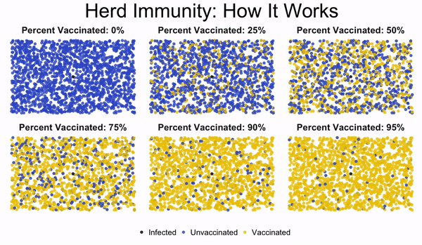
So now that my table is all filled in, I can see that my county is in the yellow and green zone for the top table. That’s a good place to be. My state is at or slightly above the national average for population level immunity and 38.1% of my county is fully vaccinated. That’s not as good as we would like, but the case rate locally is low and a good estimate of disease burden since test positivity is below 5%. Zero percent of the currently hospitalized patients are there for COVID-19. (NOTE: if your county does not have a hospital, there will not be a value for your county). There is a 5% risk that someone at the 100 person event would be positive and potentially spread to others. That means that 95 times out of 100, the party would be COVID-19 free. That sounds like really good odds for our event. But let’s look at the herd immunity animation again to see what we think here (think percent immune rather than percent vaccinated at the top of each box). On a state level, my population level immunity is 55%. So 5 times out of 100, the box on the upper right would happen. Those are pretty small odds, I know. But the stakes are high if we are unlucky, and more so if everyone is having a party of 100 people.
So based on your community data, if your friend asked you the risk of hosting a party for 100 people, what would you tell them? What, if any, risk mitigation strategies would you recommend? In my community, I would tell them that the risk is low and they should have their party. But I would recommend that they have as much of the event outside as possible. I mean, shouldn’t the kick off to summer be outside anyway? Do it up big with outdoor music, slip and slides or bouncy houses (depending on age), food, etc, to encourage people to spend the time outside. The risk is low, but not zero. So if they’re concerned about not hosting a super-spreader event, having the event outside is the safest option. If they have kids or others who are not yet vaccinated, consider making masks available to anyone who needs to go inside to use the restroom, etc. Open the windows of the home to improve ventilation inside for those brief encounters. Of course, if you have an underlying condition that puts you at higher risk and you are not vaccinated (or are perhaps fully vaccinated but immunocompromised), your risk calculation will be different and you need to be more cautious. But for the general population in my county, I would feel pretty okay about having a 100 person party that was outside given what the data show, especially if I happened to already know that most of them were fully vaccinated.
Just like I used to send my students off during the last class of the week, I’ll tell you in my mom/teacher voice to make good decisions this weekend. We have worked hard to get to this point in the pandemic and a lot of people have been very careful, have gotten vaccinated, and have been part of the community effort to limit transmission. That hard work has gotten us to a safer place than we might have expected. It’s okay to take a deep breath and celebrate that. So if you are comfortable, it’s okay to expand your bubble a bit. If you are still risk averse and sort of shell shocked by this pandemic, that is totally okay and understandable too. Your lived experience is valid. For those who are ready to emerge, it’s okay to savor the things we missed over the past year and I hope we approach those things with a new appreciation and respect. But that’s not the same thing as pretending the pandemic is over and abandoning all that we’ve learned in the past year. Let’s all make good, smart, evidence-based decisions and I’ll look forward to seeing you on Monday with the Week in Review.
I want to say thank you for the notes of thanks and gratitude after I shared that I was burned out and needing to take some time away. It seems I’m not alone and I think we all have a new appreciate for the importance of mental health as well as physical health as a result of the pandemic. I’m excited to start thinking about how to retool the newsletter to be more of a current events in public health commentary for my paying subscribers to enjoy. One of the things I’ve always loved about being an educator is that I do as much learning as I do teaching. That could be updating my knowledge of changing evidence in the field of study or learning new ways to deliver content in meaningful ways. So I’m excited to use my mind for things other than COVID-19, while still keeping a careful eye on the pandemic trends and letting the public know of any big changes. But, yes, I do get your notes when you reply to the newsletter. If I haven’t had a chance to respond personally yet, please know that writing this newsletter and helping you through an incredibly difficult year has been perhaps the most impactful and important work I have ever done. Thank you for the reward of knowing that it impacted you.
References
https://georgiarecorder.com/wp-content/uploads/2020/09/Holiday-Impact-on-COVID-19-Cases_Schmidke_083120.pdf
https://beta.healthdata.gov/Health/COVID-19-Community-Profile-Report/gqxm-d9w9
https://covid19dashboardgt.shinyapps.io/us_immunitylevel/
https://covid19risk.biosci.gatech.edu/
Georgia COVID-19 Updates is a free newsletter that depends on reader support. If you wish to subscribe please click the link below. There are free and paid options available.
My Ph.D. is in Medical Microbiology and Immunology. I've worked at places like Creighton University, the Centers for Disease Control & Prevention and Mercer University School of Medicine. All thoughts are my professional opinion and should not be considered medical advice.